
Shelten Font Vintage: a rustic serif built for badges and labels
Design style
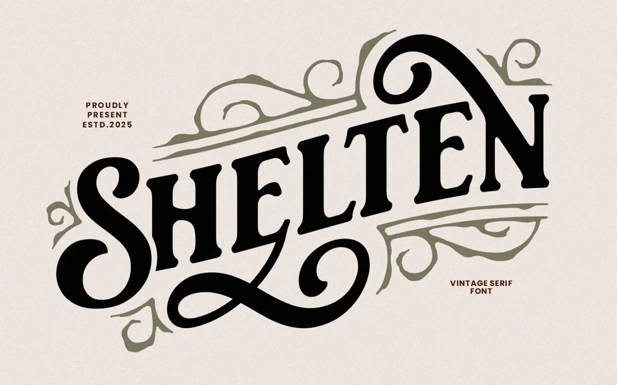
Shelten Font Vintage sits in the well-worn category of hand-inked revival serifs, the kind meant to evoke old barbershop signage, pomade tins and craft-beer labels rather than body text. The strokes carry a deliberately uneven ink trap look: thick-to-thin transitions that don’t quite follow classical logic, edges that wobble slightly as if pressed from a worn plate. That roughness is the whole point. It reads as printed, not drawn on a screen, and it does that job convincingly.
The letterforms lean condensed with a fairly upright stance, which suits stacked lettering in a badge or crest more than a single flowing line of text. Serifs are blunt and a little irregular from letter to letter, giving the face a hand-cut character rather than a mechanical one. It won’t be mistaken for a refined transitional serif, and it isn’t trying to be. Where it succeeds is in commitment to a mood: this is a font that knows exactly what shelf it belongs on.
Character set and features
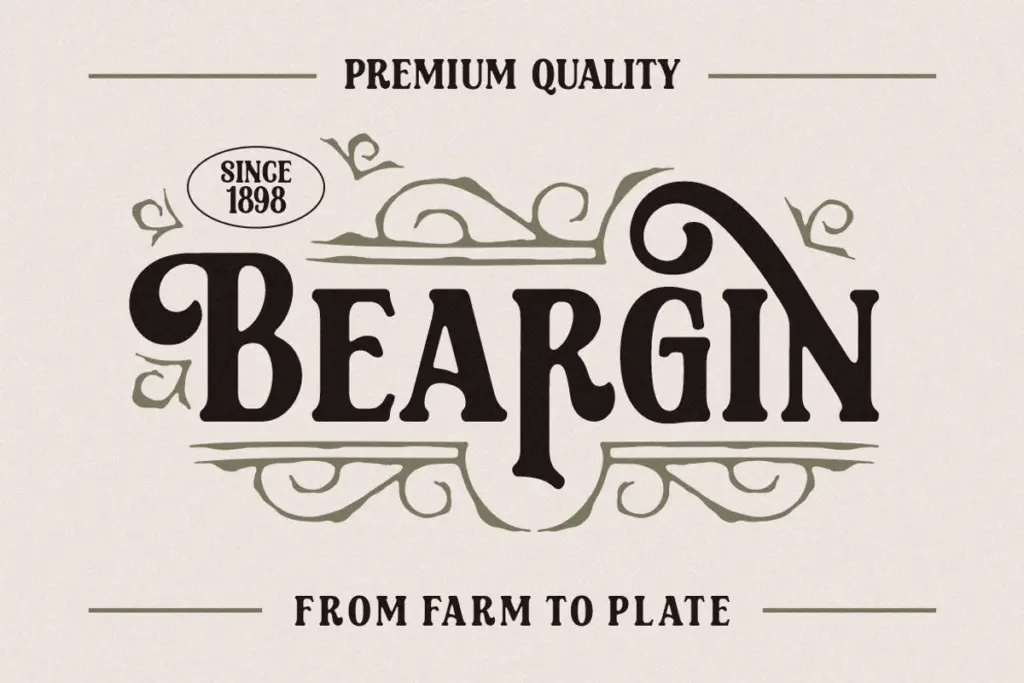
The set covers uppercase, lowercase, numerals and standard punctuation, along with basic multilingual support and a handful of alternate characters, likely swash variants on select letters. That’s a workable range for short-form work, but it’s not a font built for typographic complexity. Anyone hoping for extensive ligatures, contextual alternates, or a deep stylistic-set system will be disappointed; what’s here is enough to add texture, not enough to build a flexible identity system.
Accessing the alternates will mean going through a glyphs panel or character map, since there’s no indication of automatic contextual swapping. That’s a minor friction for anyone working outside Illustrator, Photoshop or CorelDraw, and worth knowing before committing a layout to a swash-heavy treatment.
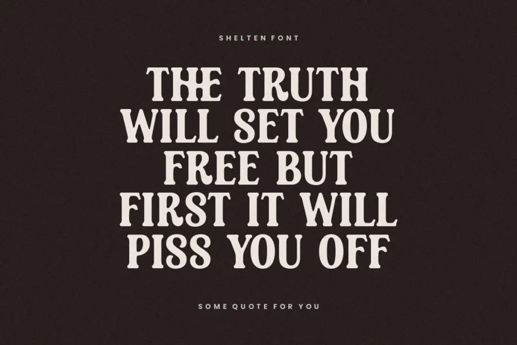
At small sizes the roughness of the strokes starts to blur into the surrounding shapes, and the condensed proportions tighten further. This isn’t a font for paragraph text or fine print, and it shouldn’t be pushed there. It’s built to be seen large, where the ink-trap texture actually reads as texture rather than noise.
Use cases
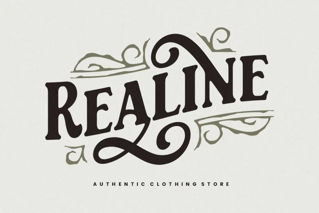
The obvious home is exactly where the name points: barbershop and pomade branding, coffee packaging, craft labels, beer and spirits badges, anything wanting a rustic, slightly weathered Americana feel. Stack it inside a circular badge with a ruled border and it does the job with little extra styling needed. It also works reasonably well for short lockups on posters, apparel graphics and hand-lettered-style logotypes where a vintage, slightly imperfect mark is the goal.
It’s less suited to anything requiring restraint or neutrality, corporate branding, editorial headlines, UI work, or any context where the type needs to disappear behind the message. Pair it with a plain sans or a simple slab for secondary text, since it has no quiet mode of its own to fall back on. Used sparingly, at a few words at a time, it earns its keep.
What we liked, and what we didn’t
Strengths
- The ink-trap texture reads convincingly as printed rather than digital.
- Alternate swash characters add variety without overcomplicating the set.
- Works immediately in badge and crest layouts with little extra styling.
Trade-offs
- Legibility drops off quickly below display sizes.
- Limited OpenType features mean little room to build a layered typographic system.
Shelten Font Vintage delivers exactly the rustic, hand-inked mood it promises, and it does that one job well. It's not built for flexibility or fine detail, so treat it as a badge and label specialist rather than a general-purpose display face.
Verdict

Tmfonts reviews typefaces in depth — every font is tested in real branding, editorial and screen layouts before a word gets written. 555+ fonts reviewed and counting.