
Recline Font Free Download
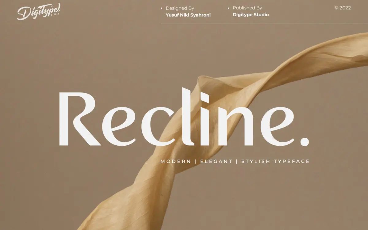
Is Recline free to download?
Recline is a commercial font sold on Creative Market, so the full version needs a paid license. Get it from the official listing: Recline font download.
Need something free? These sans serif fonts from Google Fonts are free for personal and commercial use:
Design style
Recline sits in the clean, minimalist end of the sans serif spectrum. It’s the kind of typeface built to disappear into a layout rather than announce itself: even strokes, restrained curves, apertures that stay open enough to read but closed enough to feel tidy. Nothing about the letterforms is trying to be clever, and that’s the point. This is a workhorse cut, not a statement piece.
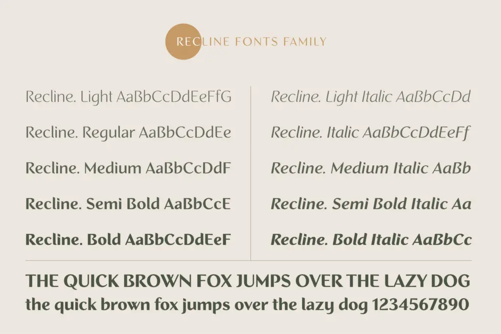
The family spans ten weights, split between straight and angled cuts — five of each. That angled variant is the more interesting design decision here. Rather than just italicising the straight version, the angled set reads as a deliberate companion style, useful for adding contrast within a single family without reaching for a second typeface. It’s a practical solution to a problem a lot of corporate identity work runs into: needing variety without needing a second license or a mismatched pairing.
At the lighter weights the strokes thin out cleanly without going brittle, and at the heavier end the letters hold their counters reasonably well rather than clogging up. The middle weights are where the design feels most at home — confident, a little cool, unfussy.
Character set and features
With ten weights across two treatments, Recline is built more for systematic use than for any single flourish. The value of a family like this isn’t in one hero weight — it’s in the ability to build a full hierarchy from one source: a light for body copy, a medium for subheads, a bold or black for titling, all sharing the same skeleton so nothing feels bolted together.
The straight and angled options give art directors a lever to pull when a layout needs a bit of movement — a pull quote, a label, a callout — without switching families entirely. It’s a sensible feature rather than a flashy one, and it will matter more to some projects than others.
What the brief doesn’t tell us is language coverage, OpenType features like ligatures or alternates, or whether the family includes true italics beyond the angled cut. Buyers who need broad diacritic support or discretionary ligatures for editorial work should check the character map before committing, since none of that is confirmed here.

Use cases
Recline is aimed squarely at corporate and editorial contexts: identity systems, business cards, packaging, books, and magazines are all named directly, and the design supports that claim. It has the neutrality corporate identity work usually wants — a typeface that can sit next to a logotype without competing with it.
For packaging and product labels, the weight range is genuinely useful; a black weight for a brand name and a light weight for ingredient copy can come from the same family, which keeps kerning and spacing consistent across a package’s different text roles. For editorial layouts, the same logic applies to running heads, captions, and body text.
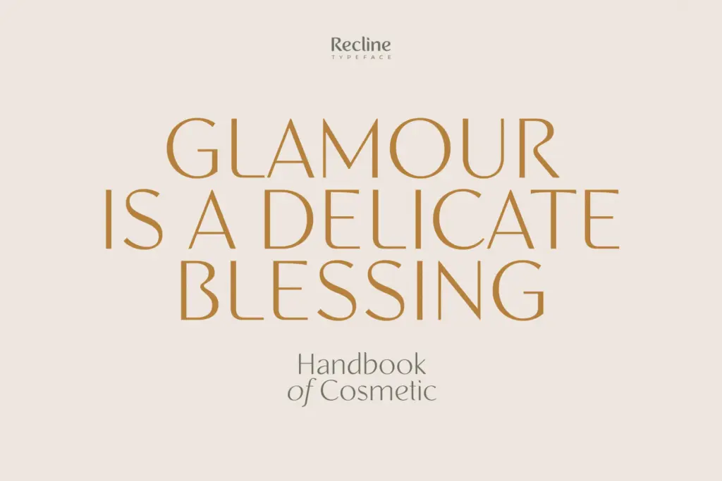
It’s less suited to work that wants personality up front — invitations, packaging that needs warmth, or branding for a business that wants to feel handmade. Recline reads as considered and controlled, not characterful, and that’s a fair trade for the jobs it’s built for.
What we liked, and what we didn’t
Strengths
- Ten weights give a genuine hierarchy from one family without mismatched pairings.
- The angled cut offers a built-in contrast option for labels and callouts.
- Middle weights are well-balanced and hold up cleanly in body text.
Trade-offs
- No confirmed information on language support or OpenType features like ligatures.
- The design is deliberately neutral, so it won't suit branding that wants personality or warmth.
Recline is a competent, quiet workhorse sans built for systems rather than statements. The ten-weight range and angled companion cut give it real utility in corporate and editorial work, though buyers wanting flair or confirmed language and OpenType depth should look elsewhere.

Tmfonts writes independent reviews of typefaces: what each font does well, where it falls short, what it suits, and where it is sold.