
The Daily Notes Font Free Download
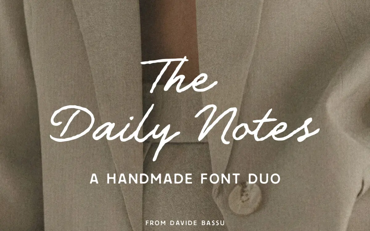
Is The Daily Notes free to download?
The Daily Notes is a commercial font sold on Creative Market, so the full version needs a paid license. Get it from the official listing: The Daily Notes font download.
Need something free? These script fonts from Google Fonts are free for personal and commercial use:
Design style
The Daily Notes pairs a loose, hand-drawn script with a companion geometric sans, and the whole thing is pitched squarely at the current wave of soft, editorial branding — the kind of look you see on skincare boxes and café menus. The script has a relaxed, slightly uneven baseline that reads as written rather than drawn with a pen tool, though it’s tidier than true handwriting: joins are consistent, letter widths don’t wander too far, and the overall texture stays even across a line of text. It comes in Regular, Slanted, Bold and Bold Slanted, so there’s a reasonable spread of weight for headline work without needing a second script typeface.
The sans is the quieter half of the pairing, and deliberately so. It’s geometric and airy, with open counters and a light touch, built to sit underneath the script as a support voice rather than compete with it. Two weights — Regular and Bold — is enough for basic hierarchy but not much more; anyone wanting a fuller sans system for body-heavy work will need to look elsewhere.
Character set and features
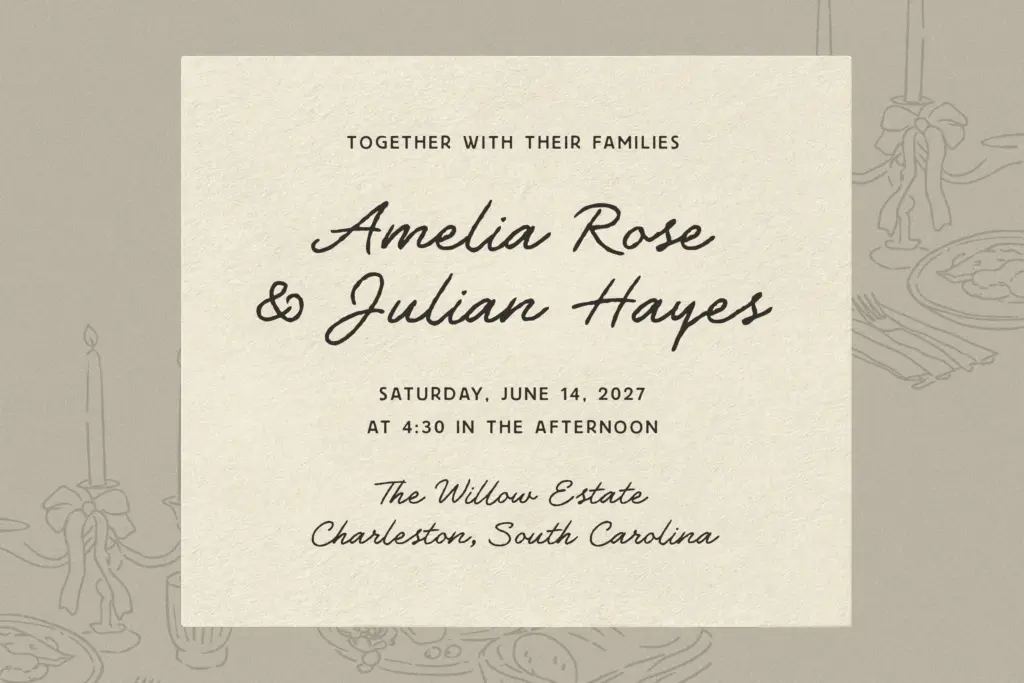
The script’s main selling point is its 50-plus OpenType alternates and ligatures. In practice, this is what keeps a hand-lettered font from looking mechanically repeated — swapped letterforms and connecting ligatures break up the sameness that undermines a lot of script fonts once you set more than a word or two. Used properly through OpenType-aware software, the alternates give short phrases and logotypes a genuinely varied, less templated feel. Used carelessly, or in an app that doesn’t support the features, the script will default to its base glyphs and look flatter and more generic — worth checking before you commit to it for a client logo.
Bassu keeps the sans simple by comparison: no elaborate feature set, just clean geometric letterforms in two weights that do their job without drawing attention to themselves. That restraint is the point, but it also means the sans has little personality on its own — it’s a support act, not a typeface you’d reach for independently.
Use cases
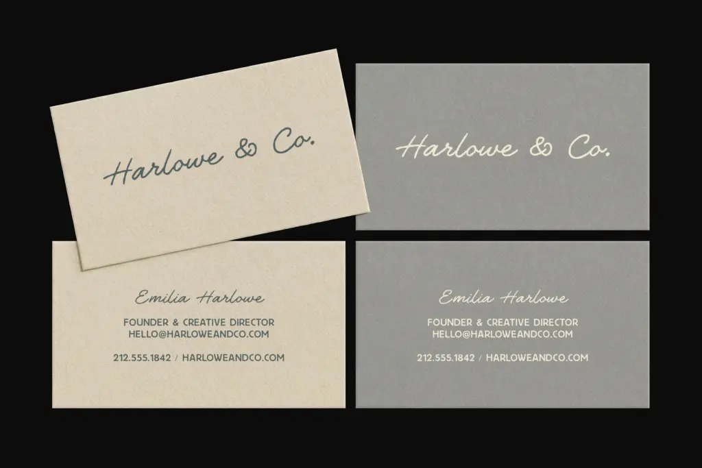
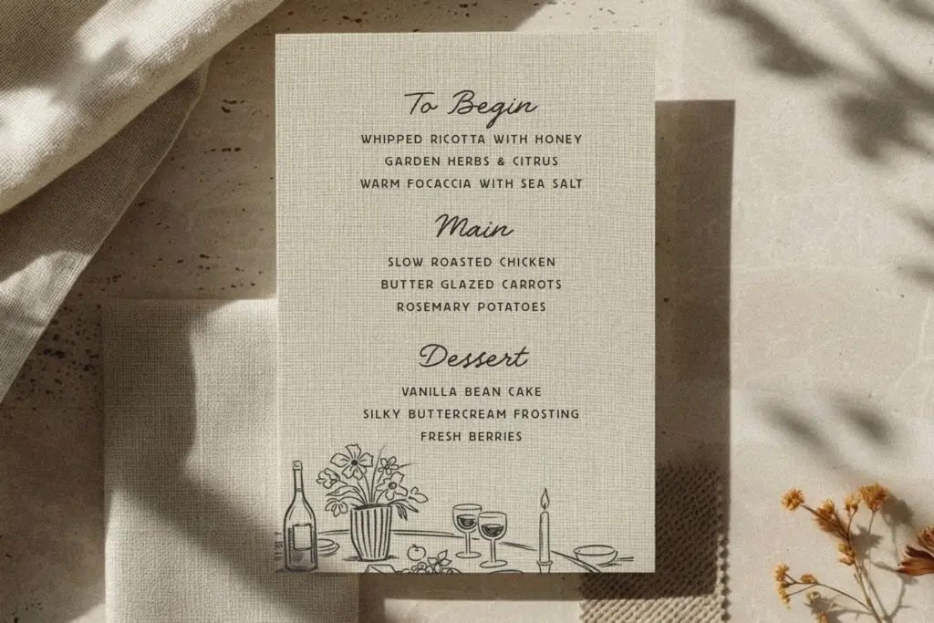
This duo is built for a specific job: brand identities that want to feel handmade but still look professional on a shelf or a screen. Beauty and wellness packaging, boutique stationery, café signage, wedding suites, and social content for lifestyle brands are all reasonable fits — the script carries the personality, the sans carries the information. Set as a wordmark or a short tagline, the script performs well; set as a paragraph, it starts to strain, as most scripts do, so keep it to headlines, quotes, and short lines.
Where it’s less useful is in anything that needs a full typographic system — long-form editorial text, dense UI, or multilingual documents with heavy body copy. The sans alone doesn’t have the range for that, and the script was never meant to carry paragraphs. Treat it as a branding toolkit rather than a complete family, and it does exactly what it promises.
What we liked, and what we didn’t
Strengths
- Over 50 script alternates and ligatures keep repeated letters from looking mechanical
- Four script styles give real range for logotypes and headline work
- The sans is genuinely quiet and doesn't compete with the script for attention
Trade-offs
- The sans has only two weights, limiting it for anything beyond basic hierarchy
- The script needs OpenType support to show its best features, so results vary by software
The Daily Notes does one job well: giving branding projects a handmade script voice with a quiet sans to back it up. The alternates keep the script from feeling repetitive, but the pairing is narrow in scope and the sans is too thin a family to carry much beyond secondary text.

Tmfonts writes independent reviews of typefaces: what each font does well, where it falls short, what it suits, and where it is sold.