
Olivetti Lettera Font Free Download
Is Olivetti Lettera free to download?
Olivetti Lettera is a commercial font sold on Creative Market, so the full version needs a paid license. Get it from the official listing: Olivetti Lettera font download.
Need something free? These serif fonts from Google Fonts are free for personal and commercial use:
Design style
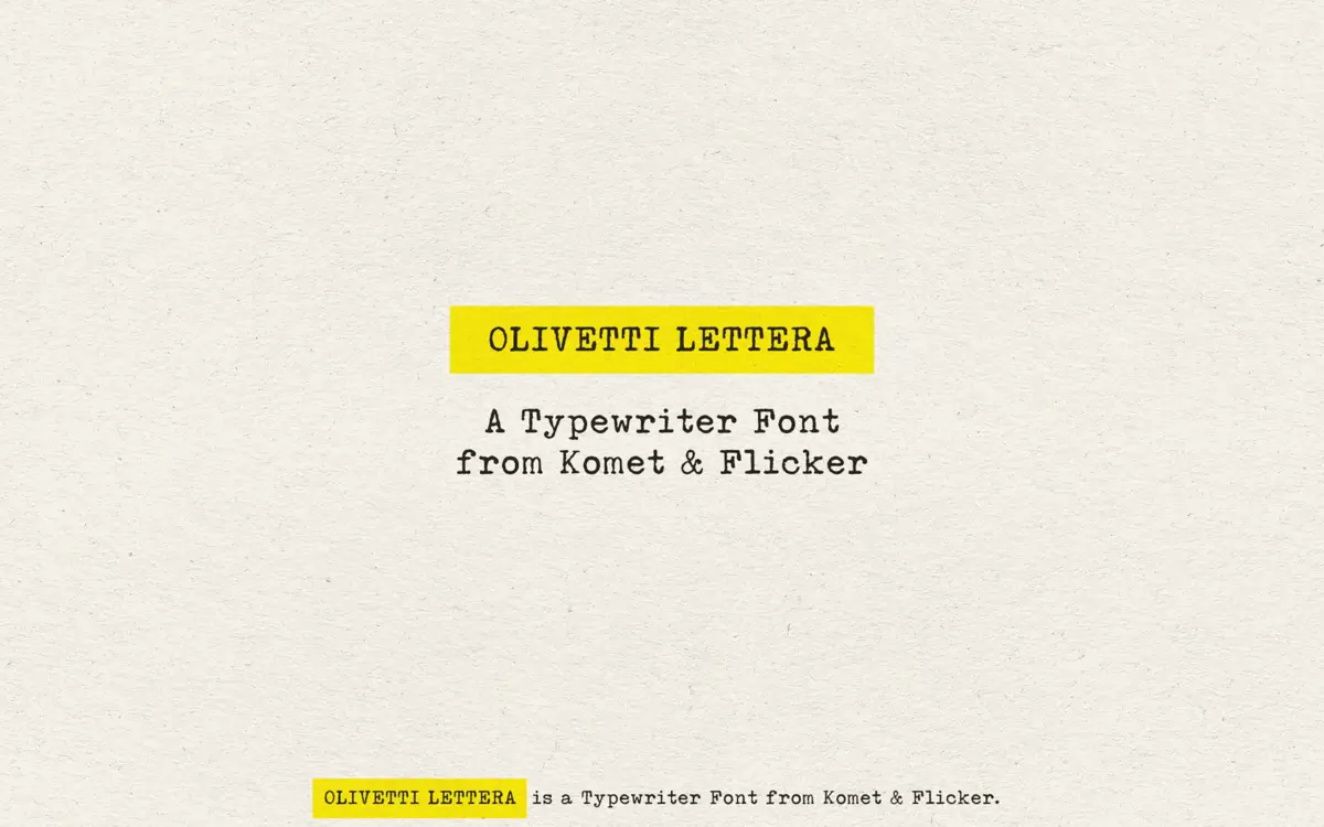
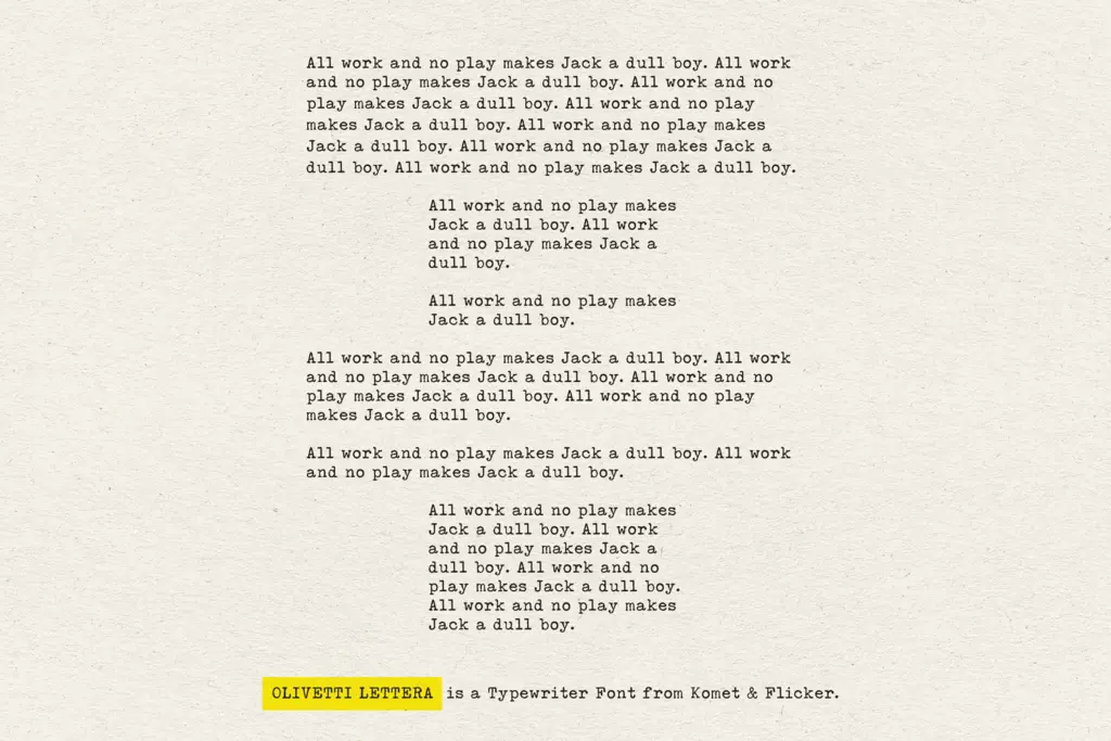
Olivetti Lettera does what its name promises: it reproduces the look of type struck through a worn ribbon onto cheap paper, rather than a clean digital approximation of one. The letterforms carry uneven ink density, broken strokes, and slightly irregular baselines that read as mechanical rather than hand-drawn. Where a lot of typewriter fonts settle for a uniform monospace grid with a light texture overlay, this one leans harder into inconsistency — some characters look like the hammer struck a touch too hard, others feel faint, as if the ribbon was thinning. That variation is the whole point, and it is convincing.
The underlying skeleton is a classic slab-ish serif typewriter form, with the kind of stubby, functional serifs you’d expect from a Lettera 35: no elegance, no modulation, just a machine doing its job. The roughness is applied on top of that structure rather than baked into distorted letter shapes, which keeps the alphabet recognisable even as the texture pushes it toward decay.
Character set and features
The set covers uppercase and lowercase basic Latin, along with multilingual Western and Central European characters, so accented languages are supported without hunting for a separate cut. Numbers, punctuation and a handful of symbols round out the practical side, and two styles of pre-made fraction glyphs are a nice touch for anyone typesetting recipes, measurements or technical copy in a period style.
The more distinctive addition is a set of twenty custom connecting word glyphs — pre-built ligature-style combinations rather than individual letters. These are accessed through the Glyphs panel in Illustrator or Photoshop, not through automatic OpenType substitution, so using them means manually swapping in the right glyph rather than typing and letting the font do the work. That’s a limitation worth knowing before you commit to a layout built around them: they’re a manual finishing tool, not a live-type feature.
Use cases
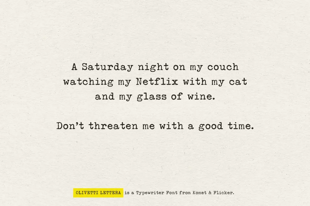
This is a mood font before it’s a workhorse font. It suits packaging and label work that wants a vintage, analog stamp — coffee bags, stationery lines, indie zines, anything trying to look like it came off a desk in a 1960s office rather than a screen. It works well for pull quotes, stamped headlines, or short bursts of copy where the texture can register clearly. Poster and editorial layouts chasing a documentary or archival tone will get good mileage from it too.
It is not built for body copy. The roughness that makes it convincing at display sizes turns into visual noise once you drop it below a few words per line — legibility holds up in short bursts but degrades in paragraphs, so pair it with a clean sans or serif for actual reading text. Logo use is possible but risky: the texture can reproduce inconsistently across print methods and screen sizes, so test at the intended output size before locking anything in. Treat it as a flavour typeface, applied deliberately and sparingly, rather than a full typographic system.

What we liked, and what we didn’t
Strengths
- Ink density and strike irregularity feel genuinely mechanical rather than filtered on
- Multilingual Western and Central European character support broadens practical use
- Fraction glyphs are a useful, specific touch for recipe or technical layouts
Trade-offs
- Legibility drops quickly once you move beyond short headlines or quotes into paragraph text
- The 20 connecting glyphs must be inserted manually through the glyphs panel, not typed automatically
Olivetti Lettera nails the tactile, uneven feel of a real vintage typewriter rather than settling for a generic monospace-plus-texture look. It's a strong choice for short display bursts and vintage branding, but it isn't built for reading text and its bonus ligatures require manual glyph swapping.

Tmfonts writes independent reviews of typefaces: what each font does well, where it falls short, what it suits, and where it is sold.