
Saint Viet Font Free Download
Is Saint Viet free to download?
Saint Viet is a commercial font sold on Creative Market, so the full version needs a paid license. Get it from the official listing: Saint Viet font download.
Need something free? These script fonts from Google Fonts are free for personal and commercial use:
Design style
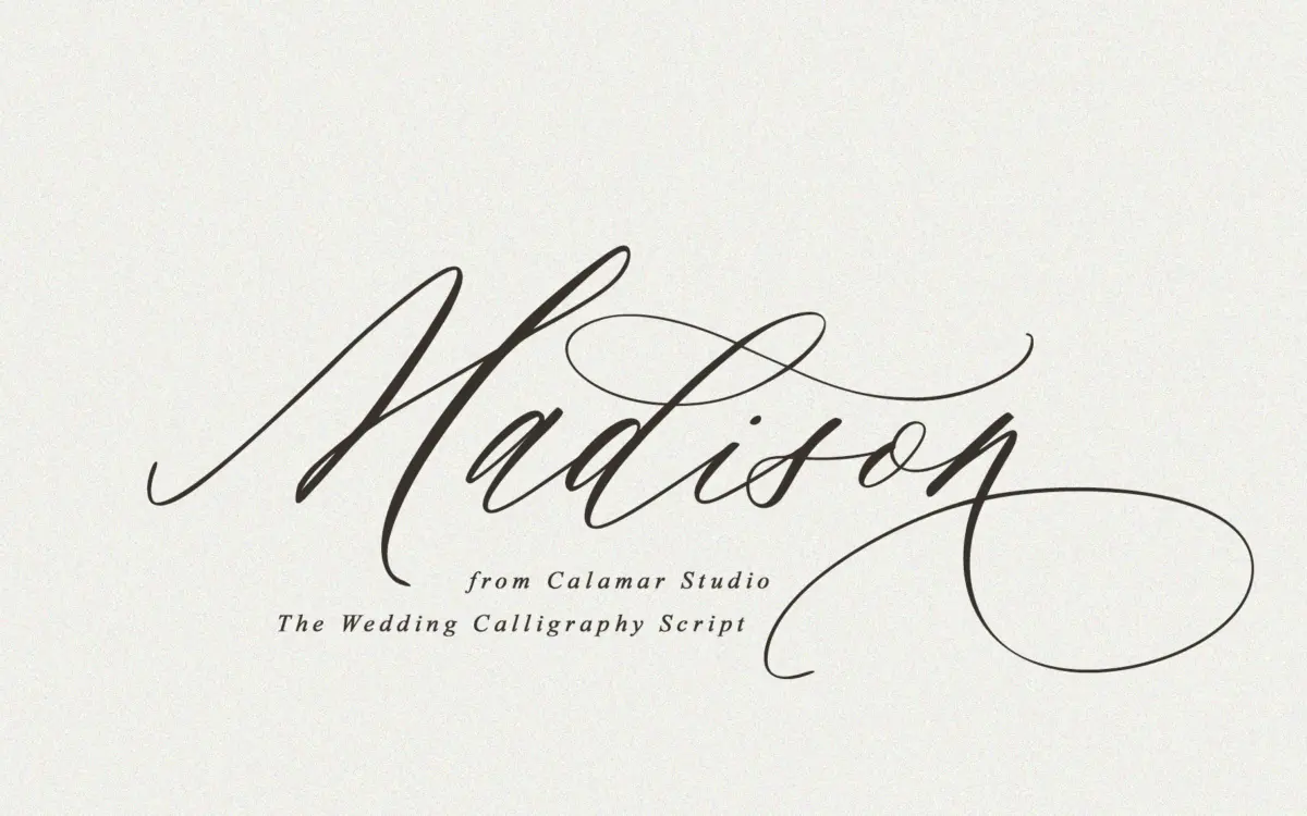
Saint Viet sits in the crowded field of modern calligraphy scripts, but it does the basics well. The stroke contrast is light rather than brushy — thin hairlines swell gently into the downstrokes, giving it a fountain-pen quality rather than the wetter, heavier look of brush scripts. Letters lean forward at a consistent, unhurried angle, and the joins between characters are drawn to look like a single continuous hand movement rather than snapped-together glyphs. Ascenders and descenders carry long, looping flourishes, which is where the “sophisticated flows” claim actually holds up — the loops are genuinely elegant rather than decorative filler. It reads as feminine and soft, aimed squarely at the invitation-and-branding end of script design rather than anything with edge or grit.
Character set and features
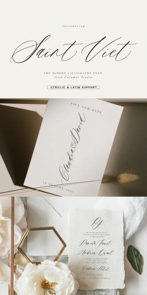
The set covers uppercase and lowercase, numerals, and punctuation, plus a large bank of stylistic alternates and ligatures — the seller claims over 500 alternates, with some capitals offering up to ten variants. That’s a substantial amount of raw material, and it matters for a script like this: without alternates, connecting scripts repeat the same swoosh on every capital and start to look mechanical by the second line of text. Here you can swap in a plainer or a more flourished cap depending on what’s next to it, which is the difference between a script that looks handwritten and one that looks templated. The trade-off is that none of this works automatically — you need software that supports OpenType stylistic sets and ligatures, and some time spent manually selecting alternates in a layout, particularly for anything longer than a few words. Latin and Cyrillic coverage is included, which extends its reach into Eastern European markets that many script fonts ignore entirely.
Use cases
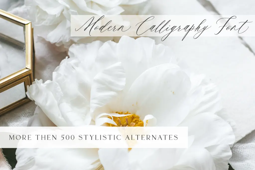
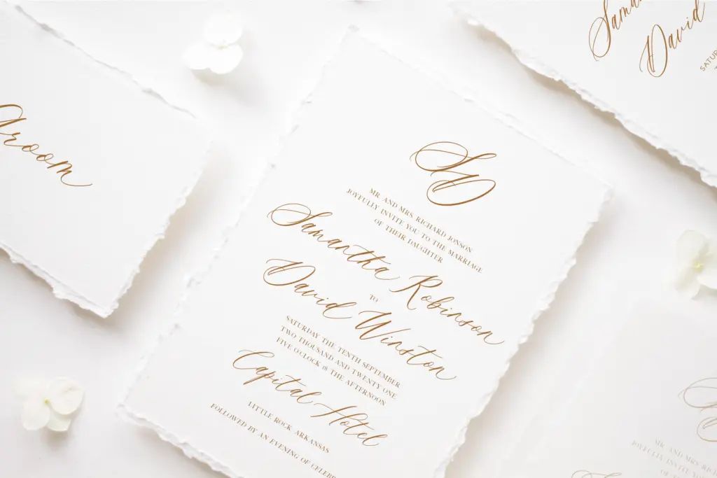
This is a font built for short, ceremonial lines of text — invitation headers, save-the-date lettering, a bride and groom’s names, a monogram, a logotype for a florist or a boutique. At that scale, the calligraphic detail and the alternates earn their keep: you’re not fighting legibility, you’re composing. It is less suited to anything that needs to be read quickly or at small sizes — body copy, signage, UI — because the light strokes and connected forms start to blur and the personality that makes it work in a headline becomes a liability in a paragraph. Pair it with a plain sans or a quiet serif for supporting text; let Saint Viet carry only the words that deserve the attention. For designers working on feminine branding, stationery suites, or packaging that wants a handwritten touch without looking like a template default, it’s a reasonable, well-drawn option — provided you’re willing to put in the alternate-swapping work rather than just typing and walking away.
What we liked, and what we didn’t
Strengths
- Large bank of stylistic alternates prevents the repetitive look common in connecting scripts
- Light, consistent stroke contrast gives it a refined, fountain-pen character rather than a heavy brush look
- Latin and Cyrillic support extends its reach beyond typical script-font markets
Trade-offs
- Requires manual alternate selection and OpenType-aware software to look its best, not a plug-and-play font
- Connected, light strokes make it unreadable at small sizes or in long text passages
Saint Viet is a competently drawn modern calligraphy script with genuinely useful alternates for anyone doing wedding stationery or soft branding work. It demands manual layout effort to look its best and has little use beyond short, decorative lines of text.

Tmfonts writes independent reviews of typefaces: what each font does well, where it falls short, what it suits, and where it is sold.