
TT Norms Pro Basic Font Free Download
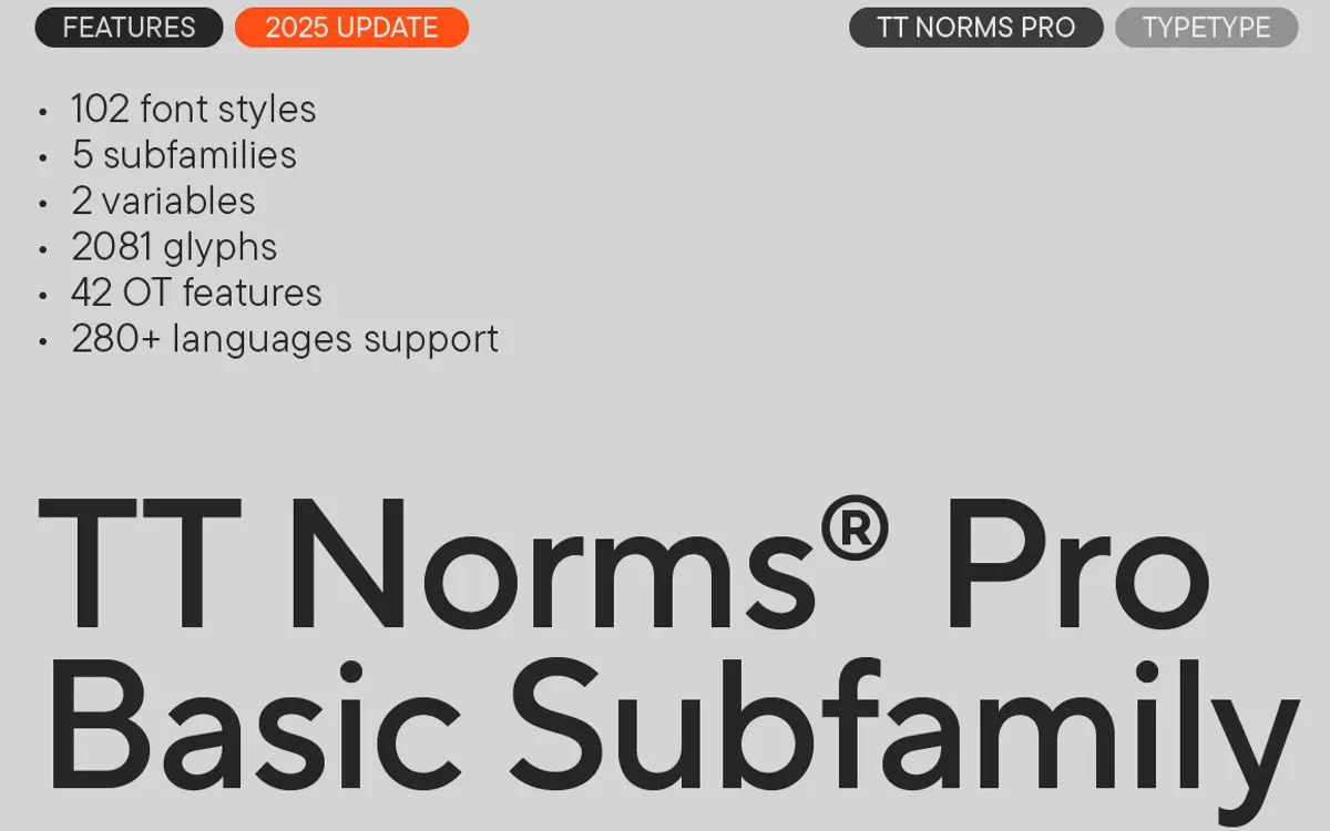
Is TT Norms Pro Basic free to download?
TT Norms Pro Basic is a commercial font sold on Creative Market, so the full version needs a paid license. Get it from the official listing: TT Norms Pro Basic font download.
Need something free? These sans serif fonts from Google Fonts are free for personal and commercial use:
Design style
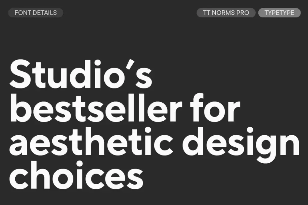
TT Norms Pro Basic sits in the well-populated territory of geometric-leaning grotesques that try to split the difference between Neue Haas-style neutrality and something a little warmer. The circular bowls of the o and e, the near-monolinear stroke weight and the squared-off terminals give it a contemporary, slightly corporate feel rather than a strict compass-drawn geometric look. It doesn’t chase personality the way a display geometric sans might — there’s no quirky single-storey a or oddball terminal to remember it by. That’s a deliberate trade: TT Norms Pro reads as tidy and competent rather than distinctive.
Across the 22 styles in this Basic package, the weight progression is even, and the italics are drawn as true italics rather than sloped romans, which gives the family a bit more range when you need to differentiate text without switching typefaces. At heavier weights the letterforms hold their proportions reasonably well, though as with most geometric sans families, counters start to close up at the black end, so headline use at very heavy weights wants generous tracking.
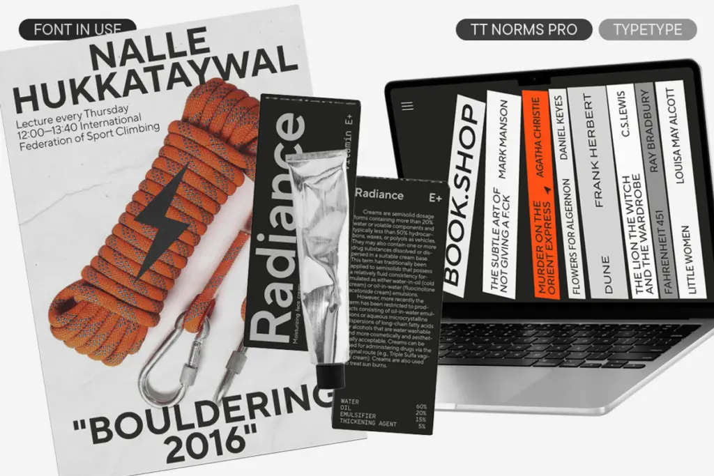
Character set and features
The character set is the strongest argument for choosing this over a generic system sans. Cyrillic support is included alongside Latin, which matters if your project touches Eastern European or Russian-language markets — a surprising number of
What we liked, and what we didn’t
Strengths
- True italics rather than sloped romans give real contrast between roman and italic settings.
- Even weight progression across the family makes hierarchy easy to build without switching typefaces.
- Cyrillic support alongside Latin extends its use into multilingual branding projects.
Trade-offs
- Letterforms are competent but largely anonymous, offering little to distinguish it in a crowded field of geometric sans faces.
- Counters close up at the heaviest weights, requiring extra tracking for headline use.
TT Norms Pro Basic is a dependable, slightly anonymous geometric sans that does its job across branding, editorial and interface work without ever demanding attention. It won't carry a logotype on personality alone, but as a working family with true italics, wide weight range and Cyrillic support, it earns its keep. Choose it when you need reliability, not a signature.

Tmfonts writes independent reviews of typefaces: what each font does well, where it falls short, what it suits, and where it is sold.