
Big Bird Font Free Download
Is Big Bird free to download?
Big Bird is a commercial font sold on Creative Market, so the full version needs a paid license. Get it from the official listing: Big Bird font download.
Need something free? These handwritten fonts from Google Fonts are free for personal and commercial use:
Design style
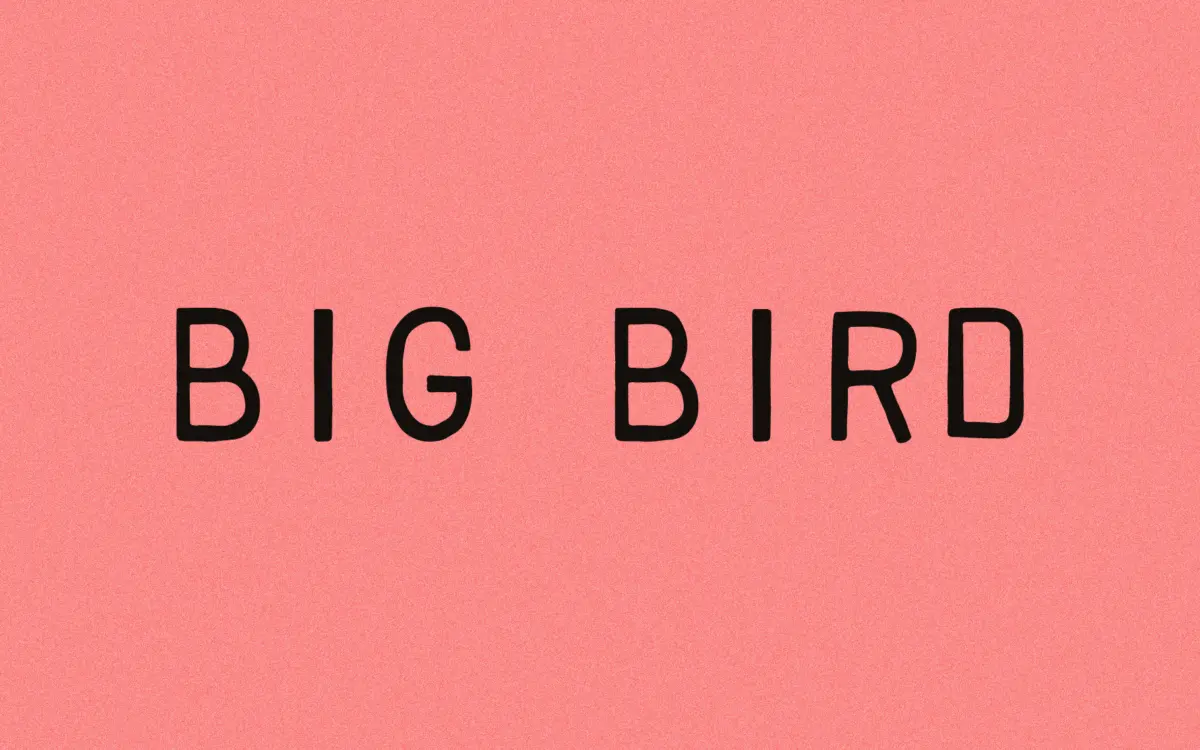
Big Bird belongs to the stamp-lettering tradition: letterforms that look like they were cut into rubber or worn through a printing block rather than drawn on a screen. The strokes carry a deliberate unevenness, thick in places where a hand-cut letter would naturally thicken, and the edges break up slightly rather than running clean. It reads as handwritten in spirit even though the construction is closer to a distressed sans than a script.
The designer describes it as a lighter-handed follow-up to an earlier, presumably heavier stamp font, and that lightness shows in the letter widths — nothing feels cramped or overbuilt. It’s a face with a clear point of view: worn, a little irregular, built for texture rather than polish. That’s a specific mood, and the whole alphabet commits to it rather than hedging with a few distressed glyphs bolted onto an otherwise clean skeleton.
Character set and features
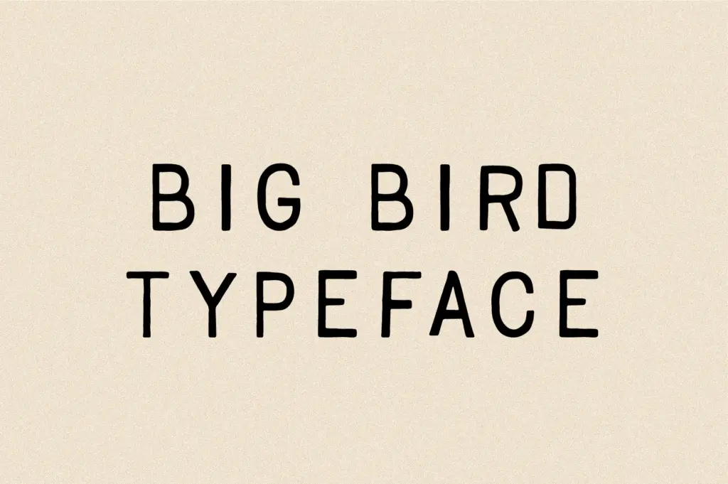
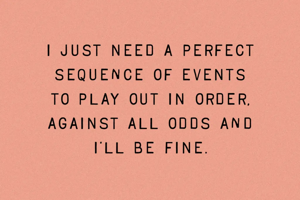
The letterforms carry consistent hand-drawn irregularities across the set — no two letters sit identically on the baseline, which is the point, but it means the typeface asks to be read as a texture rather than parsed letter by letter. Language support extends across Western European territories, including diacritics for Icelandic and Welsh, so it’s usable well beyond an English-only market.
Because the roughness is baked into the outlines rather than applied as an effect, the font behaves predictably in layout software — what you see in the specimen is what prints, with no random substitution system to manage. That’s a practical upside for a stamp-style face: some vintage fonts overcomplicate themselves with contextual alternates that make preview and production diverge. Big Bird keeps it simple, which also means the texture repeats identically wherever a letter repeats, so a word with doubled letters will show the same

Tmfonts writes independent reviews of typefaces: what each font does well, where it falls short, what it suits, and where it is sold.