
Blissful Radiance Font Free Download
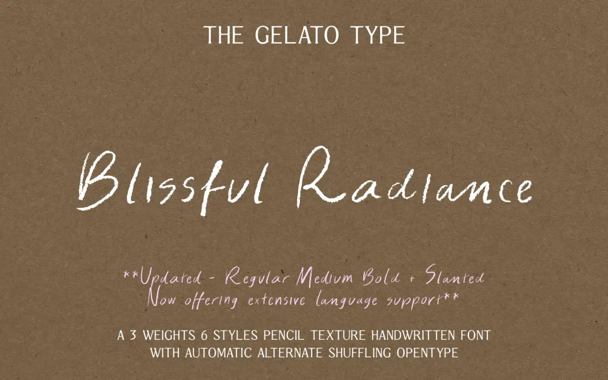
Is Blissful Radiance free to download?
Blissful Radiance is a commercial font sold on Creative Market, so the full version needs a paid license. Get it from the official listing: Blissful Radiance font download.
Need something free? These handwritten fonts from Google Fonts are free for personal and commercial use:
Design style
Blissful Radiance sits in the well-populated pencil-texture corner of the handwritten market, but it earns its keep with restraint. The stroke has a dry, slightly broken edge rather than a heavy graphite smear, which keeps words from turning muddy at small sizes. Letters lean forward with a natural, unforced slant, and joins between characters look like they were written in one pass rather than assembled letter by letter. There’s a looseness to the baseline — words drift up and down a touch, the way real handwriting does — but it’s controlled enough that lines of text don’t wobble into illegibility.
What separates it from the generic pencil script is its refusal to overdo the texture. Many fonts in this category pile on grain until every word reads as a jpeg of a napkin doodle. This one keeps the pencil quality light: visible at display sizes, mostly invisible once you’re setting body copy. It reads as handwriting first, texture second.
Character set and features
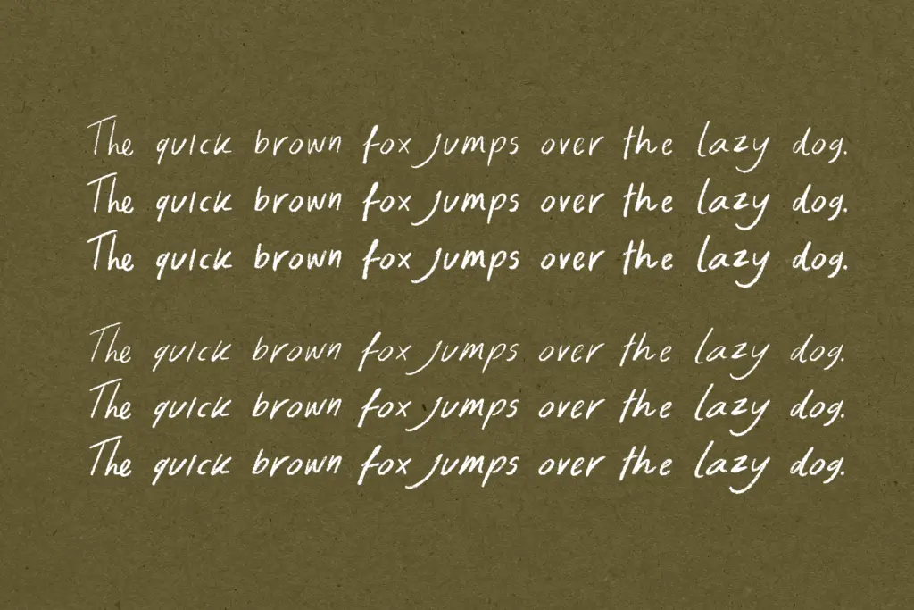
The font ships in three weights — Regular, Medium and Bold — each with a matching slanted companion, six styles in total. That’s a reasonable spread for a handwritten face, though don’t expect the weights to behave like a sans serif family; the jump from Regular to Bold changes the personality of the strokes more than it builds a tidy hierarchy. Use them as distinct moods rather than a strict weight ladder.
Contextual alternates are the more useful feature here. Two alternate sets rotate automatically as you type, which does genuinely help avoid the repeated-letter problem that makes handwritten fonts look robotic in longer headlines — a name with three A’s won’t show the same A three times. It’s not full randomisation, so on very long passages you can still spot the pattern if you look for it, but for headline-length copy it does its job quietly and without needing manual glyph substitution.
Multilingual character support is included, which widens the font’s practical reach beyond English-only branding, though as with any handwritten face, extended diacritics can strain the pencil-stroke logic a little more than base Latin characters do.
Use cases
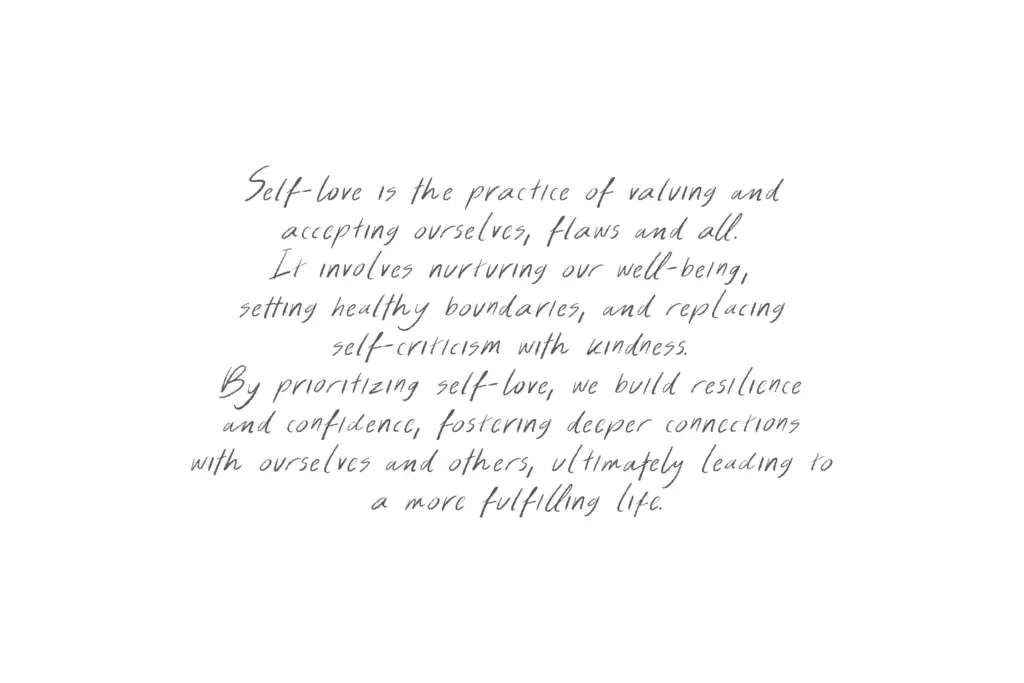
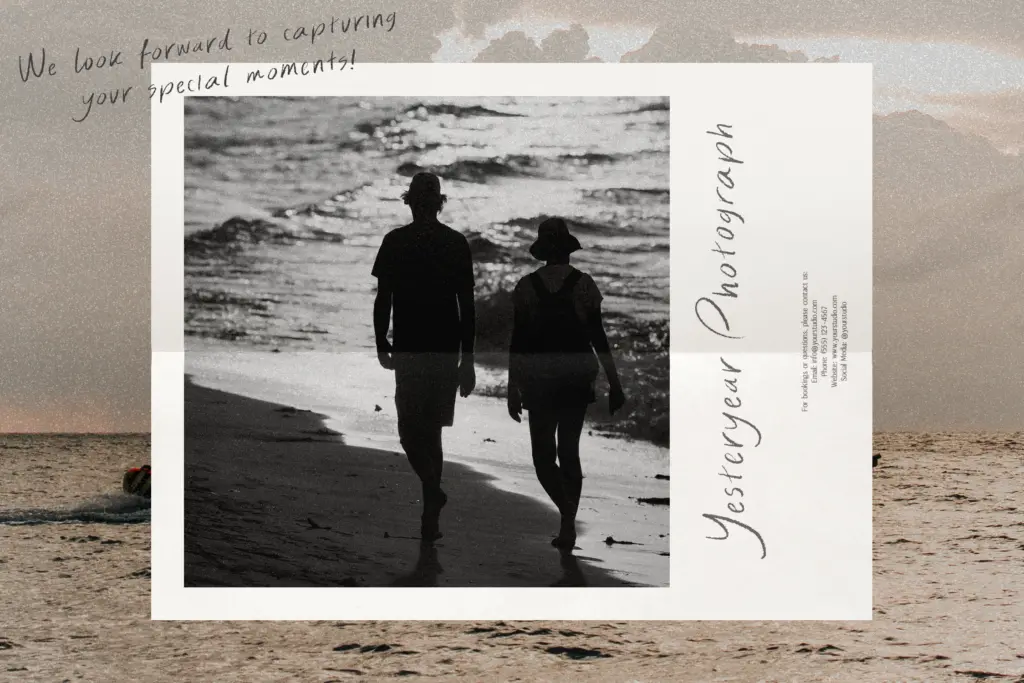
This is a font for projects that want warmth without slipping into twee. Wedding stationery, greeting cards, packaging for a small skincare or bakery brand, social graphics for a personal or lifestyle account — anywhere the brief calls for something that reads as handwritten rather than typed. The lighter weights work well for short passages of body text, invitation wording, or a signature-style sign-off; the bolder slanted style is better reserved for headlines and standalone words where its texture can register properly.
It’s not a font for dense paragraphs — pencil texture and irregular baselines fight legibility once you’re past a sentence or two — and it’s not a fit for anything that needs to feel corporate or precise. Keep it to the moments where the brief actually wants a human hand showing.
What we liked, and what we didn’t
Strengths
- Pencil texture is light enough to stay legible rather than decorative clutter
- Contextual alternates genuinely reduce repeated-letter monotony in headlines
- Six styles across three weights and matching slants give real flexibility for display use
Trade-offs
- Irregular baseline and texture make it unsuitable for anything beyond short passages
- Weight changes shift the font's character more than they build a clean size hierarchy
Blissful Radiance is a competent, restrained entry in the pencil-script category, more useful than most because it doesn't drown itself in texture. It won't carry paragraph text or corporate branding, but for cards, invitations and short lifestyle headlines it does exactly what it promises.

Tmfonts writes independent reviews of typefaces: what each font does well, where it falls short, what it suits, and where it is sold.