
Des Montilles Font Free Download
Is Des Montilles free to download?
Des Montilles is a commercial font sold on Creative Market, so the full version needs a paid license. Get it from the official listing: Des Montilles font download.
Need something free? These script fonts from Google Fonts are free for personal and commercial use:
Design style
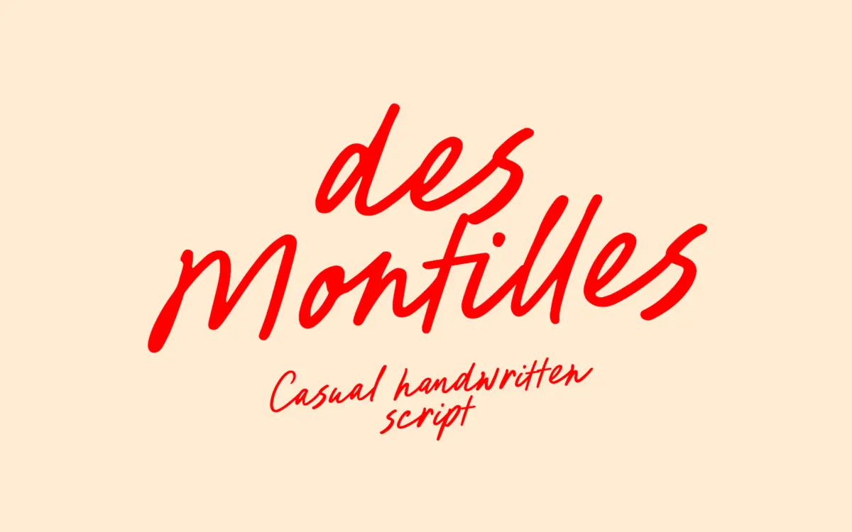
Des Montilles sits in the well-populated territory of casual handwritten script: a monoline-leaning build with slight pressure variation, loose baseline wobble, and a pen angle that stays consistent enough to feel like one hand wrote it in one sitting. It’s not a formal copperplate or a broad-nib calligraphic script — there’s no dramatic thick-thin contrast — but a everyday, notebook-margin kind of gesture. Letters lean forward slightly and connect through low, unfussy joins rather than tall swash bridges.
The heart connections mentioned in the seller’s notes are the most distinctive move here: certain letter pairs resolve into a small heart shape at the join, which reads as a deliberate wink toward the wedding-and-greeting-card market rather than a typographic accident. Beginning and end swashes on lowercase letters add some flourish at word edges without overloading the middle of a line, which is the right call for a script meant to be set in short runs of text.

Character set and features
The character set covers the standard alphabet and punctuation along with a broad range of accented Latin characters — enough diacritic coverage for most Western and Central European languages, which matters more than people expect once a script font gets used on stationery for an international client list. PUA encoding means those extra glyphs and ligatures are reachable without OpenType-aware software, a practical detail for anyone working in tools that don’t expose stylistic alternates cleanly.
The handwritten ligatures are the feature doing the most work. Scripts with true letter connection live or die on how well their ligatures cover common letter pairs, and here the joins look considered rather than mechanically generated — the heart-shaped connections in particular only show up where they don’t fight the surrounding letterforms. That said, there’s no visible layered or alternate-glyph system for swapping troublesome combinations manually; you get the ligature set as built, so heavy customisation of specific words will mean manual kerning rather than swapping in alternates.
Use cases
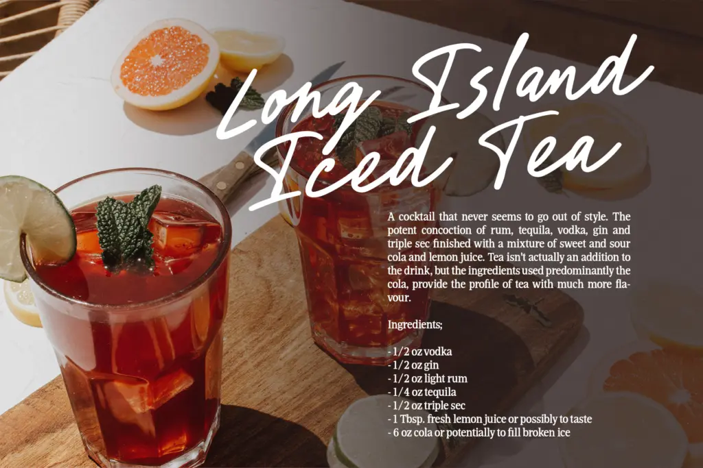
This is a font for short, decorative text rather than paragraphs: names on invitations, a signature-style logotype, a line on a greeting card, a watermark for a photographer’s portfolio. At small sizes the joins start to blur together, so anything meant to be read at a glance — a menu item, a caption, body copy of any length — will fight the script’s looseness. It wants generous point size and room to breathe.
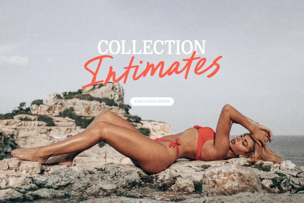
For branding work it reads best as an accent rather than a whole identity system — a signature mark paired against a plainer typeface for supporting text, since a script this casual rarely wants to carry logotype, tagline and body copy alone. Wedding stationery, apparel graphics, and social-media quote cards are the natural home; anything requiring dense-set text or strict legibility at small sizes is asking more of it than the design intends to give.
What we liked, and what we didn’t
Strengths
- Heart-shaped ligature connections feel purpose-built rather than decorative filler
- Broad multilingual diacritic support beyond the basics
- PUA encoding makes extra glyphs usable without OpenType-aware software
Trade-offs
- Joins blur together at small sizes, limiting it to short-text and display use
- No visible alternate-glyph system for manually resolving awkward letter pairs
Des Montilles is a competent casual script with one genuinely charming feature — its heart-shaped letter connections — aimed squarely at wedding and greeting-card work. It's not a font for dense text, but for short decorative lines and signature-style logos it does its job cleanly.

Tmfonts writes independent reviews of typefaces: what each font does well, where it falls short, what it suits, and where it is sold.