
iBrand Ligature Font Free Download
Is iBrand Ligature free to download?
iBrand Ligature is a commercial font sold on Creative Market, so the full version needs a paid license. Get it from the official listing: iBrand Ligature font download.
Need something free? These display fonts from Google Fonts are free for personal and commercial use:
Design style
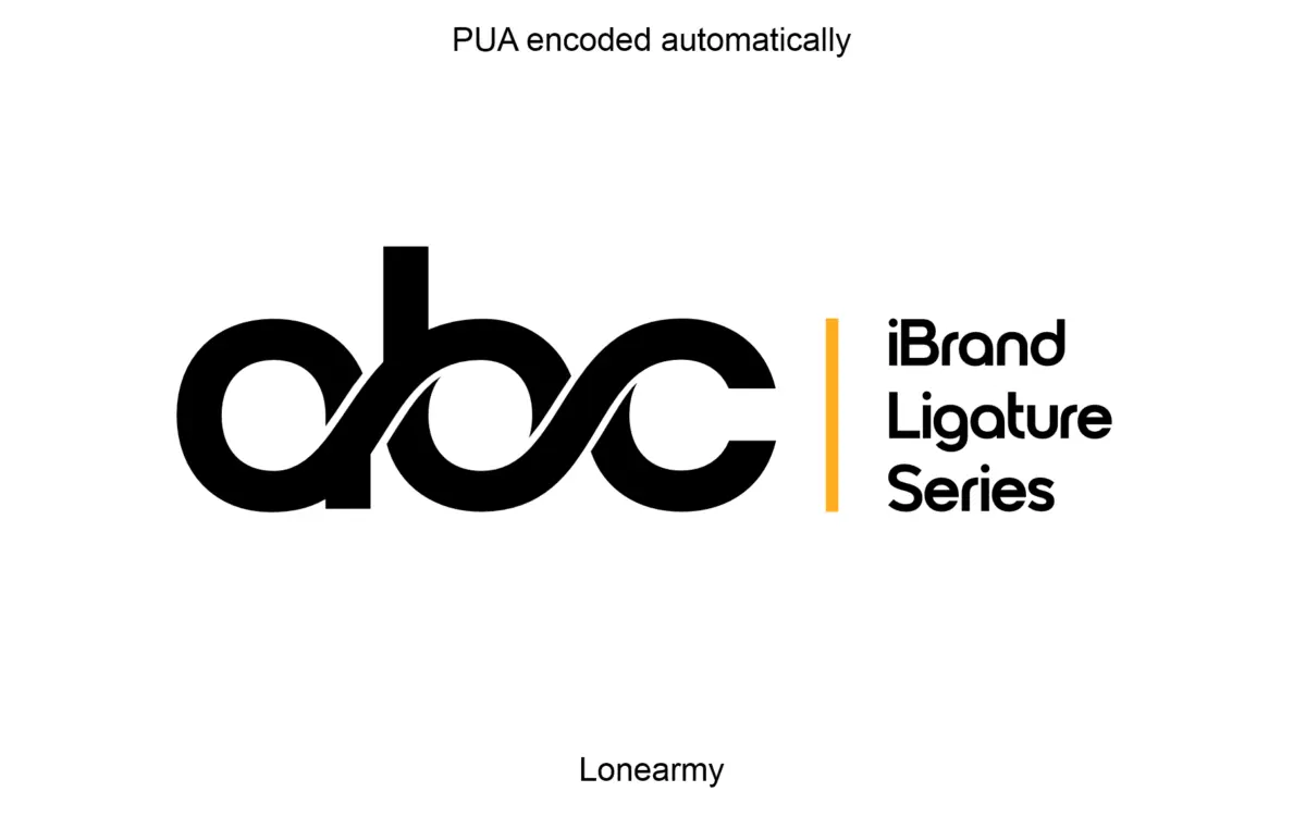
iBrand Ligature is built around a narrow idea: two or three letters locking together into a single mark. It reads as a monogram generator more than a text typeface, with strokes cut to interlock rather than sit side by side. The letterforms are geometric and even in weight, with terminals squared off cleanly so the joins don’t get muddy where strokes overlap. There’s no attempt at warmth or calligraphic flourish here — the drawing is deliberately mechanical, which suits its job. It won’t win points for personality on its own, but that’s not really the brief. The personality is meant to come from the specific combination of letters you choose to fuse.
Character set and features
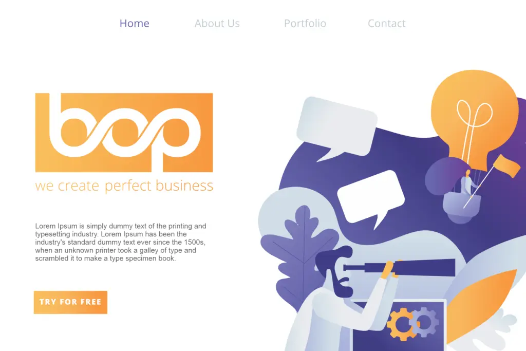
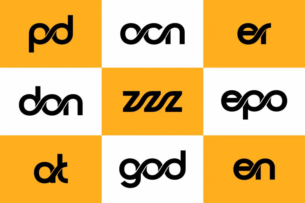
The ligature mechanism is the whole point of this font, and it’s built through OpenType substitution rather than a handful of fixed pairs. That means the letter combinations you get depend on which two (occasionally three) characters you type next to each other, with the software swapping in a fused glyph automatically. When it works, the result is a compact, symmetrical mark that looks intentional rather than accidental — the kind of thing you’d expect a designer to have hand-drawn for a specific client. When it doesn’t quite work, because a pairing wasn’t anticipated or the counters get too tight, you’re stuck fiddling with tracking or falling back to a plain two-letter lockup. Spacing and kerning are tuned tightly for this purpose, which is a plus for logo work and a liability anywhere else — the font is not meant to be read as a sentence, and it shows the moment you try. There’s no mention of extended language support or a companion text weight, so treat this as a single-purpose display tool rather than a full family.
Use cases
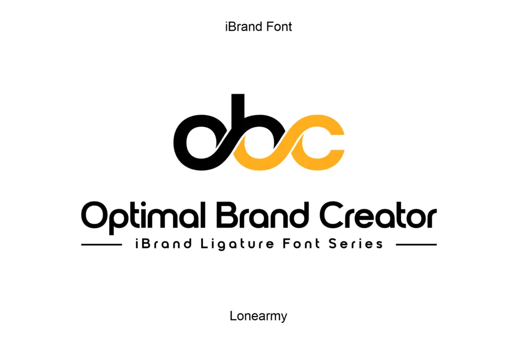
This is a font for the specific moment in a branding project where a client wants an initial-based icon: a monogram for a boutique, a favicon-style mark, a stamp on packaging, a wordless logo for a wedding or a personal brand. It’s also useful as a starting point for a hand-off icon that a designer will trace and clean up afterward, since it gets you most of the way to a locked, balanced form without redrawing from scratch. It is not a typeface for headlines, taglines, or anything longer than a couple of characters — the ligatures stop being useful the moment you’re setting words instead of initials, and the seller is upfront that it isn’t meant for body copy either. Buyers should go in expecting a narrow, single-purpose tool: excellent for generating a two-letter mark quickly, but you’ll still want to check the specific combination you need actually renders well, since not every letter pair will interlock cleanly. Budget time to test your initials before committing a brand identity to it.
What we liked, and what we didn’t
Strengths
- OpenType ligature substitution generates fused letter marks automatically rather than relying on a small fixed set
- Tight, deliberate kerning gives the monogram forms a finished, professional look
- Clean geometric strokes make the fused marks easy to reproduce at small icon sizes
Trade-offs
- Some letter pairings won't interlock as cleanly as others, so testing your specific initials is essential before committing
- Entirely unsuited to setting words or headlines, so it can't serve as a companion to the logo it creates
iBrand Ligature does one job — turning two initials into a locked monogram mark — and does it reasonably well when the letter pairing cooperates. It has no ambition beyond that job, which is honest but also limits who should buy it.

Tmfonts writes independent reviews of typefaces: what each font does well, where it falls short, what it suits, and where it is sold.