
Bazook Font Free Download
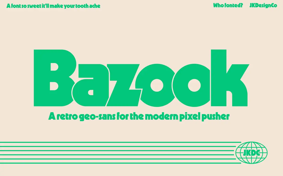
Is Bazook free to download?
Bazook is a commercial font sold on Creative Market, so the full version needs a paid license. Get it from the official listing: Bazook font download.
Need something free? These sans serif fonts from Google Fonts are free for personal and commercial use:
Design style
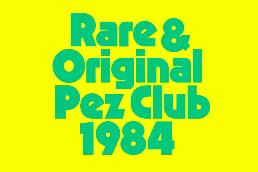
Bazook is a single-weight geometric sans built heavy and stays that way through every letter. The geometry is the point: circular bowls, near-perfect diagonals, and a general refusal to taper anything down. It sits in the lineage of bulky retro-geo faces from the Kabel and Geo 231 family tree, but pushed further into ultra-bold territory, where the counters shrink and the strokes start to dominate the shape.
What separates it from a generic bold geometric is the tension the designer builds between sharp and round. Some terminals cut at hard angles, giving letters like the A and K a slightly aggressive, technical edge, while the O and C stay bubbly and full, almost toylike. That contrast is what gives Bazook its 80s-cereal-box character rather than reading as a straight corporate sans. It’s a font with a clear mood rather than a neutral workhorse, and that mood is loud, blocky, and a little playful.
Character set and features
Bazook ships as a single Regular style, so there’s no light or black companion to lean on for hierarchy — what you see is what you get, and the whole point of the design is that it’s already maximal. The set includes diacritics and umlauts covering common Latin-script languages, which is a practical inclusion for a display font like this; a lot of retro-styled faces stop at basic English punctuation and leave European-language projects stranded.
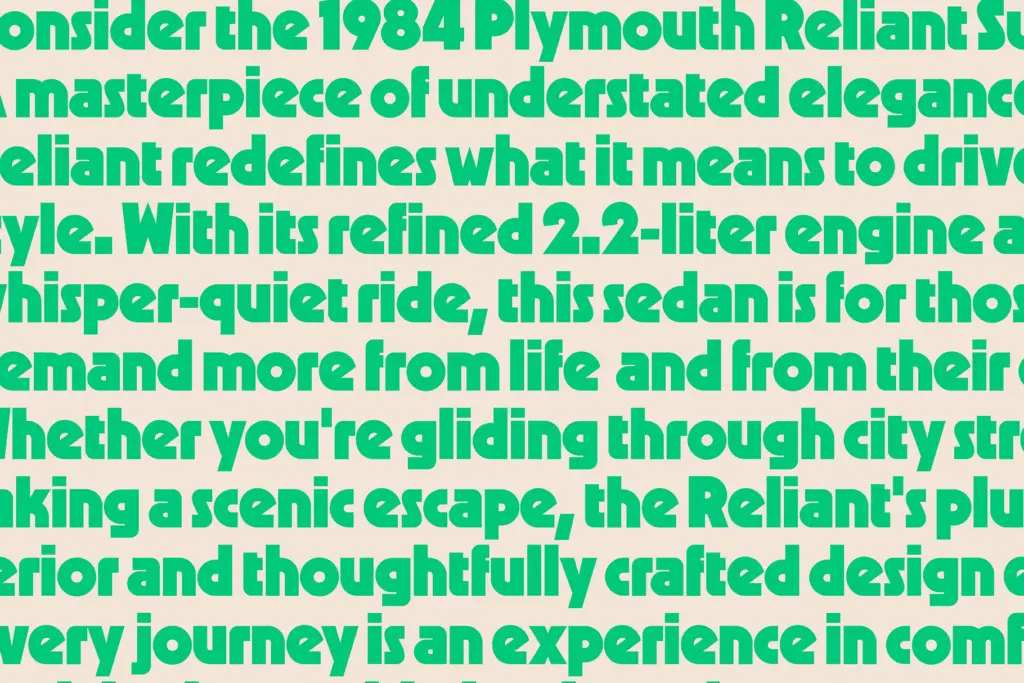
Because the letterforms are so heavy and geometric, legibility drops off quickly at small sizes. Counters close in, and tightly set lowercase text starts to look muddy rather than punchy. This isn’t a font that’s trying to be readable at body-copy sizes, though, so that’s less a flaw than a boundary you need to respect. At headline scale — large, short words, generous spacing — it holds its shape well and reads instantly, which is really the only test that matters for a face like this.
Use cases
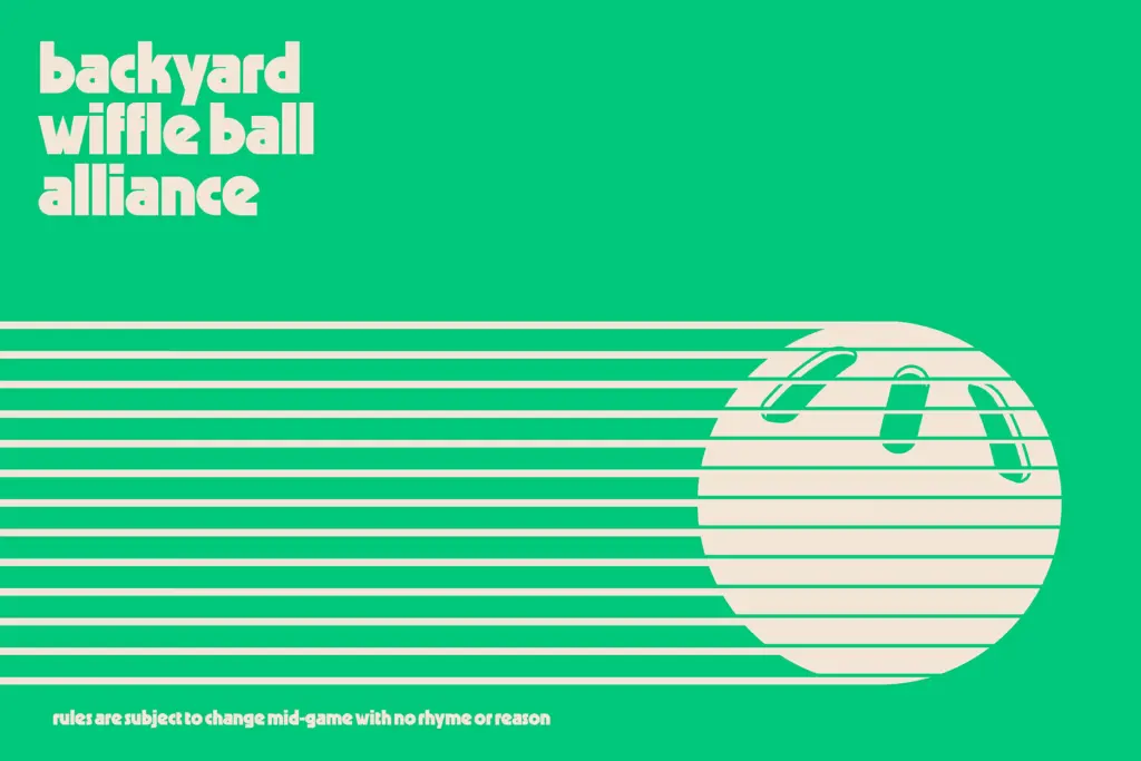
Bazook is built for short bursts of type: logotypes, packaging headers, poster titles, cassette-tape-style branding, anything that wants a nostalgic, slightly synthetic energy. It works well against bold flat colour, which is where the geometric shapes read cleanest — busy backgrounds or photography will fight it. Given the single weight, it’s best treated as an accent typeface rather than a full identity system; pair it with a plainer sans or slab for supporting text and let Bazook carry just the headline or wordmark.
It’s also a natural fit for retro packaging projects, band merchandise, or any brand refresh that wants a wink at 80s design without going full pastiche. Where it struggles is anywhere that needs restraint or a wide range of weights — annual reports, UI text, anything that needs to scale down to a caption. Keep it big, keep it short, and it does exactly what it’s built to do.
What we liked, and what we didn’t
Strengths
- Strong, consistent geometric character that reads instantly at headline size
- Diacritic support across several European languages, unusual for a display-only font
- Distinct retro mood that avoids feeling like a generic bold sans
Trade-offs
- Single weight limits its use to accent and headline roles rather than full systems
- Counters close up fast at small sizes, so it's unusable for body text
Bazook is a confident, single-minded display font that nails a specific 80s-geometric mood without trying to be anything else. It's not going to carry a full brand system on its own, but for headlines, logos, and packaging it delivers exactly the chunky, nostalgic punch it promises.

Tmfonts writes independent reviews of typefaces: what each font does well, where it falls short, what it suits, and where it is sold.