
Sanremo Vintage Font Duo Free Download
Is Sanremo Vintage Font Duo free to download?
Sanremo Vintage Font Duo is a commercial font sold on Creative Market, so the full version needs a paid license. Get it from the official listing: Sanremo Vintage Font Duo download.
Need something free? These handwritten fonts from Google Fonts are free for personal and commercial use:
Design style
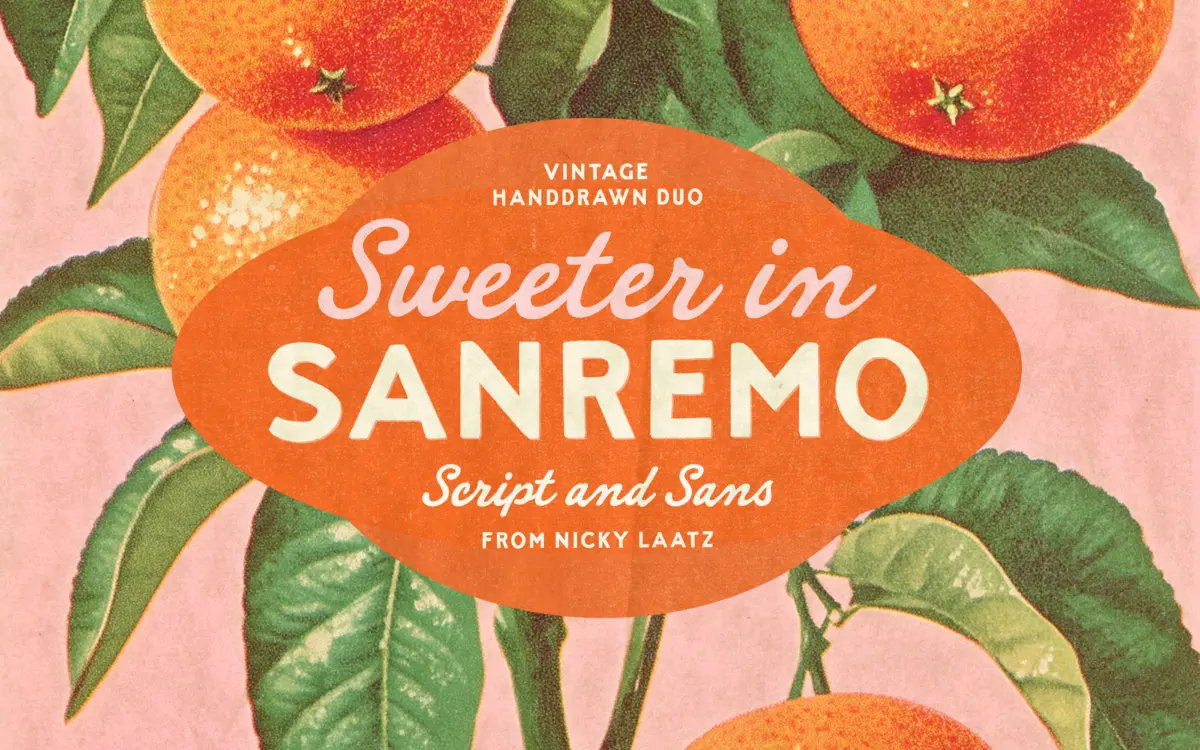
Sanremo is built around the look of hand-painted matchbook covers and old seaside signage rather than any single decade’s official typeface fashion. The sans serif half is all caps, drawn with the kind of wobble you get from a brush that’s been loaded a little unevenly — strokes thicken and thin without a strict pattern, and the letterforms sit slightly off their baseline in a way that reads as confident rather than sloppy. It’s a display face first: bold, condensed enough to pack into a label, and clearly meant to be seen at a distance.
The script partner is looser and lighter, with a genuine handwritten slant rather than a calligraphic one. Letters connect unevenly, some joins are tight and others barely touch, which is exactly what gives it the cheerful, dashed-off character the pairing is going for. It won’t suit anyone after a polished, formal script — this one is meant to look like it was written quickly with a decent brush pen, imperfections included.
Character set and features
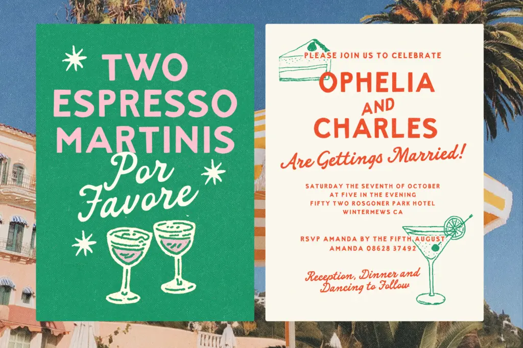
As a duo, the two styles are drawn to sit together rather than to work interchangeably — the caps carry the weight and structure, the script adds informal accents, taglines, or a signature-style flourish underneath. That division of labour is the whole point of buying them as a pair rather than a single face. The rough, hand-drawn edges are consistent enough across the alphabet that mixing cases and words doesn’t create jarring inconsistencies, which is the main risk with any typeface built to look imperfect on purpose.
Ligatures and alternate connecting forms in the script help break up repeated letter combinations, which matters more here than in a cleaner script because Sanremo’s charm depends on variation — repeat the same joined pair too often and the handmade illusion cracks. Both styles are intentionally rough at the edges, so anyone expecting crisp vector precision at small sizes should look elsewhere; this is a face designed to be seen big, not read in a paragraph.
Use cases
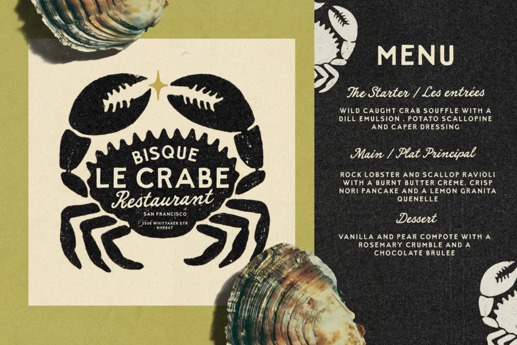
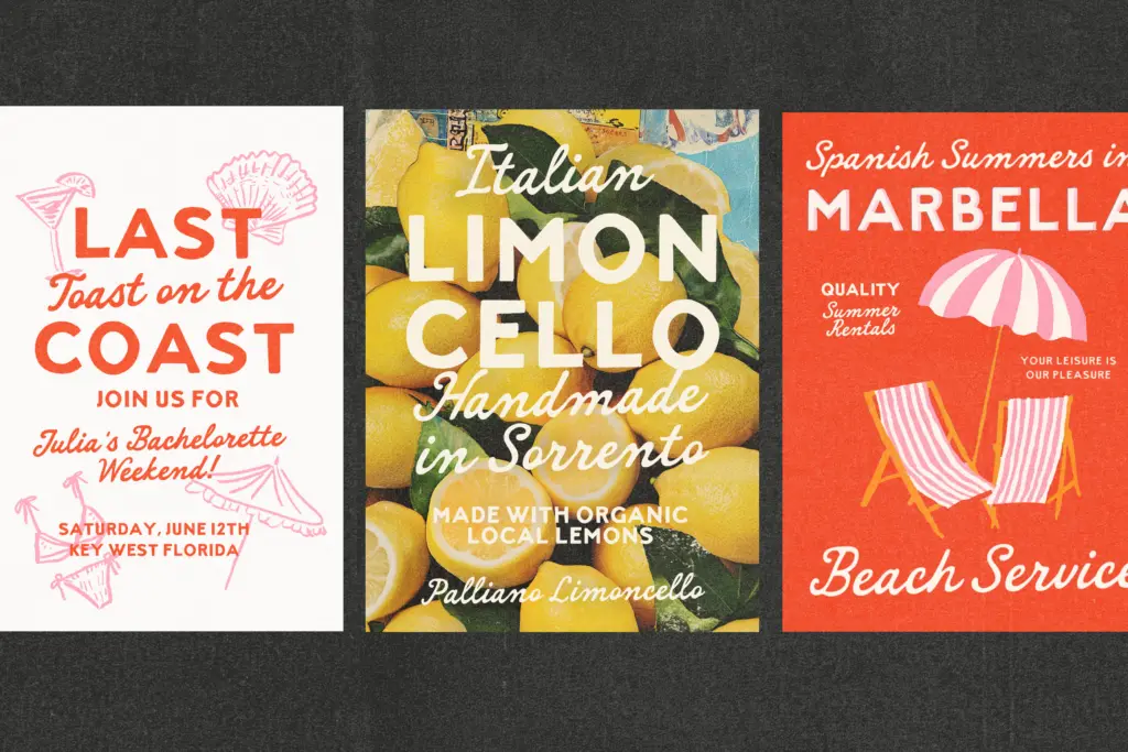
This duo does its best work anywhere a brand wants to look hand-lettered and a bit worn-in on purpose: drink menus, product labels, market stall signage, packaging for small-batch goods, and travel or coastal-themed branding where a slightly weathered, mid-century feel is the goal. The bold caps are strong enough to anchor a logotype or a matchbook-style badge, and the script slots in underneath as a supporting line — a tagline, a place name, a short flourish.
It’s less suited to body copy, long-form editorial layouts, or anything that needs to read as neutral or contemporary. The deliberate roughness that makes it charming on a label becomes a liability in dense text, where the eye needs consistency more than character. Treat Sanremo as a display and accent pairing, not a workhorse text system, and it earns its keep on packaging, invitations, and playful branding projects that want a bit of retro grit rather than a clean modern finish.
What we liked, and what we didn’t
Strengths
- The bold caps have real presence and read well on packaging and badges at a distance.
- Script and sans are drawn to complement each other, so the pairing feels considered rather than bundled.
- Alternate script forms help avoid repetitive-looking letter joins across a design.
Trade-offs
- The deliberate roughness limits legibility at small sizes or in longer text.
- Its retro, hand-painted character is narrow enough that it won't suit clean or contemporary branding.
Sanremo is a solid pick for anyone chasing a mid-century, hand-painted look for labels and signage rather than a general-purpose typeface. The rough caps and loose script pair convincingly, but the charm is purpose-built and doesn't stretch to body text or neutral branding.

Tmfonts writes independent reviews of typefaces: what each font does well, where it falls short, what it suits, and where it is sold.