
JA Jayagiri Font Free Download
Is JA Jayagiri free to download?
JA Jayagiri is a commercial font sold on Creative Market, so the full version needs a paid license. Get it from the official listing: JA Jayagiri font download.
Need something free? These display fonts from Google Fonts are free for personal and commercial use:
Design style
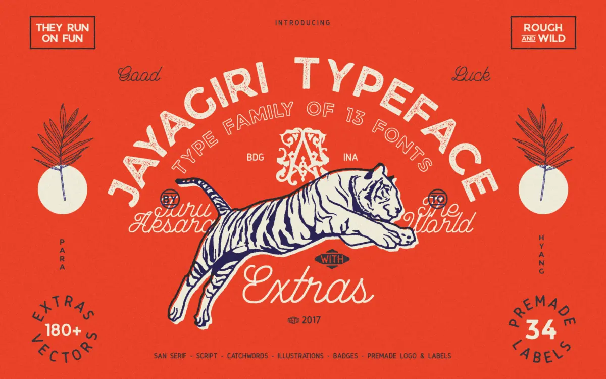
JA Jayagiri is a brush-driven display face built around uneven, hand-cut strokes. Letters lean and wobble deliberately, edges are chipped rather than smoothed, and the baseline shifts letter to letter rather than sitting flat. It reads as a signwriter’s marker pushed fast across rough paper, not a polished script. The name references a mountain, and the letterforms carry that in a loose, weathered way — nothing about this face is trying to look controlled.
The weight is heavy and consistent throughout, with thick, ink-trap-like joins where strokes meet. There’s no attempt at fine contrast; this is a face built for impact at a glance rather than for sustained reading. Spacing is tight and irregular by design, which reinforces the handmade feel but means the letterforms sometimes crowd each other, especially around rounded shapes like o, e and s.
Character set and features
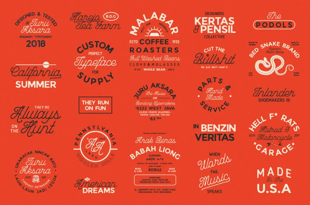
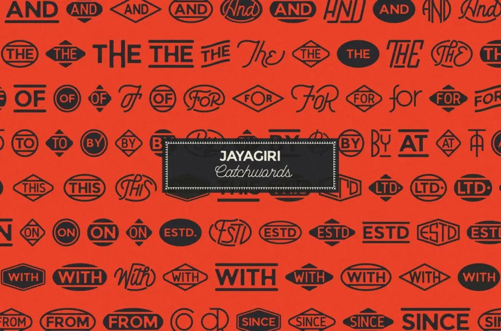
The ‘Extras’ bundle suggests the family ships with supplementary glyphs — likely alternates, ligatures, or ornamental marks alongside the base uppercase and lowercase set, though the brief doesn’t specify exact counts or language coverage. Designers should check the character map before committing to a project that needs full punctuation or extended accents, since rough-hewn display faces like this one often prioritise a strong core alphabet over exhaustive glyph support.
Because the letterforms are irregular by construction, any alternates included are valuable — they let you break up repeated letters in a word so the roughness doesn’t read as mechanical repetition. If the font includes swashes or texture variants, use them sparingly; stacking too many rough elements in one composition can tip from

Tmfonts writes independent reviews of typefaces: what each font does well, where it falls short, what it suits, and where it is sold.