
Kindred Font Free Download
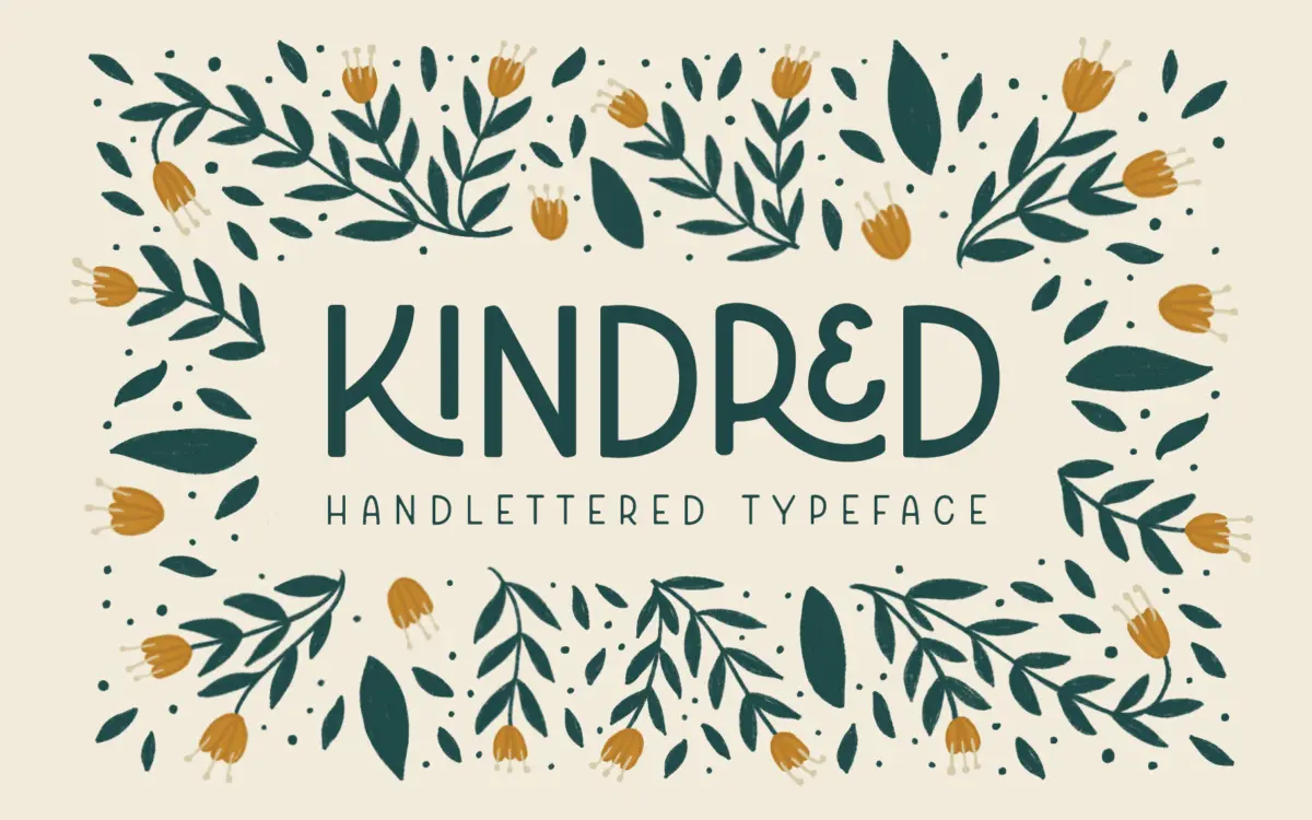
Is Kindred free to download?
Kindred is a commercial font sold on Creative Market, so the full version needs a paid license. Get it from the official listing: Kindred font download.
Need something free? These sans serif fonts from Google Fonts are free for personal and commercial use:
Design style
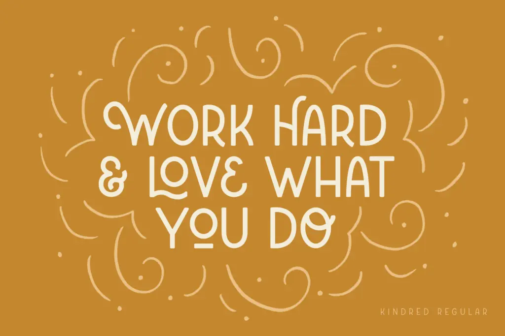
Kindred sits in an odd spot between sans serif and hand lettering, and it knows it. The base skeleton is a simple geometric sans — even stroke weight, rounded corners, no contrast to speak of — but the letters are drawn to interlock and overlap the way hand-lettered signage does, with swashes bridging the gaps between characters. The rounded corners do a lot of the work here: they soften what would otherwise be a fairly plain grotesque and give it the friendly, slightly bouncy feel the seller is going for. It reads as approachable rather than technical, which is clearly the point.
Because it’s uppercase-only, Kindred lives or dies on how well those capitals vary in width and rhythm, and this is where the ligatures and alternates earn their keep — without them, a run of all-caps sans letters this simple would look flat and repetitive fast. With them switched on, adjacent letters nest into each other and the word takes on a built, custom-lettered look rather than a typed one. It’s a font that needs its OpenType features doing their job; turned off, it’s a much less interesting typeface.
Character set and features
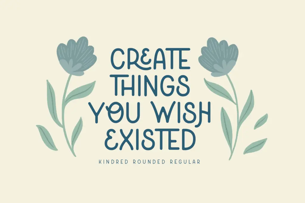
The package is generous: 281 glyphs across six styles — Light, Regular, Bold, and rounded versions of each — plus 34 standard ligatures enabled by default and more than 90 stylistic alternates. That’s a real toolkit, not a token gesture toward customisation. The ligatures handle common double letters and awkward pairings so words don’t just sit side by side but visually connect, and the alternates let you swap in a flourish or a different letter shape where the composition calls for it. Language support covers several Western European languages, which matters less for the swash-heavy display use this font is built for but is a reasonable inclusion.
The catch is that this much flexibility asks something of the user. Getting a word to look
What we liked, and what we didn’t
Strengths
- Ligatures and alternates give real word-by-word customisation rather than a fixed look
- Rounded corners and interlocking swashes create a convincing hand-lettered feel at logo scale
- Six weights across straight and rounded versions offer usable range within one family
Trade-offs
- Uppercase-only construction rules out body copy or anything needing sentence case
- Getting good results depends on manually selecting alternates rather than trusting the defaults
Kindred is a well-built display tool for anyone who wants a hand-lettered logotype look without hand-lettering it. The ligature and alternate system is genuinely deep, but that depth means it needs a hands-on user rather than a set-and-forget one. It's not for body text or anything requiring lowercase, and it shouldn't be asked to do that job.

Tmfonts writes independent reviews of typefaces: what each font does well, where it falls short, what it suits, and where it is sold.