
Roie Font Free Download
Is Roie free to download?
Roie is a commercial font sold on Creative Market, so the full version needs a paid license. Get it from the official listing: Roie font download.
Need something free? These sans serif fonts from Google Fonts are free for personal and commercial use:
Design style
Roie belongs to the crowded family of geometric sans faces designed with a single job in mind: sitting inside a logo lockup at large size. The letterforms are pared back to near-generic shapes — circular bowls, even stroke weight, minimal contrast — with the kind of restraint that reads as neutral rather than expressive. There’s no obvious quirk or signature detail that would make it recognisable in a lineup of similar minimal sans faces, and that’s clearly by design. It’s built to disappear behind whatever brand it’s dressed up as, not to carry a personality of its own.
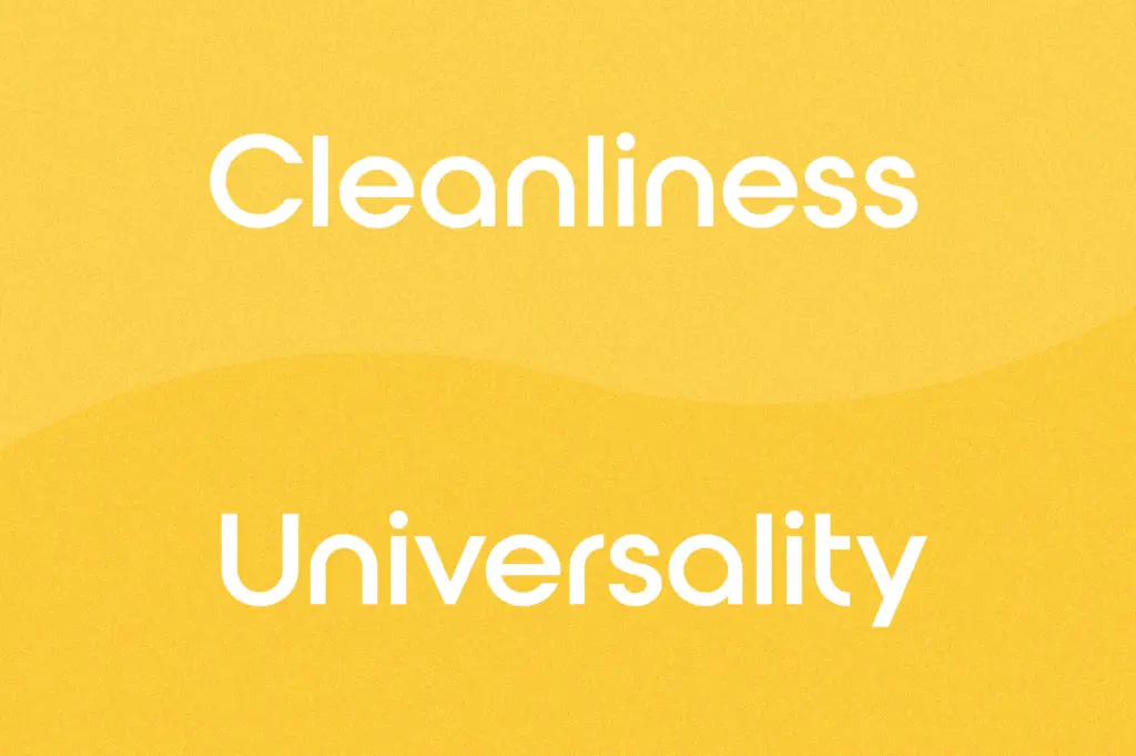
The spacing is even and the proportions are close to monolinear, which gives it a calm, settled rhythm at display sizes. Curves are kept simple, terminals are cut straight rather than rounded or angled, and there’s no attempt at flair in the joins. This is a font that wants to be quiet.
Character set and features
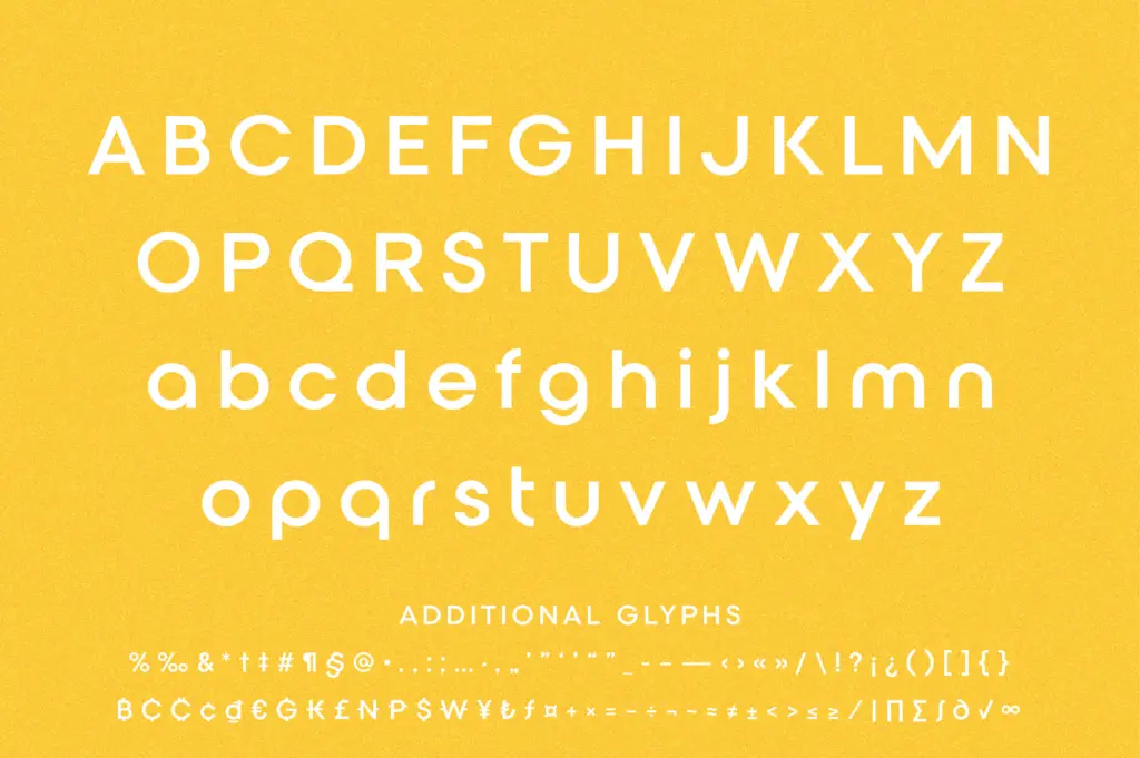
The seller notes broad language coverage across Latin, Cyrillic, Greek and Vietnamese, which is a genuinely useful spread if you’re building a wordmark for a business operating across those alphabets — most logo-focused sans releases stop at Latin and maybe basic Cyrillic. Beyond that language reach, the character design itself is explicitly not intended for body text or long-form setting. The letterforms are drawn for short strings — a company name, a single word, a monogram — rather than for paragraphs, and it shows: the spacing and proportions are tuned for isolated words at large sizes, not for reading rhythm across a page.
There’s nothing here in the way of ligatures, alternates or stylistic sets to speak of; this isn’t a font family with a deep OpenType feature set to explore. What you get is a clean, consistent set of glyphs across several scripts, built for one purpose.
Use cases
Roie is aimed squarely at logotypes and short brand marks — the name is literally in the product title. It will do fine work as a standalone wordmark for a startup, a corporate identity, or a minimal product brand that wants to signal simplicity and confidence without much visual noise. Because of the multi-script support, it’s also a sensible pick for brands that need the same mark to read consistently in Cyrillic or Greek markets without commissioning a separate custom lockup.
Where it will struggle is anywhere text needs to do more than sit in a lockup: subheads, UI labels, packaging copy, or anything set at body size. The letterforms simply aren’t built with that job in mind, and pairing this with a more expressive display companion, or a proper text-optimised sans for the surrounding copy, will get better results than trying to stretch Roie across an entire brand system. Treat it as a logo typeface in the literal sense — draw the mark, lock it, and move to another typeface for everything else.
What we liked, and what we didn’t
Strengths
- Broad script coverage across Latin, Cyrillic, Greek and Vietnamese suits international branding work
- Even, calm rhythm that reads clearly at large logo sizes
- Simple geometric construction keeps it neutral enough to sit behind most brand concepts
Trade-offs
- Letterforms lack a distinguishing detail, so it can blend into a crowd of similar minimal sans logotype fonts
- Not built for body text or long strings, so it needs a second typeface for anything beyond the mark itself
Roie does one job — sitting inside a short logotype — competently but without much personality of its own. The multi-script coverage is a genuine plus for international branding work, but the font offers little beyond its stated purpose and shouldn't be asked to do more.

Tmfonts writes independent reviews of typefaces: what each font does well, where it falls short, what it suits, and where it is sold.