
The Very Vogue Serif Family Free Download
Is The Very Vogue Serif Family free to download?
The Very Vogue Serif Family is a commercial font sold on Creative Market, so the full version needs a paid license. Get it from the official listing: The Very Vogue Serif Family download.
Need something free? These serif fonts from Google Fonts are free for personal and commercial use:
Design style
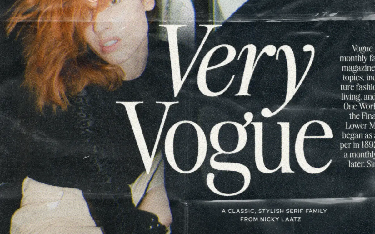
The Very Vogue Serif Family draws on the fashion-magazine mastheads of the 1980s and 90s, the kind of high-contrast didone lettering that used to sit above cover lines and perfume ads. The core of the design is a display serif with sharp thick-thin contrast, fine hairline serifs, and a vertical, almost brittle stress that reads as expensive rather than warm. It’s the kind of letter that wants space around it and a headline’s worth of size to justify its detail.
What separates this from a one-off display face is the split into Display and Text sub-families, each tuned for its own optical range. Display carries the higher contrast and tighter spacing that make sense at large sizes, where hairlines stay crisp and letters can sit close without clogging. Text backs off the contrast, adds a touch more weight, and opens the letterspacing, which is exactly the adjustment a didone needs once you shrink it down to paragraph sizes. It’s a sensible bit of type engineering rather than a gimmick, and it means the family doesn’t force you to choose between a beautiful headline and a readable paragraph.
Character set and features
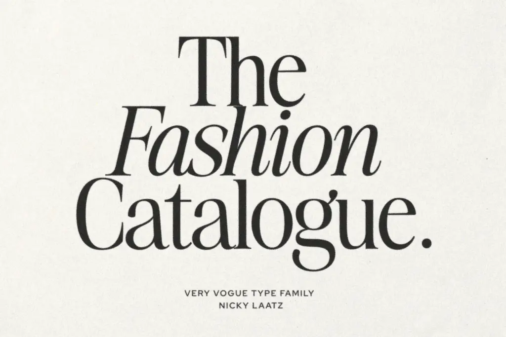
The family includes an italic alongside the upright styles, giving it the elegant-italic-font register that magazine work tends to lean on for pull quotes and bylines. The seller also references a heavier subfamily alongside the standard weights, so there’s a bolder option for covers and standout headlines without leaving the family’s visual language. Given its display-serif roots, expect the character set to be geared toward Latin-based editorial and branding use rather than an extensive glyph set for setting long-form multilingual text — treat it as a styling tool, not a workhorse text face for dense paragraphs in every language.
The real feature here is structural: two optical sizes built into one family. That’s a more useful piece of engineering than a pile of stylistic alternates, because it solves the actual problem high-contrast serifs run into — they look glamorous at 72pt and fall apart at 10pt. Having a dedicated Text cut means you’re not stuck applying manual tracking tricks to make the Display cut behave at smaller sizes, though the seller’s own tip about adjusting letterspacing by size is worth following regardless.
Use cases
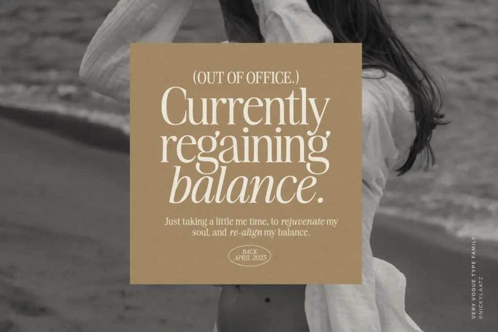
This is a font for editorial and fashion-adjacent branding: magazine covers, mastheads, beauty and lifestyle logotypes, invitation suites that want a retro, moneyed feel. The Display cut is suited to headlines, cover lines, and short-impact lettering — logos, packaging, title cards — where its tight spacing and contrast can be shown off at scale. The Text cut is the one to reach for on captions, pull quotes, and shorter body passages where you still want the family’s character but need it to hold together at reading size. It’s less suited to dense, long-form body copy or interfaces, where the contrast will eventually fight legibility no matter which cut you use. Pair it with restraint: this typeface is doing the loud work already, so layouts around it benefit from plain backgrounds and generous margins.

What we liked, and what we didn’t
Strengths
- Two optical sizes are properly engineered, not just scaled versions of each other
- High-contrast display cut has real presence for covers and logotypes
- Text cut is thoughtfully adjusted with looser spacing and softened contrast for smaller sizes
Trade-offs
- High contrast means it strains at very small sizes or dense paragraphs regardless of cut
- Character set and language support seem oriented to editorial Latin use rather than broad multilingual text
The Very Vogue Serif Family nails a specific mood — glossy 80s magazine glamour — and backs it up with a genuinely useful Display/Text split rather than just a single show-off cut. It's not built for long body copy or broad language support, but for covers, mastheads, and fashion branding it does exactly the job it was drawn for.

Tmfonts writes independent reviews of typefaces: what each font does well, where it falls short, what it suits, and where it is sold.