
Lovely Stories Stylish Pretty Script Font Free Download
Is Lovely Stories Stylish Pretty Script free to download?
Lovely Stories Stylish Pretty Script is a commercial font sold on Creative Market, so the full version needs a paid license. Get it from the official listing: Lovely Stories Stylish Pretty Script font download.
Need something free? These script fonts from Google Fonts are free for personal and commercial use:
Design style
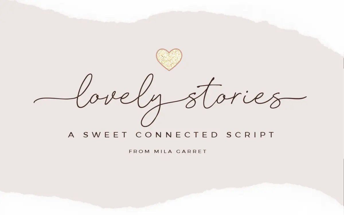
Lovely Stories sits squarely in the casual-handwritten script camp that has become the default look for wedding stationery and small-batch branding. The base letters lean rather than slant sharply, with a moderate forward tilt and a loose, slightly wobbly baseline that reads as pen-written rather than ruler-drawn. Strokes are monoline-ish with only mild contrast, which keeps the texture even rather than calligraphic. Where the font distinguishes itself is in its swash inventory: beginning and ending flourishes on the lowercase, uppercase entry swashes, and a set of connector forms that link separate words into a single continuous line. That connector idea is the most interesting design decision here, and it is also the riskiest one, since it depends entirely on the user finding and applying the right glyphs.
Character set and features
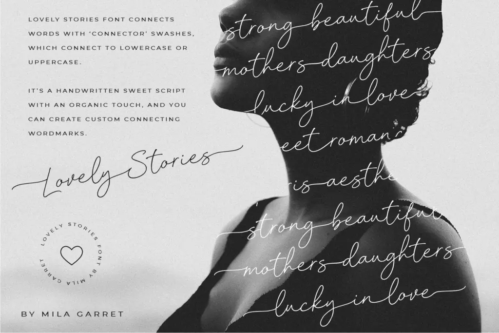
Underneath the swash system is a full standard alphabet with punctuation, so the font works without any of the extras if you just want a plain, gently informal script. Layered on top are the beginning-swash lowercase, ending-swash lowercase, and connector sets, all PUA-encoded so they are reachable by typing specific characters rather than hunting through a glyph panel in an OpenType-aware app. That is a genuine convenience for anyone working in a program without stylistic-set support, but it also means the font behaves less like a self-adjusting script and more like a kit of parts that the user assembles by hand. Get the substitutions wrong and words either look flat or collide awkwardly, since connector strokes are drawn to meet specific letterforms. Multilingual accented characters are included, covering the major Western European diacritics, which extends the font’s reach beyond English-only branding. There’s no mention of numerals or extended punctuation sets beyond the basics, so treat those as unverified rather than absent.
Use cases
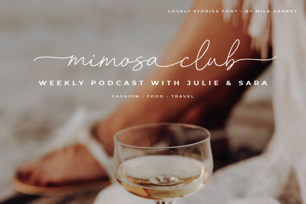
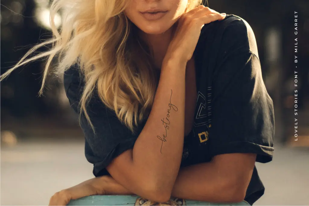
This is a font for short, decorative lines rather than paragraphs: a bride and groom’s names on an invitation, a logotype for a boutique or bakery, a headline on a social graphic, a label on packaging. The connector feature is built for exactly this kind of short phrase, where two or three words joined into one flowing mark can stand in for a hand-lettered logo. At body-text sizes or in long-form settings, the looseness of the baseline and the swash collisions become fatiguing rather than charming, so it’s not a font to set a paragraph in. Designers comfortable manually swapping PUA characters, or willing to test combinations before finalizing a layout, will get the most out of it; those expecting automatic contextual alternates that just work in any app may find the manual substitution step more fiddly than advertised. As a wedding and lifestyle-branding script, it does a competent job of hitting the current market’s expectations without pushing much past them.
What we liked, and what we didn’t
Strengths
- The connector swashes let short phrases read as a single continuous flourish, useful for logotypes.
- PUA encoding means the swash and connector glyphs are reachable without OpenType-aware software.
- Multilingual accented characters extend it beyond English-only branding work.
Trade-offs
- Getting good results depends on manually finding and applying the correct swash or connector glyph for each letter pair.
- The loose baseline and even stroke weight make it tire the eye quickly at anything beyond a short line.
Lovely Stories is a competent casual wedding script whose connector-swash system is its main selling point and its main source of friction. It looks good in short, hand-assembled phrases but needs manual glyph substitution to shine, and it isn't built for anything longer than a few words.

Tmfonts writes independent reviews of typefaces: what each font does well, where it falls short, what it suits, and where it is sold.