
Velour Font Free Download
Is Velour free to download?
Velour is a commercial font sold on Creative Market, so the full version needs a paid license. Get it from the official listing: Velour font download.
Need something free? These serif fonts from Google Fonts are free for personal and commercial use:
Design style
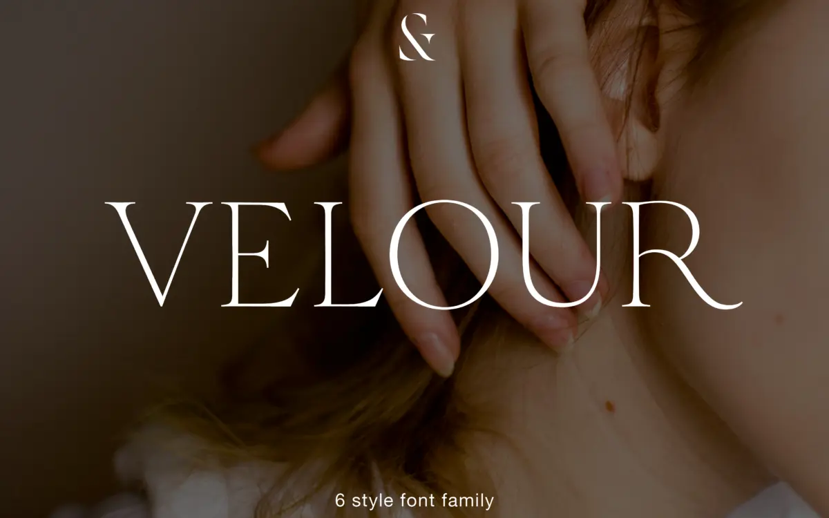
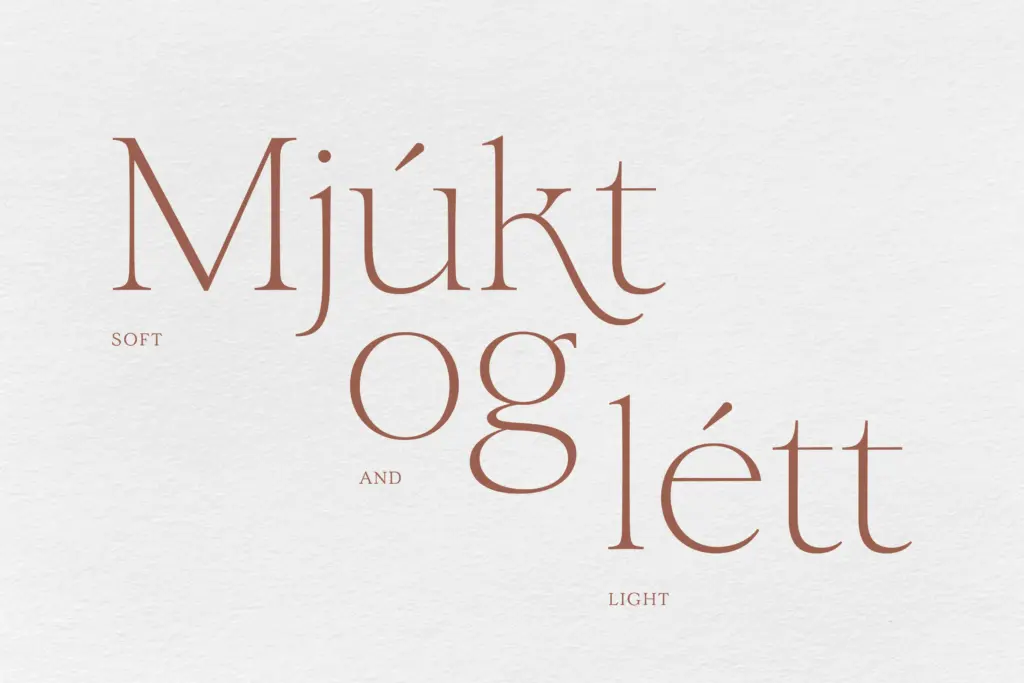
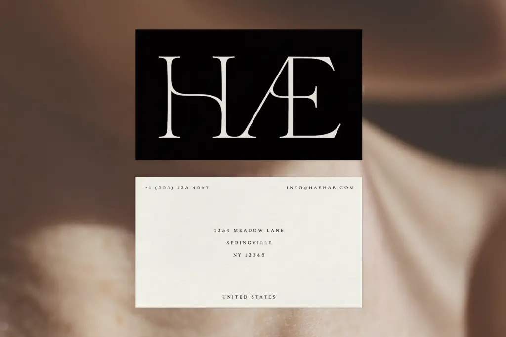
Velour sits in that editorial-serif territory where thin, bracketed serifs and high stroke contrast do the talking. What separates it from the crowd of similarly pitched display serifs is a set of small structural decisions: the crossbar on the ‘A’ and ‘H’ curves rather than sitting flat, giving both letters a slight bow that softens their usual rigidity. The ‘K’ and ‘R’ carry long, extended legs that swing out with some confidence — a gesture that reads as considered rather than showy, at least at the sizes this typeface is built for. There’s a romantic quality to the overall texture, but it’s restrained romance, not ornament for its own sake. Six weights, Thin through Bold, give the family a reasonably wide dynamic range, though the design logic clearly favours the lighter end, where the bracketed serifs and contrast have room to breathe.
Character set and features
The feature set is where Velour earns its editorial billing. There’s an automatic alternate ‘k’ that swaps in contextually, which keeps the more elaborate default form from crowding tight-set copy — a practical touch for anyone who wants the flourish without babysitting it letter by letter. Two ampersands are included, useful for anyone building a wordmark or a masthead where the ampersand carries visual weight. Alternates with simpler letterforms are also on offer, letting you dial the personality up or down depending on whether the job calls for a display headline or something closer to a subhead. Both standard and old-style numerals are present, which matters more than it sounds: old-style figures sit better inline with lowercase text, while standard figures hold their own in tables or captions. Language support extends across Western, Central and South Eastern European character sets, which covers most editorial and branding work without requiring a fallback font.

Use cases
This is a display face first, and it should be treated that way. The thin weights, in particular, are not built for body copy — the contrast that gives them their character will thin out and disappear at small sizes, especially on screen. Where Velour earns its keep is in mastheads, magazine headlines, fashion and beauty branding, invitation suites, and any wordmark that wants a literary or slightly old-world tone without tipping into pastiche. The bolder weights hold up better at smaller sizes and could function as subheadings or pull quotes alongside a plainer text face. The alternate characters and dual ampersands make it a reasonable choice for logotype work, where a handful of glyphs get scaled up and scrutinised. Anyone setting long-form text will need a separate workhorse serif for the paragraphs; Velour’s job is the moment before the reader commits to reading.
What we liked, and what we didn’t
Strengths
- Contextual alternate 'k' swaps in automatically, keeping dense settings from feeling overworked
- Two ampersands and simplified alternates give real flexibility for logotype and headline work
- Old-style and standard numerals both included, useful across editorial and tabular contexts
Trade-offs
- Thin weights lose legibility fast below display sizes, especially on screen
- Best suited to headlines and short text — needs a separate face for body copy
Velour is a capable editorial display serif with a few genuinely thoughtful details, particularly the contextual alternate 'k' and the curved crossbars on 'A' and 'H'. It's not a body-text face and the thin weights need careful handling, but for mastheads, wordmarks and invitation work it has real character.

Tmfonts writes independent reviews of typefaces: what each font does well, where it falls short, what it suits, and where it is sold.