
Hello Branch Font Free Download
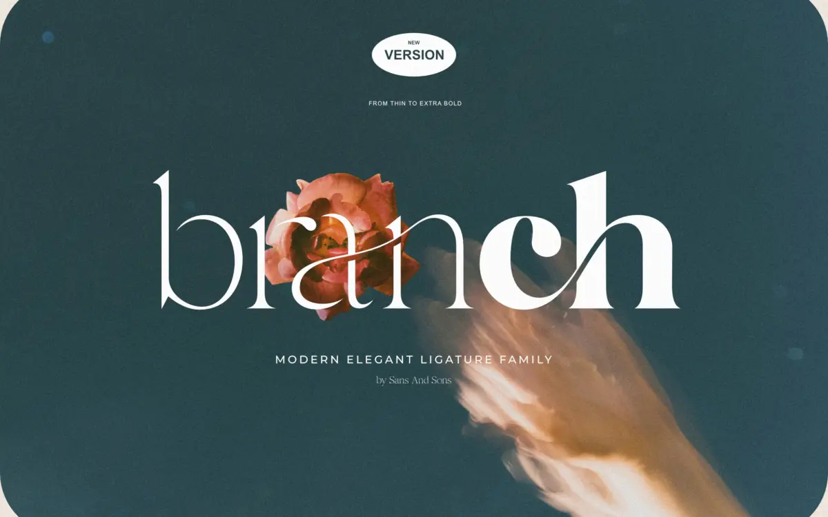
Is Hello Branch free to download?
Hello Branch is a commercial font sold on Creative Market, so the full version needs a paid license. Get it from the official listing: Hello Branch font download.
Need something free? These serif fonts from Google Fonts are free for personal and commercial use:
Design style
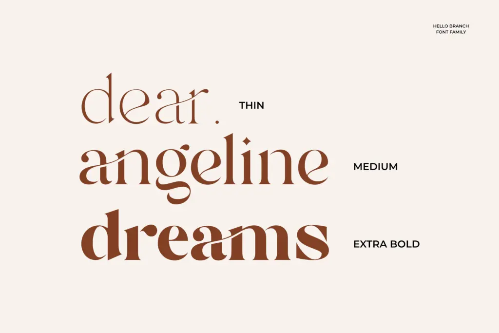
Hello Branch sits in the soft-contrast serif territory that’s become a staple of branding kits over the past few years: moderate stroke modulation, rounded bracketing, and terminals that taper rather than snap off sharply. It reads as a serif designed to feel approachable rather than authoritative. There’s nothing severe in the skeleton — no sharp spurs, no high-contrast Didone drama — which is consistent with the seller’s framing of it as a bridge between minimalism and classic elegance. That’s a real design position, even if it’s a crowded one. The letterforms don’t take risks, but they’re evenly drawn, and the curve quality holds up across the weight range, which is the harder thing to get right in an 8-cut family.
The eight weights, Thin through Extra Bold, are the main structural achievement here. Building a serif family that stays legible and proportionally consistent at both ends of that spectrum takes real optical compensation — thin weights need wider counters and lighter serifs relative to the stem, and the extremes have to be redrawn, not just interpolated blindly. Whether Sans & Sons did full optical correction at each weight or leaned on interpolation is hard to say without a specimen in hand, but the family holds together reasonably well at a glance.
Character set and features
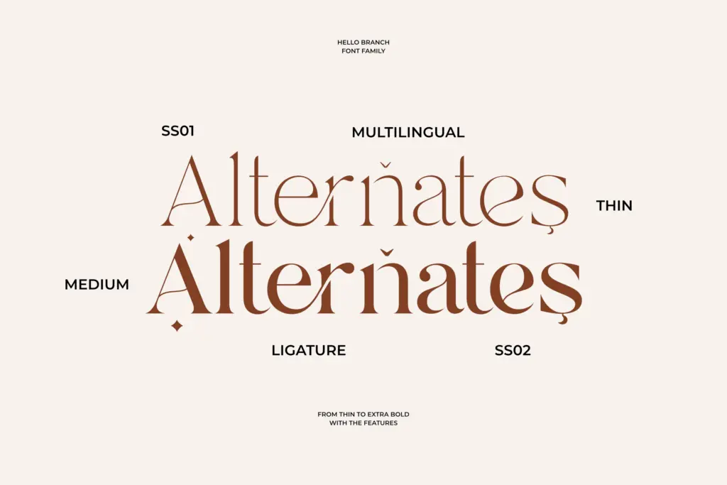
The package includes alternates and ligatures aimed at letting certain letter pairs connect more naturally, which is a common addition to serif families marketed toward branding and stationery use. PUA encoding means those extras are reachable without an OpenType-aware app, useful for anyone working in Canva or Cricut Design Space rather than Illustrator. Multilingual support is claimed, though the brief doesn’t specify which language sets, so treat that as a general capability rather than a guarantee for any particular diacritic set.
Format coverage is sensible and complete for the intended market: OTF and TTF for desktop use, WOFF for web deployment. That’s the standard trio, nothing more, but it covers the bases most buyers will need.
Use cases
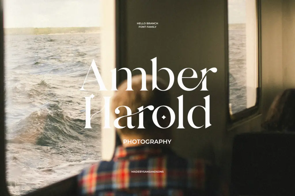
This is a family built for identity work at a modest scale — logotypes, product packaging, invitation suites, blog headers, editorial pull-quotes. The lighter weights suit large, spaced-out display settings: a wedding invitation headline, a packaging wordmark, a magazine cover line. The heavier weights push into poster and badge territory, though Extra Bold serifs like this tend to lose their delicacy and start looking generic once you go heavy — the smooth-contrast approach that reads as elegant at Thin can read as merely thick at the top end.
It’s not a font built for long-form body text. The soft contrast and rounded terminals are optimised for short, decorative settings rather than sustained reading, so save it for headlines, titles, and short editorial copy rather than paragraphs. For anyone assembling a branding kit that needs one serif to do several jobs — logo, packaging, social captions — the range of weights makes it a practical single-family solution rather than a distinctive one.
What we liked, and what we didn’t
Strengths
- Eight weights hold together proportionally from Thin to Extra Bold
- Alternates and ligatures with PUA encoding make extras accessible in non-OpenType apps
- Format coverage suits both print and web deployment out of the box
Trade-offs
- The soft-contrast style is common in current branding fonts and lacks a distinct point of view
- Extra Bold weights lose the delicacy that makes the lighter cuts appealing
Hello Branch is a competent, soft-contrast serif family that covers a wide weight range without embarrassing itself at either extreme. It won't surprise anyone familiar with the current branding-font landscape, but it's dependable for logos, packaging, and short editorial settings. Not built for body copy, and not a typeface with much of a personality beyond generic warmth.

Tmfonts writes independent reviews of typefaces: what each font does well, where it falls short, what it suits, and where it is sold.