
Constane Font Free Download
Is Constane free to download?
Constane is a commercial font sold on Creative Market, so the full version needs a paid license. Get it from the official listing: Constane font download.
Need something free? These script fonts from Google Fonts are free for personal and commercial use:
Design style
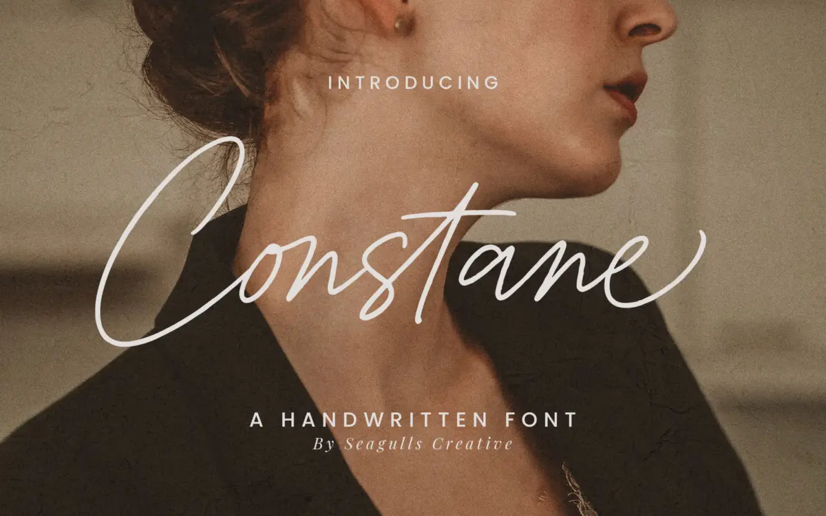
Constane sits in the casual handwritten camp rather than the polished, brush-lettered end of the script market. The strokes have the loose, slightly uneven rhythm of a pen moved quickly rather than a calligraphy nib worked slowly, and that gives it a friendly, unforced character. Letters connect in a semi-joined manner typical of this genre: some pairs flow together, others sit close but separate, which keeps the word shapes readable rather than collapsing into a single ribbon of ink.
The x-height is generous for a script, which helps counter the usual problem of handwritten faces disappearing at small sizes. Ascenders and descenders swing out with some flourish but don’t overreach into the kind of tangled swash work that needs careful kerning to avoid collisions. It reads as approachable rather than formal — closer to a note scrawled on packaging than a wedding invitation engraved in copperplate, though the brief suggests the designer wants it to stretch to both.
Character set and features
The set includes standard letters, numbers, punctuation, and a run of alternates and ligatures, which is the baseline expectation for a script font at this level. Alternate letterforms give you a way to avoid the repetition that flat scripts suffer from when the same letter appears twice in a headline — useful for logotypes and short lockups where every character is visible. Ligatures handle a handful of common letter pairs so the joins don’t look mechanical.
What isn’t clear from the material provided is how deep the alternate set goes, or whether contextual OpenType substitution is handled automatically or needs manual glyph swapping in something like Illustrator’s glyph panel. That distinction matters in practice: automatic substitution feels effortless, manual swapping is a production step designers need to budget time for. Multilingual support is mentioned, though the specific language coverage isn’t detailed, so anyone setting non-English copy should check character coverage before committing to a layout.
Use cases
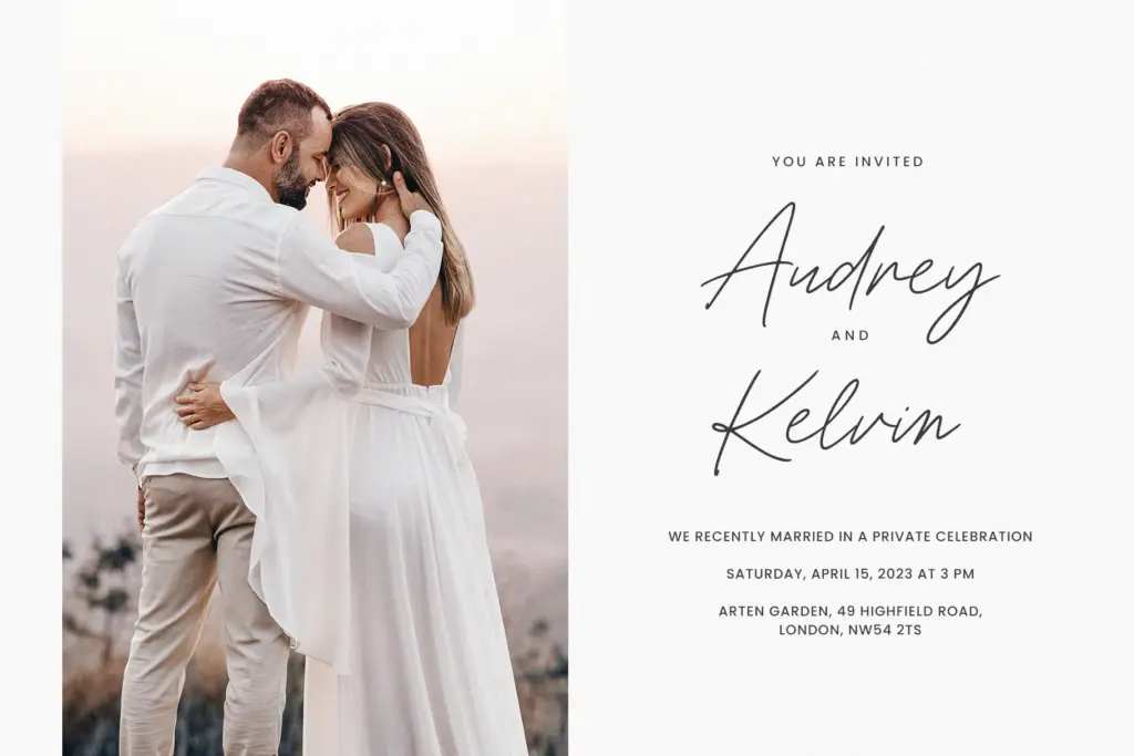
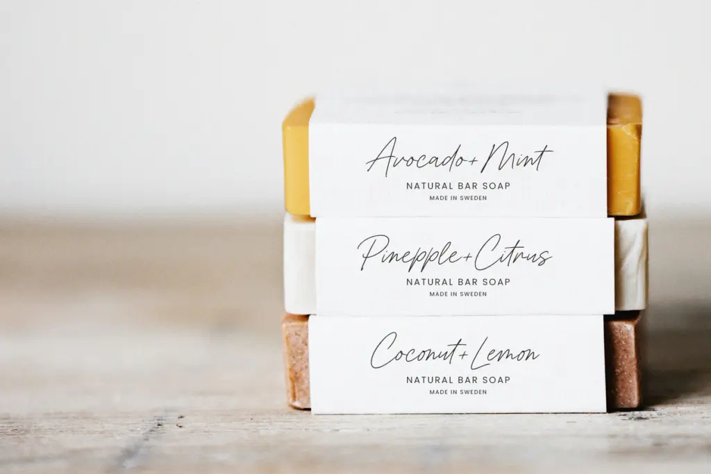
Constane’s natural home is short-form work: a logotype, a product label, a line on a greeting card, a signature-style sign-off in a social media graphic. The casual tone works well for boutique food and beverage branding, handmade goods packaging, and personal stationery where a slightly imperfect, human hand adds warmth. For wedding stationery it will suit informal or rustic-themed invitations more than black-tie formal sets, where a steadier calligraphic script usually reads as more appropriate.
At paragraph lengths it will struggle, as most handwritten scripts do — the joins and irregular baseline that look charming in a headline become fatiguing over several lines of body text. Pair it with a plain sans or serif for supporting copy and keep Constane for the moments that need personality: a name, a headline, a short tagline.

What we liked, and what we didn’t
Strengths
- Generous x-height keeps the script legible at smaller sizes than most handwritten faces manage
- Alternate letters and ligatures give short lockups enough variation to avoid obvious repetition
- Loose, casual stroke quality suits informal branding and packaging without feeling overworked
Trade-offs
- Documentation doesn't clarify whether OpenType substitution is automatic or requires manual glyph swapping
- Not suited to paragraph-length text or formal, high-contrast wedding stationery
Constane is a competent, friendly casual script that does short-form lettering jobs well without trying to be more than that. It's not the font for a formal wedding suite or long-form text, but for logotypes, labels, and quick social graphics it holds up.

Tmfonts writes independent reviews of typefaces: what each font does well, where it falls short, what it suits, and where it is sold.