
Ageia Font Free Download
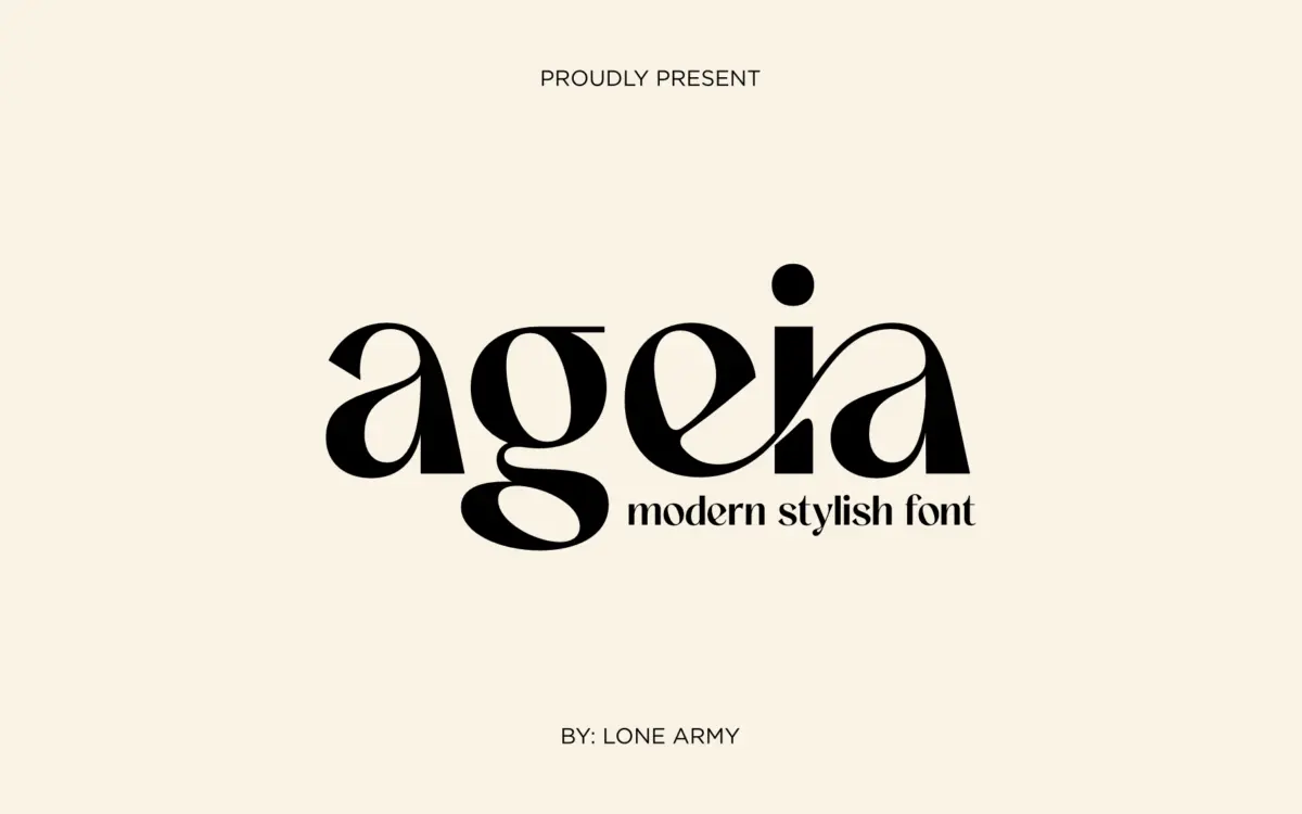
Is Ageia free to download?
Ageia is a commercial font sold on Creative Market, so the full version needs a paid license. Get it from the official listing: Ageia font download.
Need something free? These sans serif fonts from Google Fonts are free for personal and commercial use:
Design style
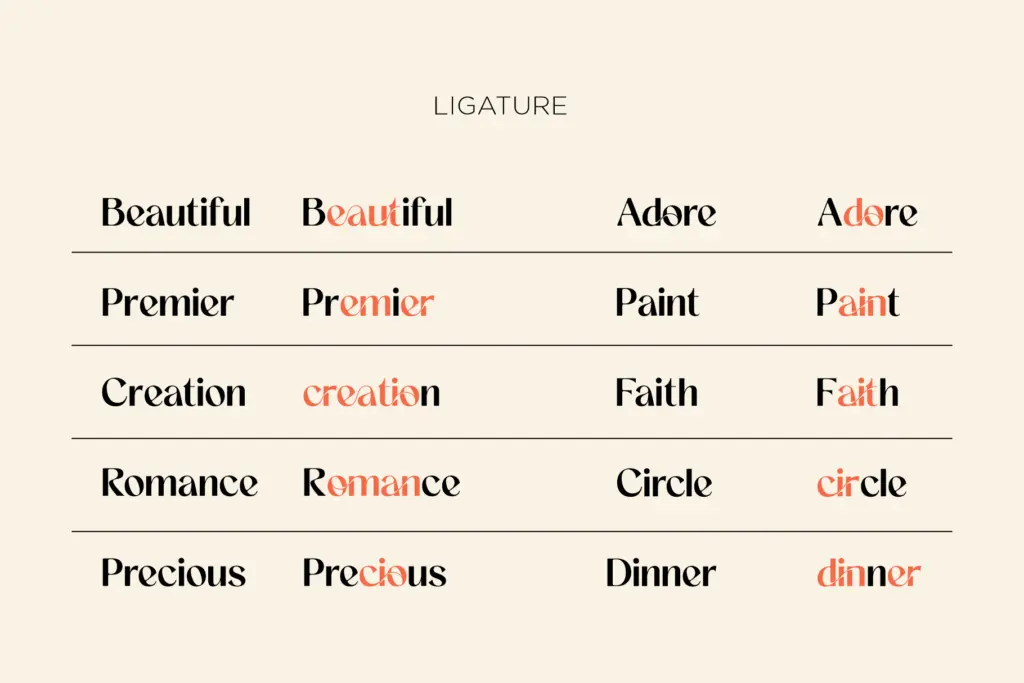
Ageia sits in that crowded space between minimal sans and lifestyle-brand display type. The skeleton is contemporary and fairly restrained — even stroke weight, closed apertures on the c and e, no obvious historical reference point. What distinguishes it from the dozens of similar sans faces on the market is a set of stylistic ligatures grafted onto that neutral frame, which give it a fluid, connected feel in short bursts of text without turning it into a script.
The tension in the design is between those two impulses. The base letterforms want to be quiet and functional; the ligatures want to be decorative and attention-grabbing. Used sparingly, that works: a word or two set with a ligature or two reads as considered rather than busy. Push it further and the mix starts to feel undecided about what kind of typeface it wants to be.
Character set and features
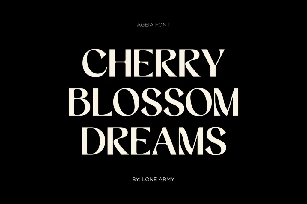
The core alphabet is drawn cleanly enough for general sans-serif duty — uppercase, lowercase, numerals, standard punctuation. The ligatures are the actual feature here, and they’re the reason to pick this over a plainer geometric sans. They work best on double letters and common pairs, joining strokes in a way that reads as a signature rather than a system.
There’s no indication of an extended language set or a variable axis, so treat this as a single-weight display face rather than a working text family. That’s a fair trade for what it is, but it means you should test your actual copy before committing — long-form running text will expose the gaps between the ligature moments and the plainer default letters, and the rhythm can feel uneven once you’re past a headline or a short line of body copy.
Use cases
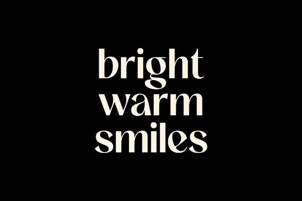
Ageia’s natural home is short-format branding: logotypes, packaging headlines, invitation lettering, editorial pull quotes. Anywhere you’re setting a word, a name, or a short phrase large enough for the ligatures to register, it does its job — the sans base keeps things legible while the ligatures add a bit of personality that a plain geometric face wouldn’t give you.
It’s less suited to interface work, body copy, or anything requiring small-size legibility, since the decorative joins lose their point at text sizes and just look like slightly odd kerning. Fashion and lifestyle branding, the use case the seller pitches, is a reasonable fit — the warmth the ligatures bring suits a brand that wants to feel approachable rather than corporate. Packaging and invitation lettering are similarly sensible, provided the layout gives the type room to breathe at a size where the ligatures actually read as intentional rather than as noise.
Pair it with restraint: one or two ligature moments per composition, set large, with plenty of white space around it. Treat it as a headline or wordmark tool, not a family you build a whole identity system on.
What we liked, and what we didn’t
Strengths
- Stylistic ligatures give an otherwise plain sans a distinct, signature-like flourish
- Clean base letterforms keep short headline settings legible
- Well suited to logotypes and single-line packaging or invitation lettering
Trade-offs
- No indication of multiple weights or a variable axis, limiting it to display use
- Ligatures lose their effect and can look like stray kerning at small sizes or in longer copy
Ageia is a competent sans base dressed up with a handful of decorative ligatures, best used sparingly on short headline or branding copy. It doesn't hold up as a general-purpose family, but for a wordmark or a line of lettering it has some character. Test it at your actual size before committing, since the ligature moments only work when there's room to notice them.

Tmfonts writes independent reviews of typefaces: what each font does well, where it falls short, what it suits, and where it is sold.