
TAN Memories Font Free Download
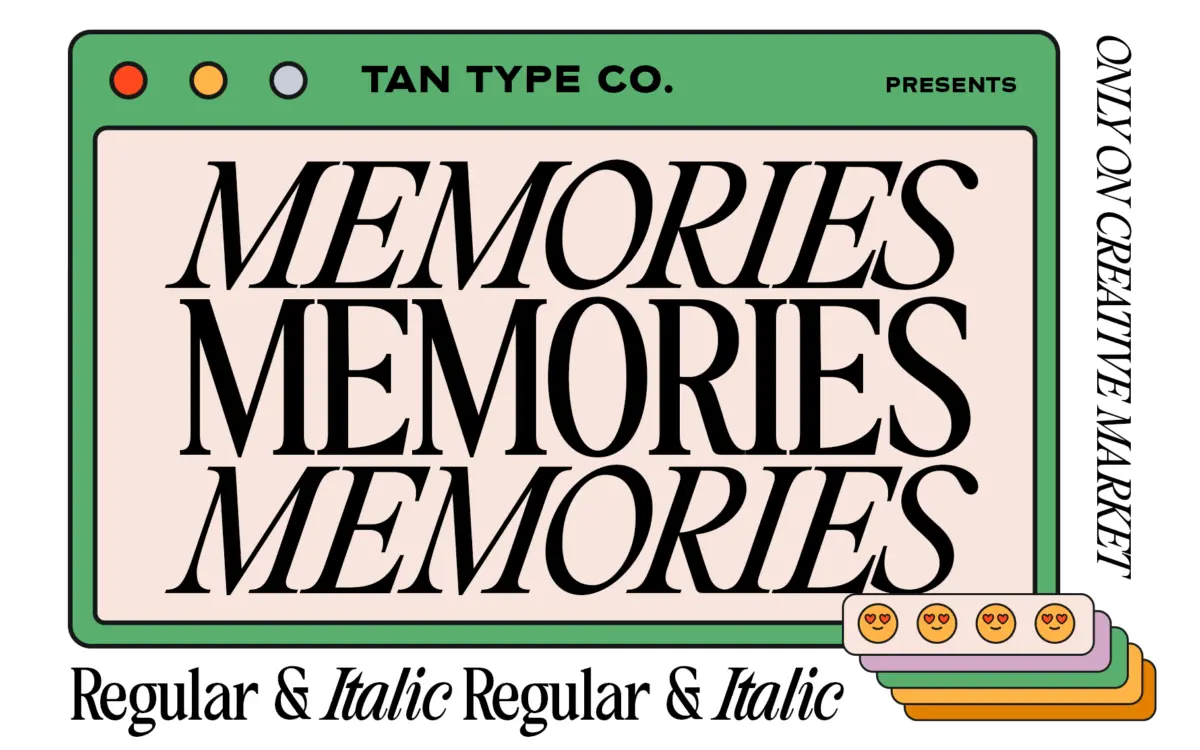
Is TAN Memories free to download?
TAN Memories is a commercial font by TanType Co., sold on Creative Market, so the full version needs a paid license. Get it from the official listing: TAN Memories font download.
Need something free? These serif fonts from Google Fonts are free for personal and commercial use:
Design style
TAN – Memories sits in the classic serif tradition: moderate contrast, bracketed serifs, a construction that owes more to book typography than to signage. It doesn’t reach for a signature quirk the way a lot of display serifs do. There’s no ink trap, no exaggerated flare, no single letterform doing the marketing work. Instead the personality comes from the spacing decision at its core — the kerning is noticeably tight, closer than most serif text faces would risk, which pulls words into denser, more compact blocks than you’d expect from the letterforms themselves.
That tightness gives the face a mood rather than a gimmick. Set in a short line it reads as composed, a little formal, with none of the airiness that a lot of “elegant serif” releases lean on. It’s a font that photographs well in a screenshot or a quote card, where the tightness reads as intentional rather than cramped.
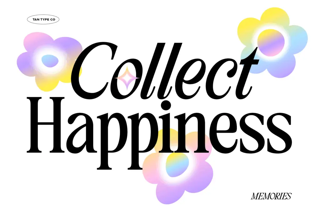
Character set and features
The letter construction is conservative enough to hold up across weights of use: the x-height is moderate, the serifs are consistent rather than showy, and there isn’t a lot of stroke-contrast drama to manage. Multilingual support is included, which extends the face beyond a narrow English-only quote-card use case into longer-form or non-English editorial work, though the brief doesn’t specify which scripts or diacritics are covered, so it’s worth checking against your specific language needs before committing to body copy.
The tight kerning that defines the look at short lengths is also the feature to watch at longer lengths. What reads as considered in a headline or a pull-quote can start to feel congested across a full paragraph, particularly in narrower columns or smaller sizes where letters have less room to breathe. This isn’t a flaw so much as a design choice that rewards short-form use and asks a bit more from anyone trying to stretch it into dense text blocks — tracking adjustments in your layout software will likely be necessary if you go that route.
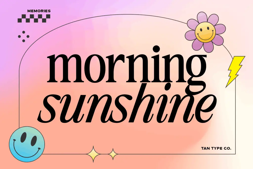
Use cases
This is a font for the moment in a layout where you need restraint rather than a statement: a pull-quote under a bold display headline, a caption, a closing line on a slide, a byline. The seller pitches it explicitly as a complement to louder display faces, and that positioning tracks with how it behaves — it’s built to sit quietly next to something with more presence, not to be the loudest voice on the page.
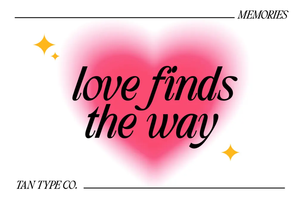
It also works as a standalone choice for editorial pieces that want a classic, unfussy mood without going full vintage-serif pastiche — magazine pull-quotes, quote graphics for social, understated invitation copy, or branding work that wants “considered” rather than “decorative.” Given the tight default spacing, it’s better suited to shorter passages of text than to long-form reading, and designers working in Canva or similar tools should keep an eye on how the kerning renders across different weights of surrounding content.
What we liked, and what we didn’t
Strengths
- Restrained, classic serif construction that pairs quietly with louder display faces
- Tight kerning gives short lines a composed, deliberate feel
- Multilingual support extends its use beyond single-language quote work
Trade-offs
- Tight default kerning can feel congested in longer paragraphs or smaller sizes
- No distinctive structural feature to set it apart from other classic serifs at a glance
TAN – Memories is a competent, understated classic serif whose defining trait — tight kerning — is also its main limitation. It's well suited to short-form editorial use like quotes and captions, but needs care before being pushed into long-form body text.

Tmfonts writes independent reviews of typefaces: what each font does well, where it falls short, what it suits, and where it is sold.