
Summer in Seville Font Free Download
Is Summer in Seville free to download?
Summer in Seville is a commercial font sold on Creative Market, so the full version needs a paid license. Get it from the official listing: Summer in Seville font download.
Need something free? These script fonts from Google Fonts are free for personal and commercial use:
Design style
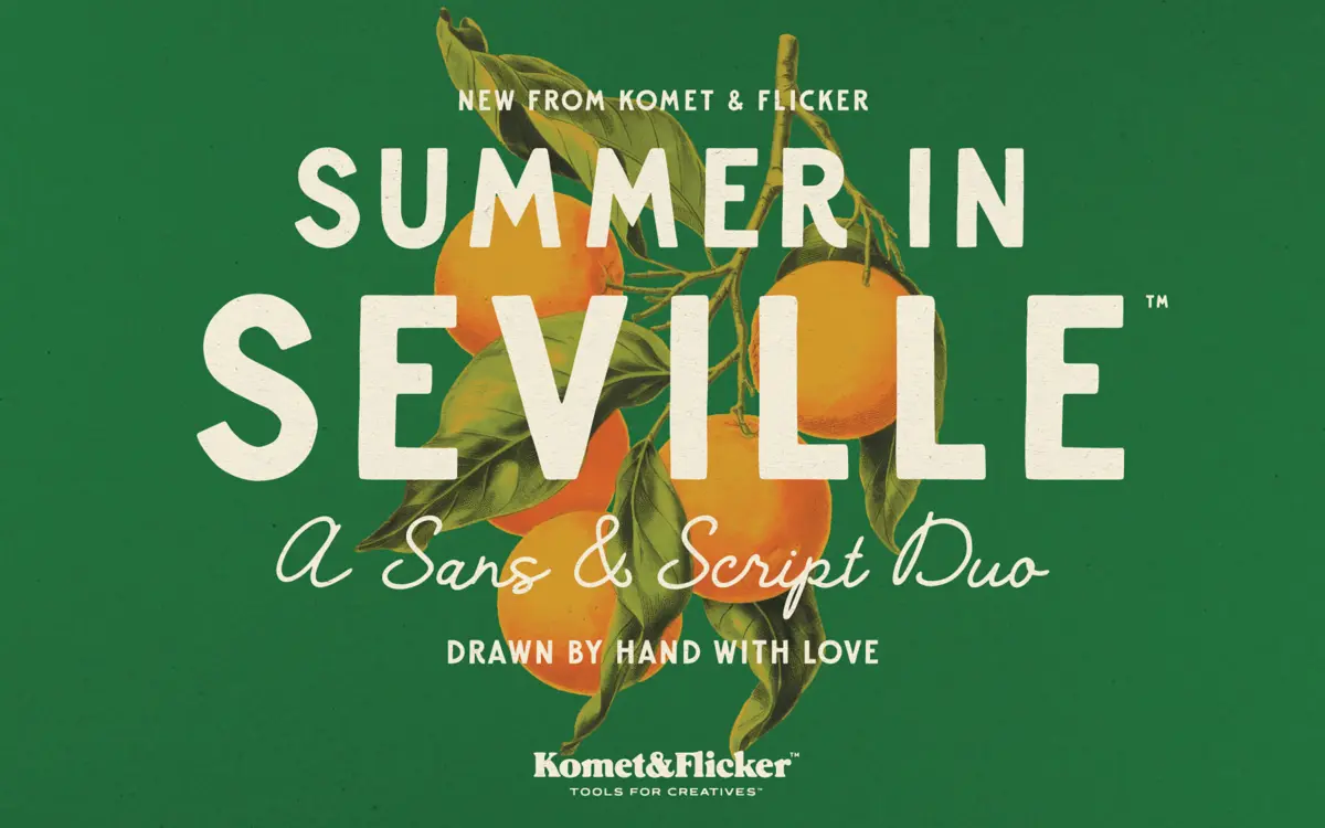
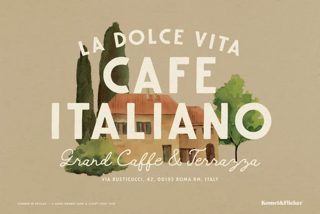
Summer in Seville is a two-part set: a bold, uppercase-only sans and a looser, connected script, both drawn by hand rather than digitised from a rigid grid. The sans carries the weight of mid-century signage lettering — thick strokes, slightly uneven baselines, and enough wobble in the counters to read as drawn rather than vectorised from scratch. The script sits beside it as the informal counterpart, with a loose, brush-like flow that avoids the over-polished bounce of a lot of contemporary script fonts. Neither style tries to be neutral. The sans has presence and a slightly worn edge; the script leans casual and unfussy rather than calligraphic. Together they read as a set built for a specific mood — sun, travel posters, old shopfronts — rather than a general-purpose workhorse pairing.
Character set and features
The sans is capitals-only, which is worth noting before you commit a layout to it: there’s no lowercase to fall back on for body copy or long-form headlines that need mixed case for readability. The script fills that gap with a full upper and lowercase set, so the pairing works best when the sans handles short, punchy words and the script carries anything longer. Both styles include select European characters, so basic diacritic coverage is there, though it’s described as selective rather than exhaustive — check your specific language needs before locking in a layout that depends on accented characters. The sans includes ten alternates, useful for breaking up repetition in a single word or logotype, and both styles ship with two styles of ready-made fractions, a small but genuinely practical inclusion for menus and pricing. The standout technical feature is the set of eleven custom connecting word glyphs, offered in both sans and script versions. These are pre-built ligature-like combinations that let short common words connect fluidly rather than sitting as separate hand-kerned letters — accessed through the Glyphs panel in Illustrator or Photoshop rather than typed automatically. It’s a smart workaround for the limitations of hand-lettered scripts, though it means the smoothest results come from using the intended word set, not typing arbitrary words and hoping the letters knit together.
Use cases
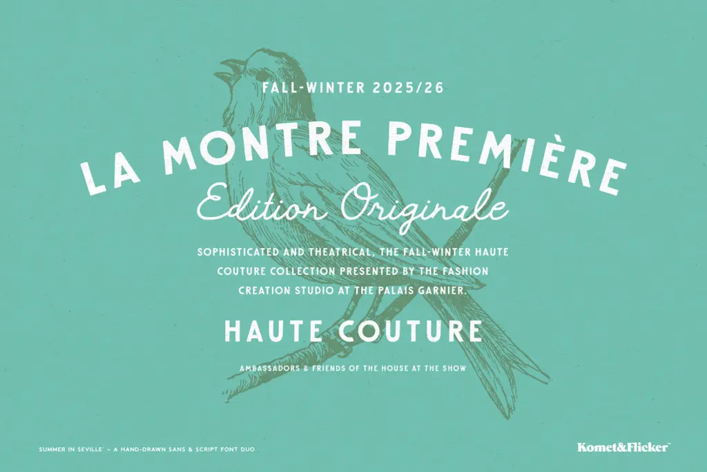
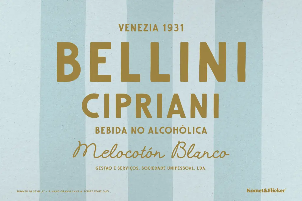
This pairing is built for short-form, high-personality work: logotypes, packaging labels, travel and event posters, café signage, wine or food branding, and invitations that want a European, sun-bleached feel rather than a formal one. The all-caps sans is well suited to headlines, badges, and short brand names where its texture can do the talking. The script handles subheads, taglines, or a signature-style flourish under a logo. Neither style is meant for paragraphs of text — the sans has no lowercase and the script’s handmade irregularity would tire the eye in long-form reading. Designers working on identity systems that need a single warm, retro voice across a few touchpoints will get the most out of it; those needing a flexible family for editorial or UI work should look elsewhere.
What we liked, and what we didn’t
Strengths
- The connecting word glyphs give the script pairing a smoother, more considered feel than most hand-lettered duos.
- The sans has real textural character without tipping into illegibility at display sizes.
- Pre-built fractions in two styles are a practical touch for menu and packaging work.
Trade-offs
- The sans is capitals-only, so there's no lowercase option for mixed-case headlines or longer text.
- European character support is described as selective, so multilingual projects need checking before commitment.
Summer in Seville is a charming, well-drawn duo for retro-leaning branding work, with a genuinely useful set of connecting word glyphs. It's not built for flexibility — the capitals-only sans and handmade script limit it to short-form, high-personality layouts rather than general use.

Tmfonts writes independent reviews of typefaces: what each font does well, where it falls short, what it suits, and where it is sold.