
Onehart Script & Sans Font Free Download
Is Onehart Script & Sans free to download?
Onehart Script & Sans is a commercial font sold on Creative Market, so the full version needs a paid license. Get it from the official listing: Onehart Script & Sans font download.
Need something free? These script fonts from Google Fonts are free for personal and commercial use:
Design style
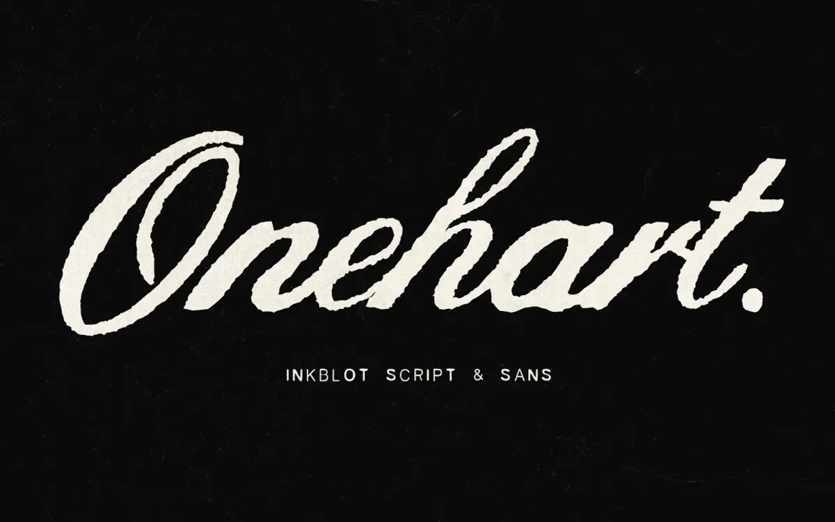
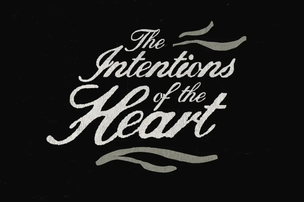
Onehart Script & Sans reads as a pair of textures more than a pair of alphabets. The script half is built from strokes that look printed through a worn screen: line weight jumps mid-letter, edges blot and fray, and no two repeated letters sit quite the same way. It leans on the DIY screen-print aesthetic of patched denim and zine culture rather than any calligraphic tradition, and that’s clearly the intent — this isn’t a font trying to look considered, it’s trying to look handled.
Onehart Sans is the quieter counterpart. It keeps the same ink-blot texture but drops the connected script motion in favour of a plainer, more geometric letter skeleton. The line gap is generous, which gives the roughened edges room to breathe instead of clogging into each other. Where the script is the loud gesture, the sans is the steadying hand underneath it — smaller caps, tighter rhythm, still visibly hand-worked but with less drama per letter.
Character set and features
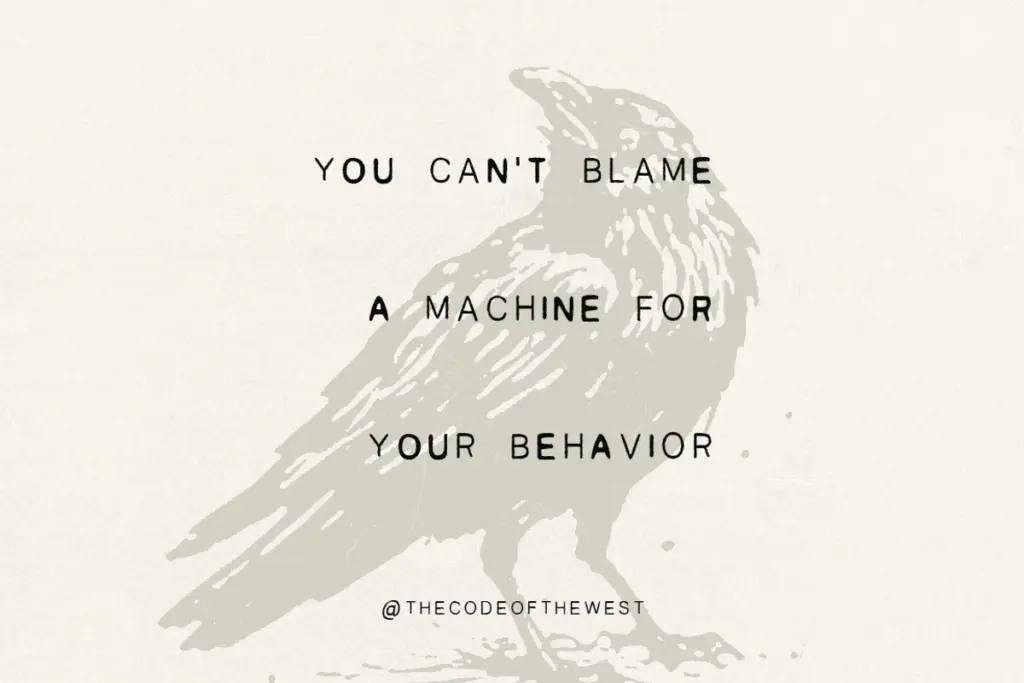
The set is basic by design: alphabet, numerals, punctuation, and the ink-blot texture that gives the family its identity. The script includes multilingual support, which extends its reach beyond English-only branding work. There are no ligatures or alternate character sets mentioned, and no OpenType stylistic flourishes to swap in — what you draw is what you get, letter by letter, with the randomised weight doing the work of variation instead of contextual alternates.
That randomness is both the feature and the ceiling. Because the ink blots and weight shifts are baked into each glyph rather than generated live, the texture repeats exactly whenever a letter repeats. In short lines — a single word, a stacked logotype — this goes unnoticed. In longer passages set at the same size, the repetition becomes visible and the

Tmfonts writes independent reviews of typefaces: what each font does well, where it falls short, what it suits, and where it is sold.