
The Marigold Grand Font Duo Free Download
Is The Marigold Grand Font Duo free to download?
The Marigold Grand Font Duo is a commercial font sold on Creative Market, so the full version needs a paid license. Get it from the official listing: The Marigold Grand Font Duo download.
Need something free? These script fonts from Google Fonts are free for personal and commercial use:
Design style
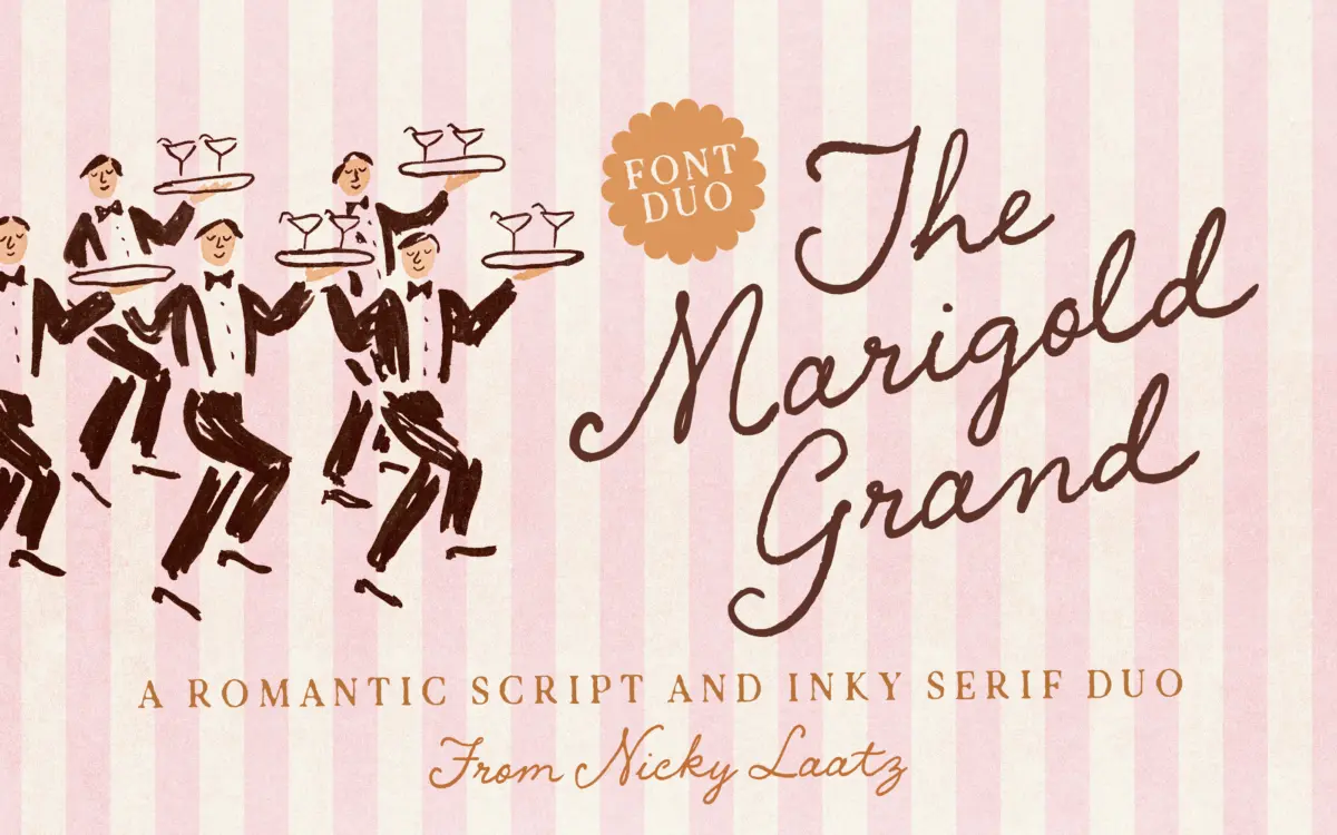
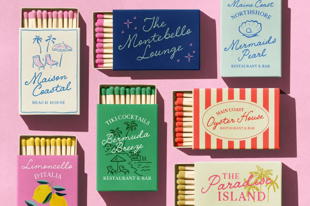
Marigold Grand is a two-part family: a flowing, romantic script paired with a rough-edged printpress serif. The script leans into the current wave of wedding-market handwriting fonts, with looping ascenders, a moderate slant and connecting strokes that mimic a fine brush or pointed pen. It’s warm rather than fussy, and it avoids the over-decorated flourish sets that make some script fonts hard to place. The serif companion is the more interesting half of the pair. Its edges are deliberately broken and inked, as though stamped from a worn printing block that hasn’t been cleaned in a while. That texture gives it a handmade, slightly weathered feel without tipping into full grunge distress.
Together the two typefaces read as a considered pairing rather than a script bundled with a generic sans as an afterthought, which is often the weak point of duo packages. The serif’s imperfections are consistent enough that they don’t read as noise once you’re a paragraph in.
Character set and features
The script comes in several minor variants — differences in weight, slant and width — so you can nudge the letterforms to fit a layout rather than being locked to one rhythm. This is genuinely useful for the kind of one-line headline work scripts get used for, where a slightly wider or upright variant can save a redesign. The printpress serif is built for smaller supporting text, and the seller states it stays legible at reduced sizes despite the inked edges, which tracks with how the roughening is applied mostly to the outer contours rather than the counters.
Language support covers a reasonable spread of Western European languages, including French, German, Spanish, Italian and the Scandinavian and Iberian language groups, plus Irish and Scottish Gaelic. That’s enough for most European invitation and packaging work but worth checking against your specific accent requirements before committing a layout. The files are noted as Canva compatible, which matters if your studio’s stationery or small-batch packaging clients are working outside a full type-savvy design pipeline.
Use cases
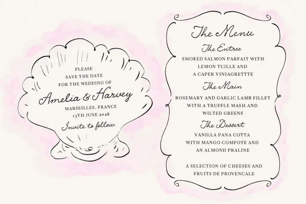
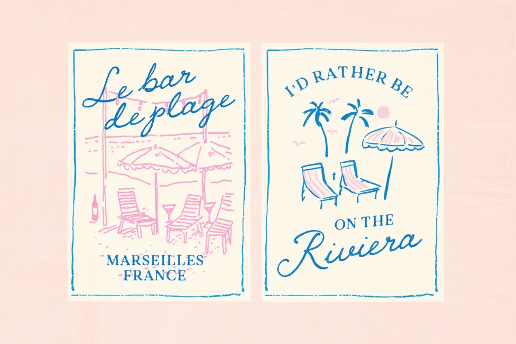
This duo sits most comfortably in the stationery and small-brand space it was clearly built for: wedding invitations, save-the-dates, greeting cards, and boutique packaging or label work where a handmade, slightly rustic tone is the goal. The script works well as a signature line, a couple’s names, or a short greeting-card message. The printpress serif is the better choice for addresses, ingredient lists, care instructions or any supporting copy that needs to stay legible while keeping the tactile, stamped quality of the brand.
It’s less suited to corporate branding, long-form editorial text, or any context that calls for a clean, neutral voice — the ink-edge texture is a strong flavour and will fight a brand that needs restraint. Signage is plausible at larger sizes where the roughened serif edges become part of the character rather than a legibility risk. For a boutique cake shop, a florist, or a small press running a limited card line, this pairing does its job without requiring a designer to hunt for a second typeface to round it out.
What we liked, and what we didn’t
Strengths
- The printpress serif's inked edges give the duo a distinct, handmade texture rather than generic grunge
- Multiple script variants let you adjust weight, slant and width without switching fonts
- The two styles are genuinely designed as a pair, so they sit together without extra tuning
Trade-offs
- The rough serif edges limit how small or how clean the text can go before texture undermines legibility
- The romantic, rustic tone narrows the font to stationery and boutique branding rather than broader commercial use
Marigold Grand pairs a warm, unfussy script with a genuinely characterful inked serif, which makes it a more coherent duo than most bundled offerings. It's built for a specific job — stationery and boutique packaging — and does that job well, but it isn't a general-purpose family.

Tmfonts writes independent reviews of typefaces: what each font does well, where it falls short, what it suits, and where it is sold.