
ED Venta Nueva Font Free Download
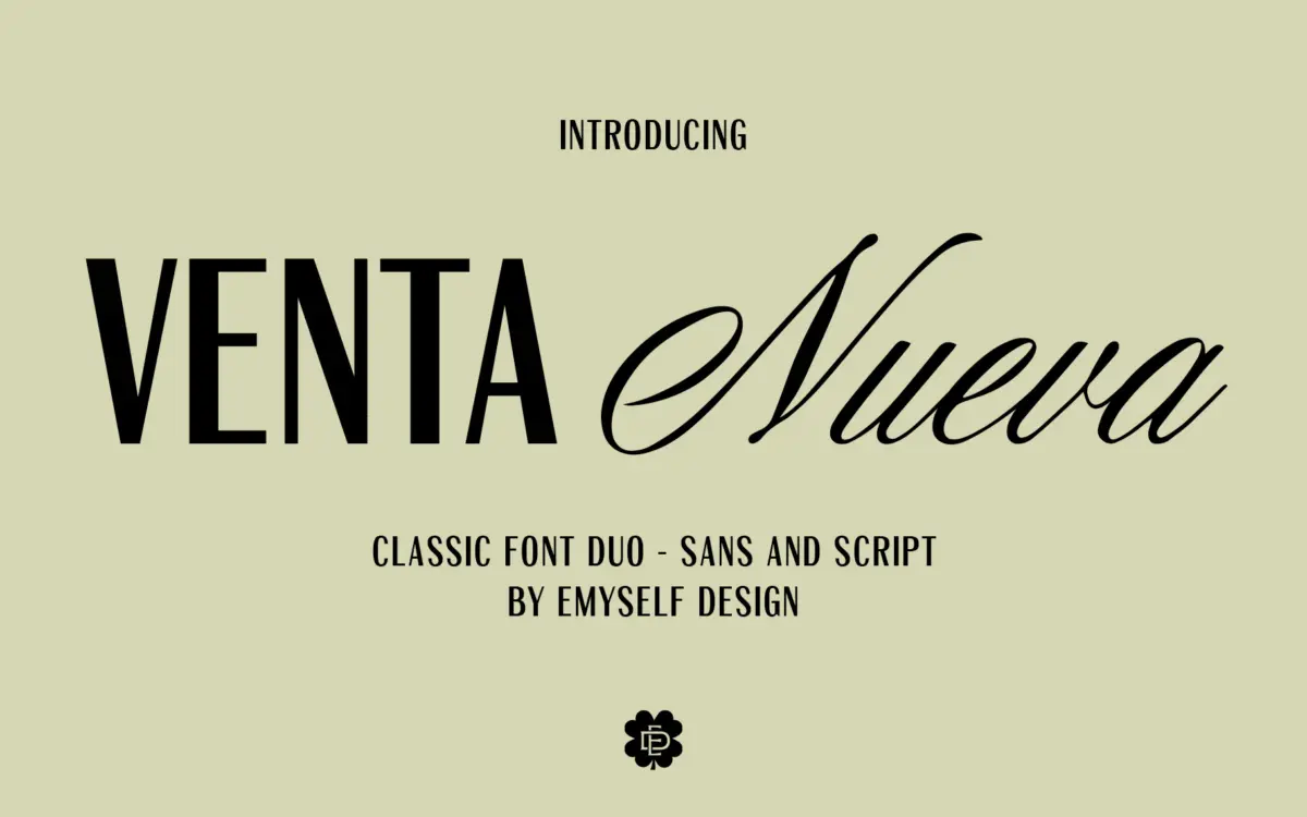
Is ED Venta Nueva free to download?
ED Venta Nueva is a commercial font sold on Creative Market, so the full version needs a paid license. Get it from the official listing: ED Venta Nueva font download.
Need something free? These script fonts from Google Fonts are free for personal and commercial use:
Design style
Venta Nueva is a two-face pairing rather than a single typeface: a flowing casual script and a plain capitals-led sans built to sit alongside it. The script has the loose, slightly uneven baseline you’d expect from a hand-lettered style rather than a formal calligraphic one — strokes taper unevenly, joins are relaxed, and there’s no attempt to fake a broad-nib or pointed-pen structure underneath. It reads as friendly and a bit informal rather than luxe or bridal-glossy, which sets it apart from the stricter copperplate-style scripts that flood this category.
The sans half is where the actual design thinking shows. It’s a plain, geometric-leaning capitals style with even stroke weight and no eccentric details — the kind of typeface built to disappear into a supporting role. It doesn’t try to compete with the script for attention, which is the point: it’s there to add small caps, subheads, or a line of clarity underneath a looser script headline.
Character set and features
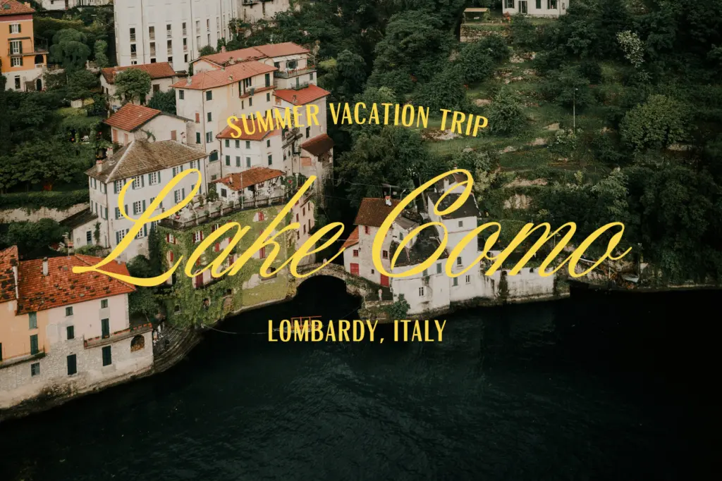
Each face carries a substantial glyph count — 379 in the script, 363 in the sans — with uppercase, lowercase, punctuation, and a set of symbols in both. That’s enough range to cover standard setting without obvious gaps, though the brief doesn’t specify contextual alternates or swash variants, so buyers expecting the kind of OpenType trickery that makes scripts feel truly hand-drawn (randomised letterforms, connecting ligatures) should treat this as a more straightforward duo rather than an alternate-heavy system. It ships in OTF, TTF, and WOFF, so it’s usable across desktop layout software and the web without extra conversion.
The two faces are clearly designed to be read as a set — same casual temperament, same era of reference — rather than a script bundled with an unrelated sans as an afterthought. That coherence is a real strength of duo products, and it holds up here: swapping between them for headline/subhead pairs doesn’t feel jarring.
Use cases
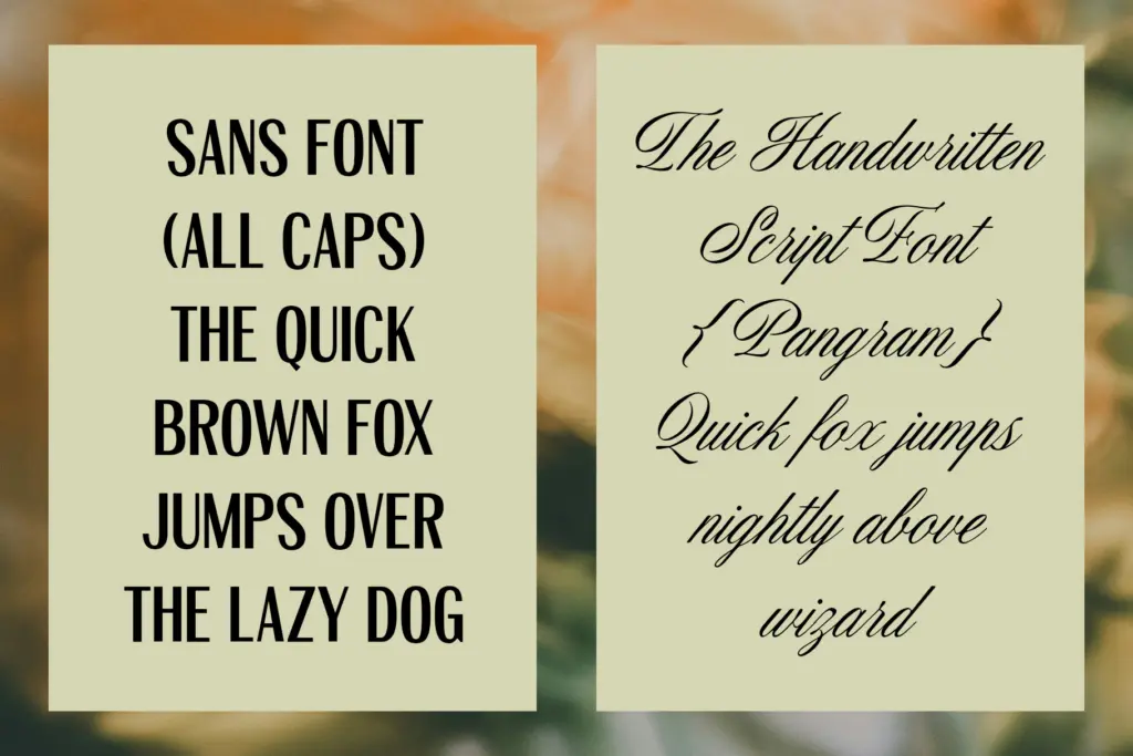
This is squarely an invitation and stationery typeface. Wedding and event invitations, greeting cards, short lifestyle quotes, packaging labels with a handmade feel — the script does the emotional work and the sans handles the practical details like dates, names, or addresses. It also suits small branding projects that want warmth without going fully ornate: a boutique, a florist, a candle label.
It’s less suited to long-form text. The script isn’t built for body copy — casual scripts like this rarely are — and legibility drops fast below display size, especially in dense paragraphs or busy backgrounds. For anything needing sustained reading, lean on the sans alone. As a duo for short-burst, decorative-but-approachable design work, it does its job cleanly; as a do-everything system, it isn’t trying to be one.

What we liked, and what we didn’t
Strengths
- The script and sans share a consistent casual tone, so pairing them feels intentional rather than bundled.
- Generous glyph counts (379 and 363) cover full punctuation and symbol sets in both faces.
- Ships in OTF, TTF, and WOFF, covering desktop and web use without conversion.
Trade-offs
- No mention of contextual alternates or ligatures, so the script may repeat identical letterforms in longer words.
- The script's loose baseline and casual joins limit it to display sizes — it won't hold up as body text.
Venta Nueva is a competent, unpretentious script-and-sans duo aimed squarely at invitation and stationery work. It doesn't reinvent the casual-script category, but the two faces are coherent together and cover the basics without gaps. Buyers wanting elaborate OpenType alternates or a script that works at body-copy sizes should look elsewhere.

Tmfonts writes independent reviews of typefaces: what each font does well, where it falls short, what it suits, and where it is sold.