
Darline Font Duo Free Download
Is Darline Font Duo free to download?
Darline Font Duo is a commercial font sold on Creative Market, so the full version needs a paid license. Get it from the official listing: Darline Font Duo download.
Need something free? These script fonts from Google Fonts are free for personal and commercial use:
Design style
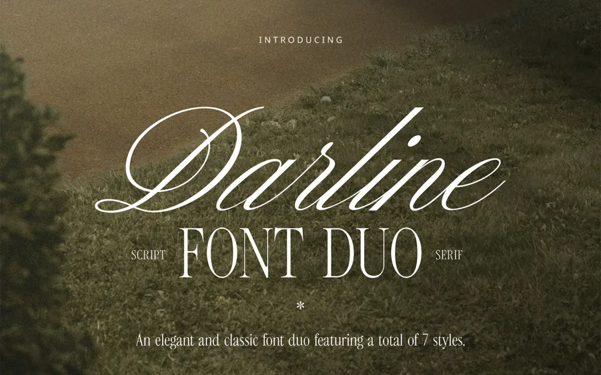
Darline is built as two families designed to sit next to each other rather than one typeface doing two jobs. The serif side is calm and a little cool: moderate contrast, restrained bracketed serifs, and a slightly narrow set that keeps it from feeling stodgy at small sizes. The script side is where the personality lives — a semi-connected hand with a relaxed slant, softened terminals, and enough looseness in the joins that it reads as written rather than plotted. Neither half tries to be loud, which is presumably the point: this is a duo aimed at the current run of muted, neutral-toned branding rather than anything with flourish.
The Aged variants push the script toward a worn, letterpress-adjacent texture — broken strokes, uneven weight, a bit of grain in the outlines. It’s a reasonable way to get a printed, heritage feel without switching typefaces, though it’s a style that dates itself faster than the clean version, so it’s worth treating as a seasoning rather than a default.
Character set and features
Between the three serif weights (Light, Regular, Bold) and the four script versions (Regular, Regular Slanted, Aged, Aged Slanted) you get seven fonts, which is generous for a duo and gives you room to build a small hierarchy without reaching for anything else — a light serif for body copy, bold serif for a wordmark, script for a signature line. The seller notes full punctuation, numerals and support across English, Italian, French, Spanish, German, Portuguese, Dutch, Danish, Norwegian and Swedish, which covers most Western European branding jobs without a glyph hunt.
What isn’t clear from the files is how deep the ligature or alternate coverage goes on the script — connecting scripts live or die on how well the joins handle awkward letter combinations, and that’s the kind of detail you only find by typing your actual client’s name into it before committing. Test proper nouns and short taglines before you build a whole identity around it.
Use cases
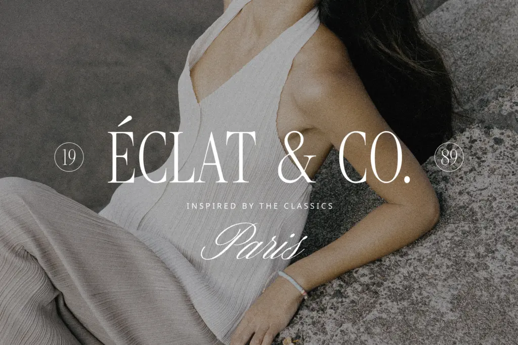
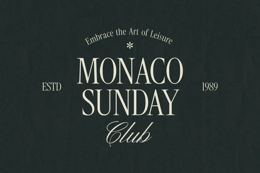
This is a duo for logotypes, packaging, invitation suites and social templates where the brief calls for something soft-spoken — the kind of “quiet luxury” skincare, stationery or boutique-retail look that’s everywhere in branding decks right now. The serif is legible enough for short paragraphs and pull quotes; it’s not a text face for long-form reading, and nobody’s asking it to be. The script is best kept to short strings — names, single words, a signature-style flourish under a serif wordmark — rather than full sentences, where connected scripts generally start to fight legibility.
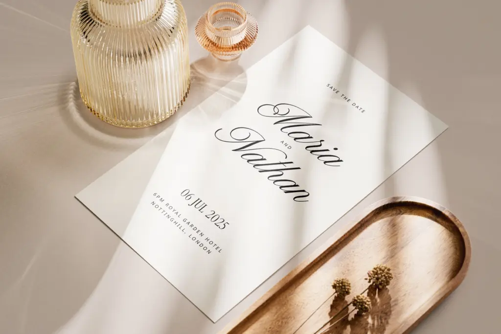
For a wedding suite, the Aged versions give you a printed, slightly worn feel for save-the-dates without switching families mid-project. For sharper, more corporate branding, stick to the plain serif and script pairing and skip the aged textures, which read more rustic than premium. Either way, the strength of this duo is coherence — serif and script were clearly drawn to sit together, so pairing anxiety is mostly removed from the job.
What we liked, and what we didn’t
Strengths
- Serif and script are visibly designed as a matched pair, so hierarchy decisions are easy
- Seven total fonts give real range for a duo, from light body text to a bold wordmark
- Aged variants offer a worn, printed texture without switching to a different typeface
Trade-offs
- The script is a style you've likely seen before in this genre of branding font, with little to distinguish it
- Aged textures date the design quickly and suit rustic or heritage briefs more than sharp corporate ones
Darline is a competent, coherent serif-and-script duo aimed squarely at the current wave of muted, minimal branding. It won't surprise anyone, but the two families were clearly drawn to work together, which saves the usual pairing guesswork.

Tmfonts writes independent reviews of typefaces: what each font does well, where it falls short, what it suits, and where it is sold.