
Darksport Font Free Download
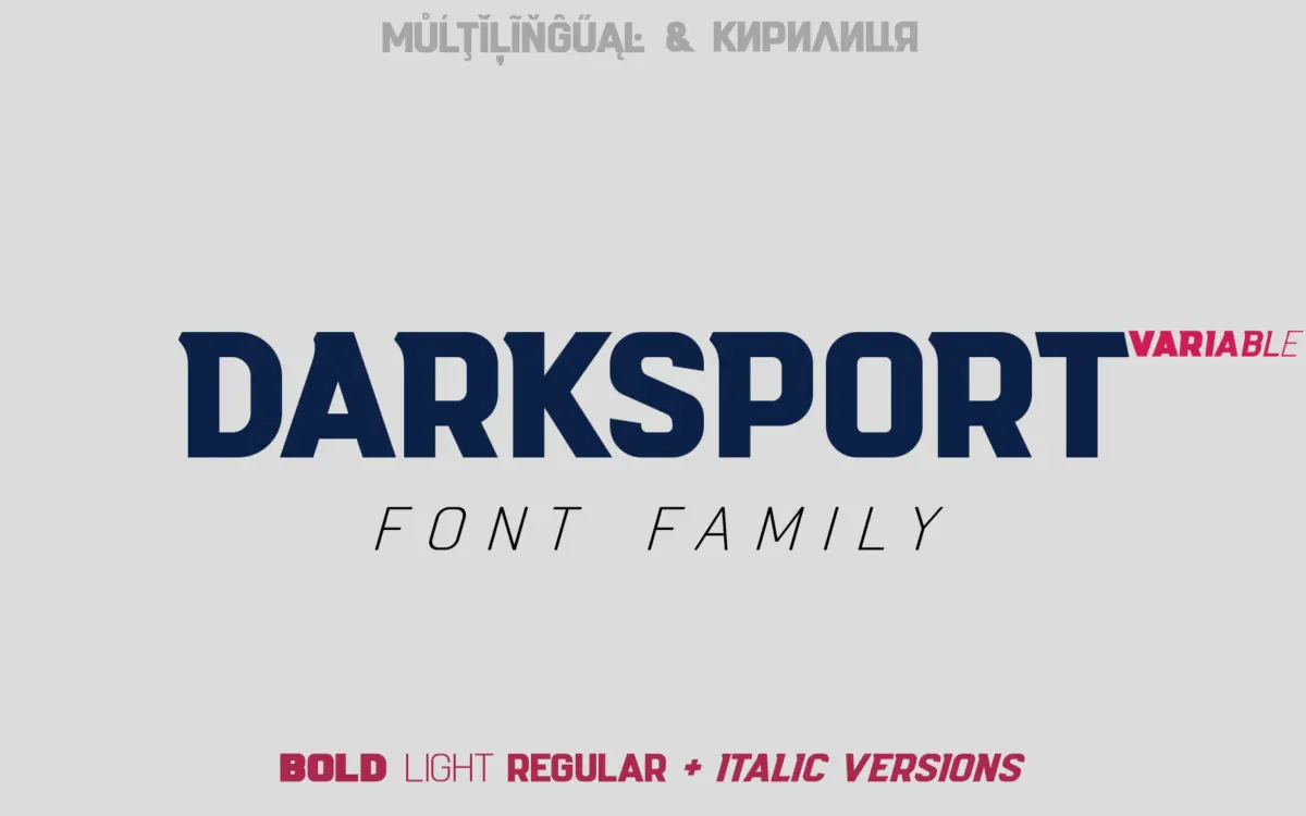
Is Darksport free to download?
Darksport is a commercial font sold on Creative Market, so the full version needs a paid license. Get it from the official listing: Darksport font download.
Need something free? These sans serif fonts from Google Fonts are free for personal and commercial use:
Design style
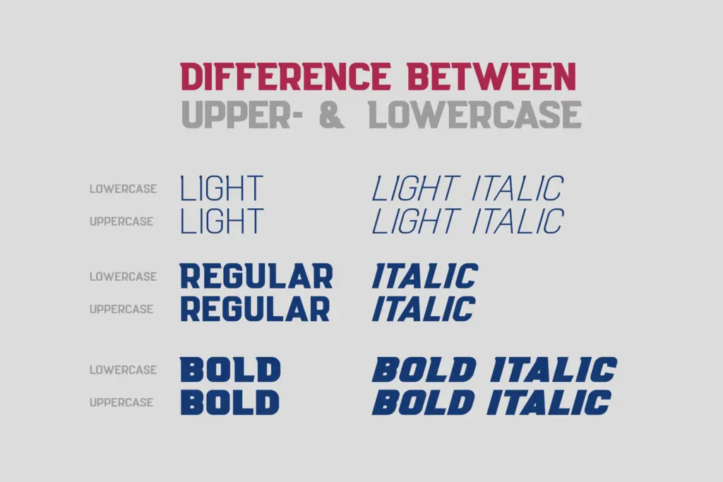
Darksport is a condensed-leaning sans built with athletic branding in mind, and it shows in the details. The letterforms carry the blunt, engineered look you associate with team wordmarks and equipment labels: tight apertures, squared-off terminals, and a general sense that every curve has been flattened just enough to read as mechanical rather than humanist. There’s a deliberate mismatch between the uppercase and lowercase — the caps are the workhorses, drawn heavier and more geometric, while the lowercase loosens up slightly with more open counters. It’s a choice that reads intentionally rather than accidentally inconsistent, and it gives the family two distinct registers to draw from depending on how loud you need the type to be.
Six weights across the family (plus a variable axis) mean you can move from a fairly restrained text weight up to something dense enough to work as a solid badge fill. The heavier cuts are where the typeface feels most at home — thick strokes, minimal daylight between letters, built for short bursts of text rather than paragraphs.
Character set and features
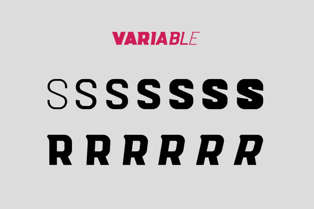
The variable version is the practical draw here: rather than juggling six static files, you get one file with an adjustable weight axis, which is genuinely useful when you’re fine-tuning a lockup or numeral set against a logo mark rather than picking from fixed stops. Language support is broad, covering Latin Pro and Slavic Cyrillic scripts across a long list of European languages, so it’s a reasonable pick for projects that need Cyrillic and Latin to sit together without swapping typefaces.
Don’t expect a deep OpenType feature set here — this isn’t a family built around ligatures, alternates, or typographic flourishes. It’s a workhorse letterform set: caps, lowercase, numerals, and the punctuation you’d need for a wordmark or a stat line. The numerals in particular are worth checking before committing, since sports typefaces live and die by how their numbers look on a jersey or scoreboard graphic, and this is clearly where the design put its attention.
Use cases
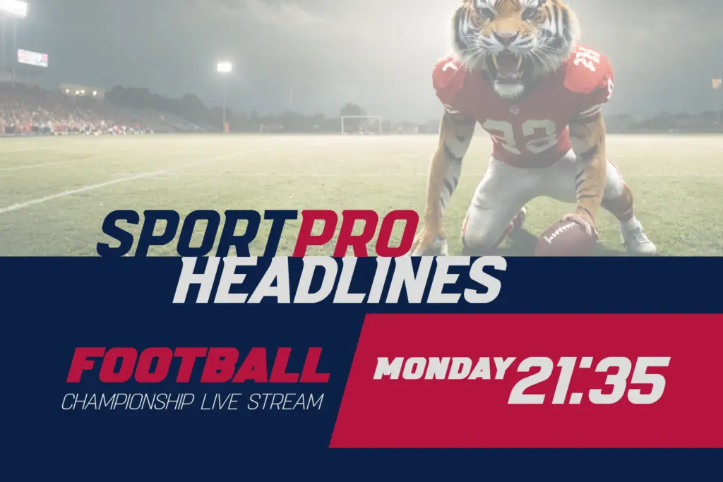
This is a typeface for short, loud statements: team names, event posters, apparel graphics, product labels that need to feel rugged. The condensed, high-contrast caps hold up well at large sizes and in the kind of badge layouts where letters get stacked, arced, or squeezed into a crest. It’s less suited to body copy or anything that needs sustained reading — the lowercase, while functional, isn’t built for comfort at paragraph lengths, and the tight spacing that makes headlines punchy will start to feel claustrophobic in longer runs.
Where it earns its keep is in identity work for sports leagues, gyms, apparel lines, and any brand chasing a rugged, athletic tone rather than a polished corporate one. Paired with the Cyrillic support, it’s also a sound option for regional sports branding across Central and Eastern Europe without needing a second typeface for the alphabet switch.
What we liked, and what we didn’t
Strengths
- Numerals and caps are drawn with real attention, which matters for scoreboard and jersey work
- Variable axis makes weight tuning against a logo mark far easier than juggling six static files
- Broad Cyrillic and Latin coverage suits cross-regional sports branding
Trade-offs
- Tight spacing and blunt lowercase make it unsuitable for anything beyond short headline text
- Minimal OpenType feature set limits its usefulness outside straightforward branding work
Darksport does one job well: loud, condensed, athletic wordmarks with the numeral quality sports work demands. It's not built for reading, and it won't stretch into elegant or editorial territory, but for badges, jerseys and event posters it delivers exactly what it promises.

Tmfonts writes independent reviews of typefaces: what each font does well, where it falls short, what it suits, and where it is sold.