
Fairwren Font Free Download
Is Fairwren free to download?
Fairwren is a commercial font sold on Creative Market, so the full version needs a paid license. Get it from the official listing: Fairwren font download.
Need something free? These serif fonts from Google Fonts are free for personal and commercial use:
Design style
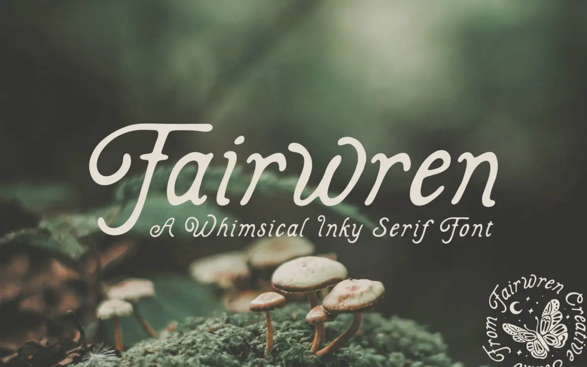
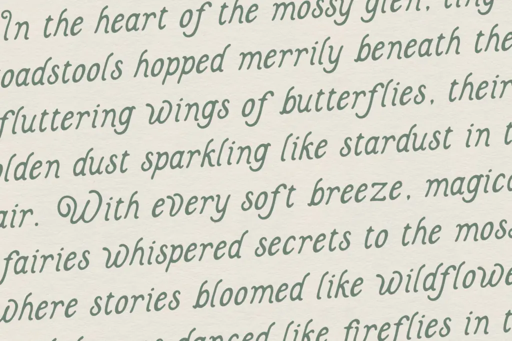
Fairwren is a display serif built around an inked, slightly ragged edge rather than a clean vector outline. The strokes are solid and bold in weight, but the terminals wobble just enough to read as hand-cut rather than mechanically drawn. Curls appear at stem ends and crossbars, giving letters a slightly overgrown, botanical quality that leans hard into the fairy-tale brief the designer set out to hit.
Where a lot of hand-inked serifs go thin and scratchy, Fairwren stays chunky. That’s the more interesting decision here: it keeps the irregularity from feeling fragile. The strokes have enough mass that the ink-edge texture reads as intentional roughness rather than a font that’s simply thin and unsteady. It’s closer to a woodcut letterpress feel than a calligraphy pen.
The trade-off is that the whimsy is baked in at a fixed intensity. There’s no restrained companion weight to dial it back for quieter moments, so every use of Fairwren announces itself as
What we liked, and what we didn’t
Strengths
- The inked-edge texture stays legible even at bold weight, unlike thinner hand-drawn serifs.
- The curled terminals give it a distinct, nature-adjacent personality that suits packaging and branding for kids' or fantasy products.
- Works well isolated as a wordmark or short headline where its texture can be appreciated.
Trade-offs
- No weight or style variation means it can't flex between whimsical and serious within one brand system.
- Legibility drops fast below display sizes, so it's unsuitable for subheads or body copy.
Fairwren is a solidly drawn, characterful display serif that does exactly one job well: storybook and cottagecore branding at headline size. It's not a font for body text or corporate flexibility, and buyers should know that going in.

Tmfonts writes independent reviews of typefaces: what each font does well, where it falls short, what it suits, and where it is sold.