
Black Font Free Download
Is Black free to download?
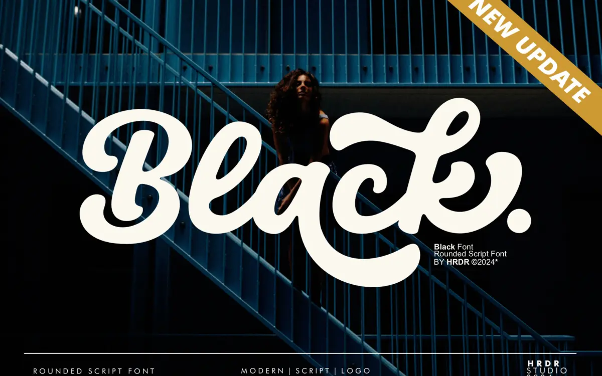
Black is a commercial font sold on Creative Market, so the full version needs a paid license. Get it from the official listing: Black font download.
Need something free? These script fonts from Google Fonts are free for personal and commercial use:
Design style
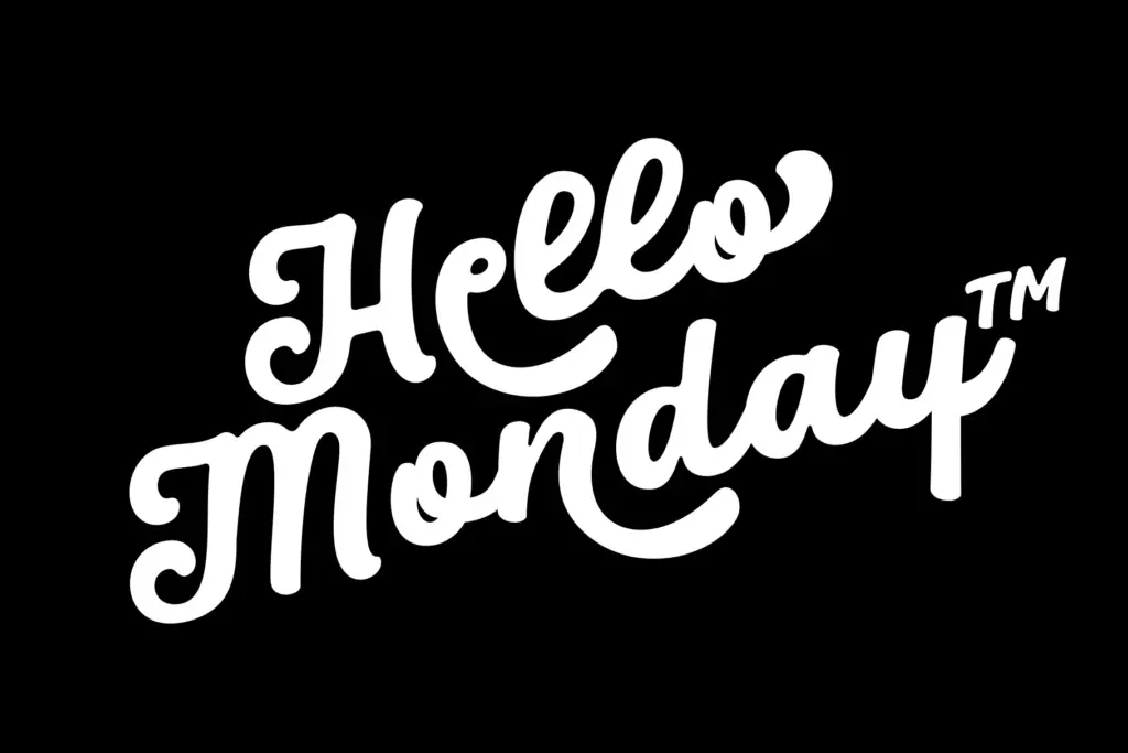
Black is a heavyweight script that leans into thick, rounded strokes rather than the traditional tapered flourish of most connecting scripts. The contrast is low and even, so letters read more like a fat marker than a pointed pen. That gives it a chunky, bouncy rhythm — closer to a hand-lettered logotype than a formal calligraphic script. The retro-and-playful character the designer is going for comes through mostly in the rounded terminals and the way ascenders and descenders loop back on themselves without sharp corners.
Because the strokes are so heavy, the connections between letters matter a lot here. Where the joins work, the word shapes hold together as a single unit, which is the whole appeal of a script like this at large sizes. Where spacing gets tight, especially with certain lowercase pairings, the loops can start to collide or read as blobs rather than letters. This is a font that rewards setting words individually and checking the kerning rather than trusting a paragraph of body text to behave.
Character set and features
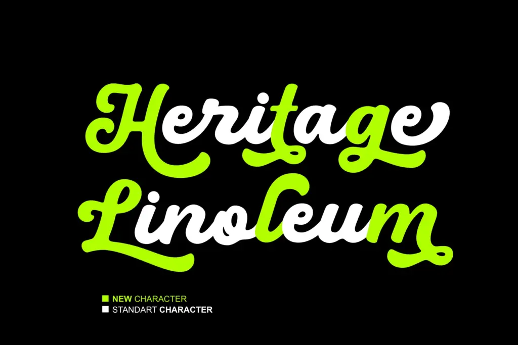
The set covers uppercase and lowercase, numerals, and ligatures, with four stylistic alternate sets (ss01 through ss04) giving you options for repeated letters or awkward pairings without breaking the handwritten illusion. That’s useful in a script font, where the difference between two adjacent letters looking hand-drawn versus mechanically repeated can make or break a word.
Multilingual support is included, which extends the font’s reach beyond English-only branding work, though as with any heavy script, diacritics and accented characters are worth checking individually since rounded scripts often struggle to keep accent marks from crowding the strokes below them. The font also ships with PUA-encoded files, meaning the alternates and ligatures remain accessible in software that doesn’t read OpenType features properly — a practical inclusion for anyone working in Silhouette, Inkscape, or similar cutting and craft software rather than a full type-savvy layout tool. The designer notes updates that added further alternates and a distinct second style, suggesting some ongoing refinement of the letterforms rather than a one-and-done release.
Use cases
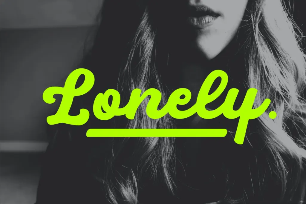
Black is built for short bursts of type: a logotype, a poster headline, a badge, a single word on packaging. Its weight and roundness make it stand out at a glance, which is exactly what a lot of playful branding and craft-market work needs. It’s a poor candidate for anything requiring extended reading — subheads, sentences, or paragraph text will fight the thick strokes and tight loops. Designers doing wedding stationery or anything requiring elegance and restraint should look elsewhere; this font wants attention, not quiet sophistication. For T-shirt graphics, novelty labels, social posts, and logo work aimed at a younger or more casual audience, it does its job without much fuss, provided you’re willing to hand-adjust spacing on the words that need it.
What we liked, and what we didn’t
Strengths
- Four stylistic alternate sets help avoid repetitive letter shapes in short words
- PUA encoding makes the alternates usable in non-OpenType software like Silhouette and Inkscape
- Chunky, rounded strokes give strong shelf and thumbnail presence for logos and packaging
Trade-offs
- Heavy strokes cause some letter pairings to crowd or collide without manual kerning
- Not suited to body text or anything beyond a few words at a time
Black is a solid, playful rounded script suited to short, punchy branding moments rather than continuous text. The alternates and ligatures give it flexibility for logo work, but the heavy strokes demand manual spacing attention on tighter pairings. Good for craft and novelty branding, not for anything requiring subtlety or long-form legibility.

Tmfonts writes independent reviews of typefaces: what each font does well, where it falls short, what it suits, and where it is sold.