
Le Maire: A Thin-Stroke Cursive Script for Quiet Branding Work
Design style
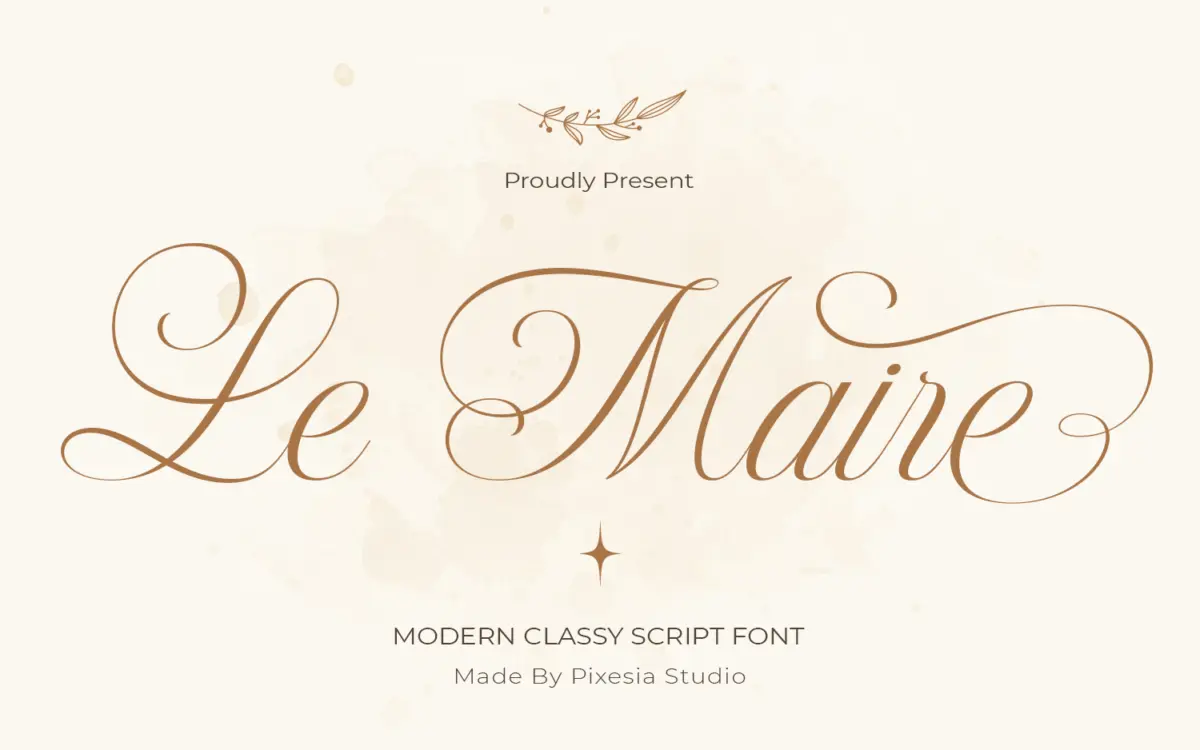
Le Maire sits in the crowded field of monoline-leaning cursive scripts, but it keeps its strokes thinner and more even than most of its competitors. Where a lot of modern scripts flex from hairline to thick within a single letter, Le Maire holds a narrower range of contrast throughout, which gives it a calmer, more restrained feel. The joins are connected and the baseline flows without much interruption, so words read as continuous gestures rather than a string of separate letters.
The lowercase has a light, almost fragile quality — entry and exit strokes are long and thin, and the bowls are kept open rather than tightly closed. Uppercase letters lean on flourish for character: extended swashes on letters like L, M and S give the capitals some presence without pushing the design into ornamental territory. It reads as calligraphy-inspired rather than calligraphy-faithful, which is fine for its intended purpose, but designers looking for the texture of an actual broad-nib or brush script will find this one smoother and more even-handed than that.
Character set and features
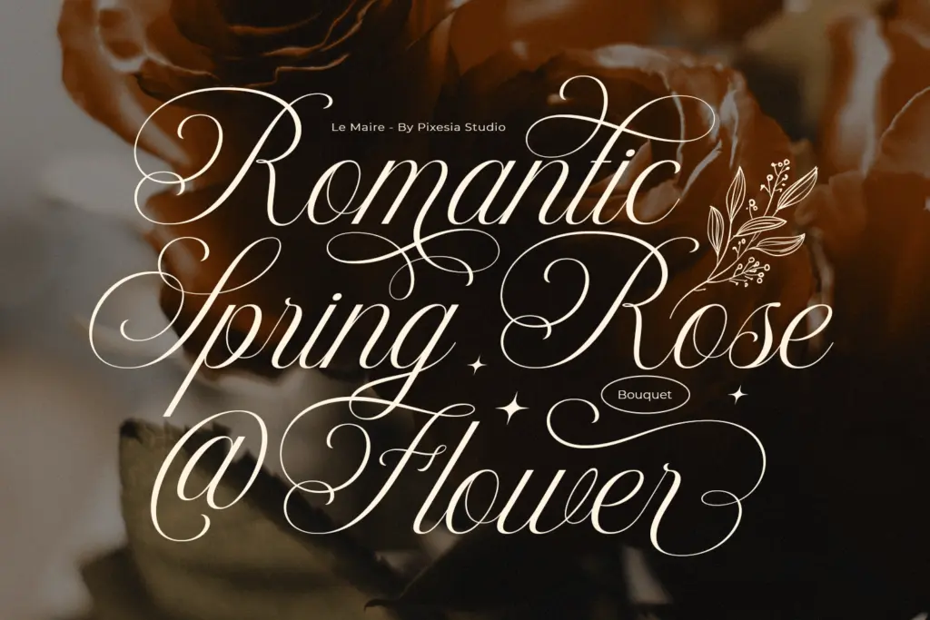
The font includes stylistic alternates and ligatures, which is standard territory for scripts at this price point but still worth using — swapping a few default letterforms for their alternates is usually what separates a generic word from a considered one. Ligatures help smooth over awkward letter pairs, particularly around double letters and certain ascender-descender combinations that are common trouble spots in connected scripts.
Full uppercase and lowercase sets are present, along with numerals and punctuation, and the PUA encoding means the alternates and ligatures are reachable through the glyphs panel without needing a separate OpenType-aware layout tool. That matters in practice: a lot of buyers of scripts like this are working in tools that don’t support automatic ligature substitution, so having every variant mapped to its own character keeps the font usable outside professional layout software.
What isn’t clear from the material available is how deep the alternate set goes — whether it’s a handful of swapped capitals or a fuller system of contextual variants — so treat the feature set as functional rather than exhaustive.
Use cases
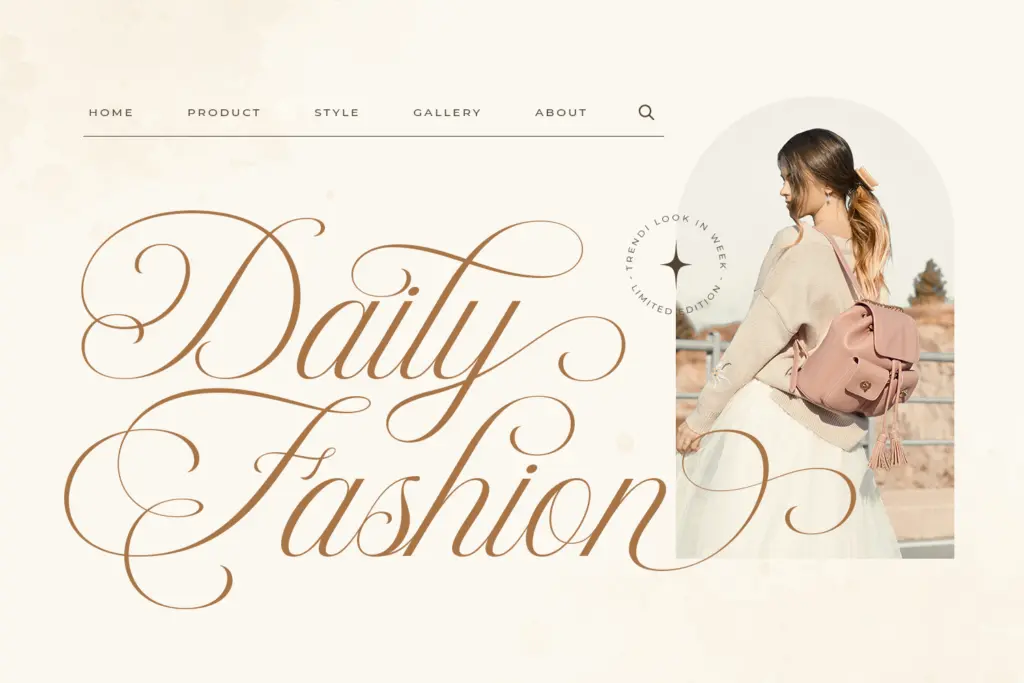
Le Maire’s thin strokes and light overall colour make it best suited to situations where it can be set at a reasonably generous size: logotypes, wordmarks, invitation headers, packaging accents, quote graphics. At small sizes, the hairline strokes will start to disappear on lower-resolution screens or on textured print stock, so this isn’t a script to reach for in body copy or fine print.
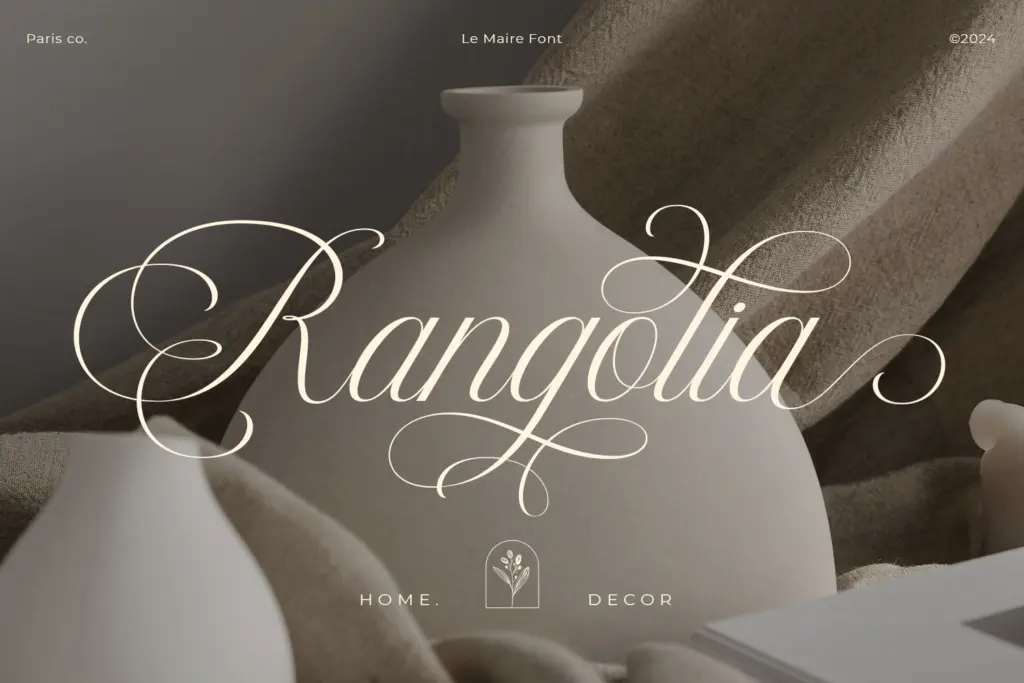
It photographs and prints well as a feature element — a product label, a monogram, a header on a stationery suite — where its restraint reads as sophistication rather than plainness. Pair it with a plain sans or a quiet serif for supporting text; something with real weight will do more to anchor a layout than a second decorative face would. For branding work aiming at a minimal, upscale tone rather than a romantic or vintage one, Le Maire delivers a legitimate, understated option.
What we liked, and what we didn’t
Strengths
- Even, thin stroke weight gives it a restrained, upscale feel distinct from heavier bounce scripts
- PUA encoding makes alternates and ligatures accessible without OpenType-aware software
- Extended swash capitals add character without tipping into full ornamentation
Trade-offs
- Hairline strokes lose definition at small sizes or on textured stock
- Alternate and ligature depth is unclear and may be limited compared to fuller script families
Le Maire is a competent, restrained cursive script that trades expressive contrast for a light, even-handed look suited to logotypes and invitations. It won't hold up at small sizes or on rough print stock, and the alternate set seems more functional than deep, but for feature-size branding work it does the job cleanly.
Verdict

Tmfonts reviews typefaces in depth — every font is tested in real branding, editorial and screen layouts before a word gets written. 555+ fonts reviewed and counting.