
Orange Squash Pro: a chunky vintage serif for retro headlines and logos
Design style
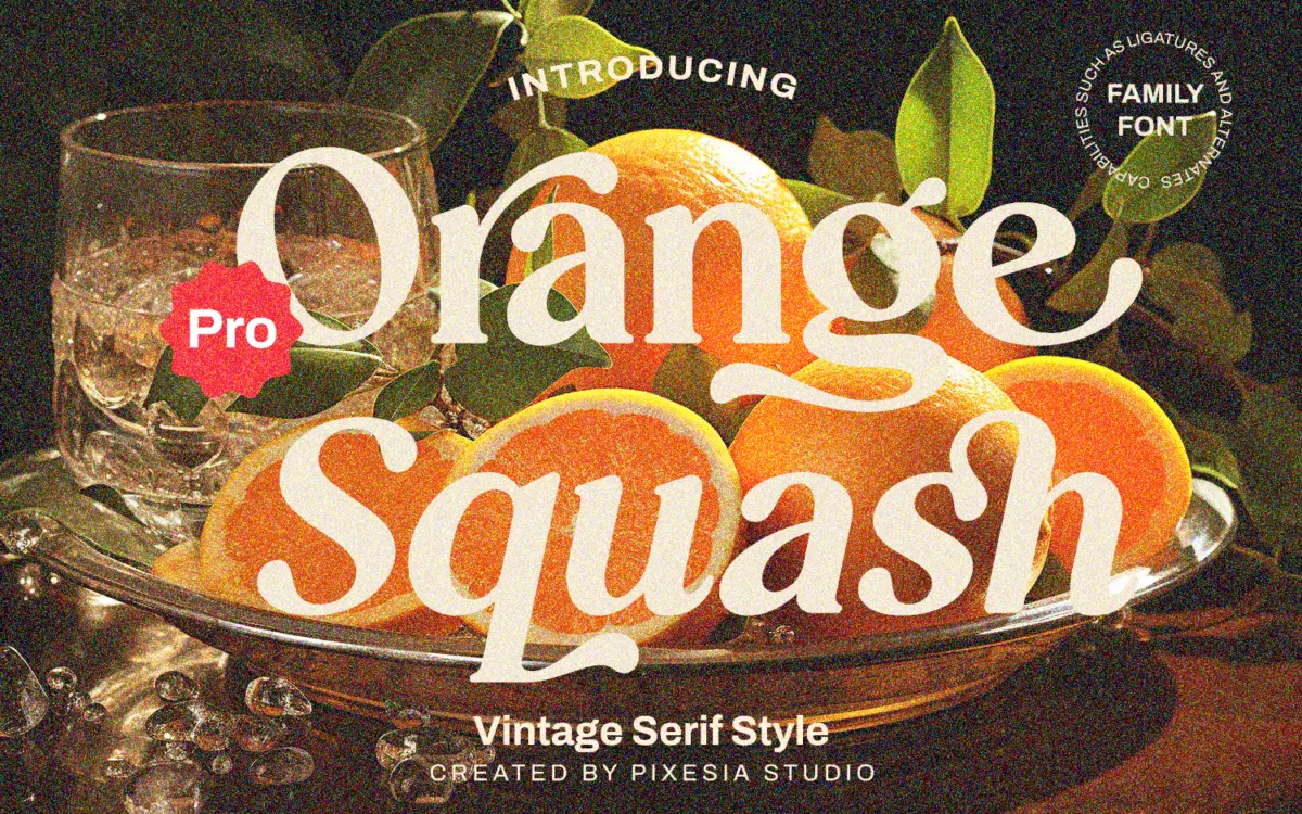
Orange Squash Pro leans into a 70s-flavoured vintage serif look: thick, blunt slab-like serifs paired with curves that bulge slightly more than a strict grotesque revival would allow. The result reads as retro without tipping into pastiche of a single decade. There’s a playful wobble to some of the curved strokes — bowls that swell unevenly, terminals that flare rather than taper cleanly — which gives it a hand-finished, poster-shop feel rather than a corporate one.
It’s a display face first and foremost. The letterforms are drawn for size: the contrast between thick and thin is exaggerated enough that the font loses definition once you shrink it much past headline scale. That’s not a flaw so much as a design decision, but it does mean the family asks to be used loudly rather than quietly.
With two weights and four styles on offer, there’s a bit of room to move between a heavier, more confident version for hero type and a lighter cut for supporting lines, though don’t expect the tonal range of a full text family — this is built around one strong idea, executed a couple of ways.
Character set and features
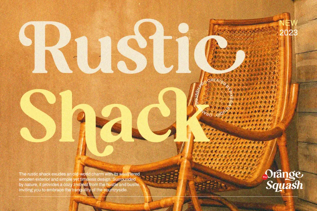
The set includes stylistic alternates and ligatures, which matter more than usual here because the vintage serif genre lives or dies on those small swashy substitutions — an alternate ‘R’ with a kicking leg, a ligated ‘ct’ or ‘st’ that breaks up repetitive letter pairs in a logo lockup. Having them PUA-encoded means you can drop them in without wrestling with the OpenType panel in every app, which is a genuinely useful convenience for anyone working outside Illustrator or InDesign.
Multilingual support across dozens of Latin-based languages is a practical plus if your work crosses borders, though it’s worth remembering that extended diacritic coverage on a display face doesn’t always mean the accented characters sit as gracefully as the base alphabet — worth checking before committing to a project with heavy accent use.
Numerals and punctuation are present and styled to match the general chunkiness, so a price tag or a date stamp won’t feel like it was bolted on from a different font.
Use cases
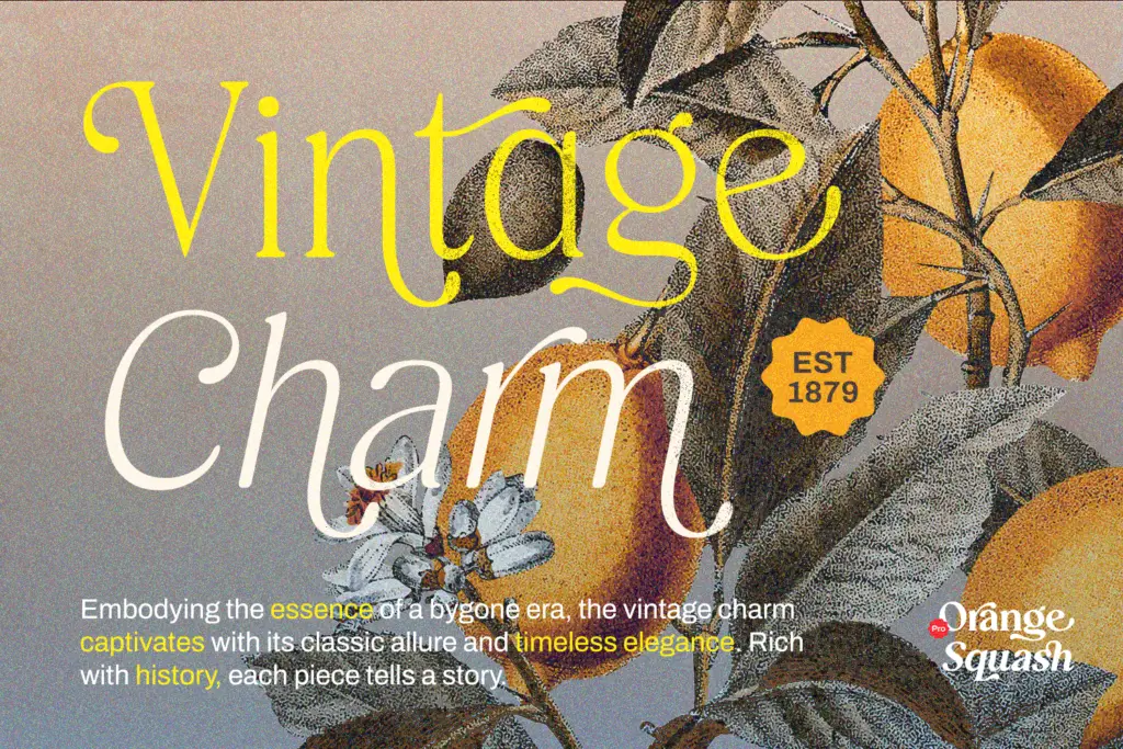
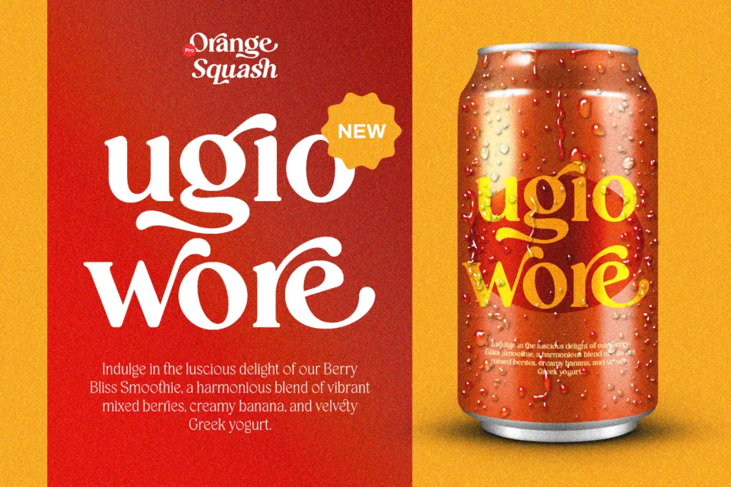
This is a logo-and-headline font, and it’s honest about that. It suits fashion and cosmetics branding that wants a nostalgic, slightly funky edge rather than minimalist restraint — think product labels, packaging call-outs, editorial mastheads, or a boutique’s wordmark. The playful curves and vintage serif structure give it personality that a plain sans or a safe text serif won’t.
It’s less suited to body copy or anything that needs to run in long paragraphs; the character quirks that make it charming at 80pt become noise at 10pt. Pair it sparingly with a plain sans or serif for supporting text rather than asking it to do double duty across a whole layout.
What we liked, and what we didn’t
Strengths
- Stylistic alternates and ligatures give logo lockups real character variation.
- PUA encoding makes the extra glyphs usable without digging through OpenType panels.
- Broad language support suits branding work that needs to travel across markets.
Trade-offs
- Heavy contrast and quirky curves lose clarity below headline sizes.
- Two weights limit how far the family can stretch across a layout on its own.
Orange Squash Pro is a confident, playful vintage serif that does one job well: bold, retro-leaning headlines and logotypes. It's not built for text, and the stylistic quirks that make it fun at large sizes will work against you if you push it smaller than intended.
Verdict

Tmfonts reviews typefaces in depth — every font is tested in real branding, editorial and screen layouts before a word gets written. 555+ fonts reviewed and counting.