
Upstate: A Collegiate Slab Serif for Team Names and Varsity Logos
Design style
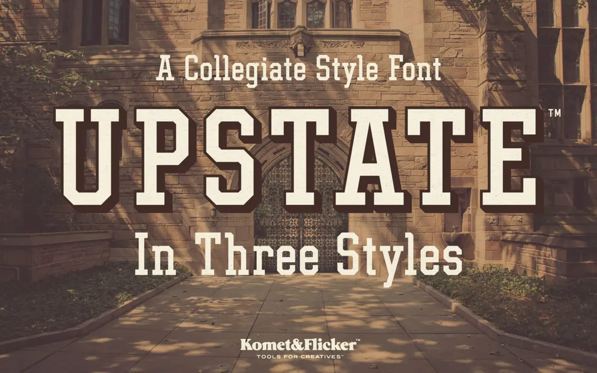
Upstate is built on the same bones as old varsity block lettering: thick, squared-off slabs, angular joins, and strokes that stay close to a single confident weight. It doesn’t try to soften the collegiate reference with any nostalgic wobble — the letters are drawn cleanly, with hard corners and minimal curve, which gives it a stamped, athletic-jersey feel rather than a hand-painted one. The slab serifs are stubby rather than bracketed, more structural than decorative, which suits the sport-and-school brief it’s chasing.
What keeps it from reading as generic block lettering is the angularity in the diagonals — the A, M, N and W lean into sharp, deliberate cuts rather than smooth transitions. That’s a small detail but it does most of the work of making the face feel like it belongs on a letterman jacket rather than a spreadsheet header.
Character set and features
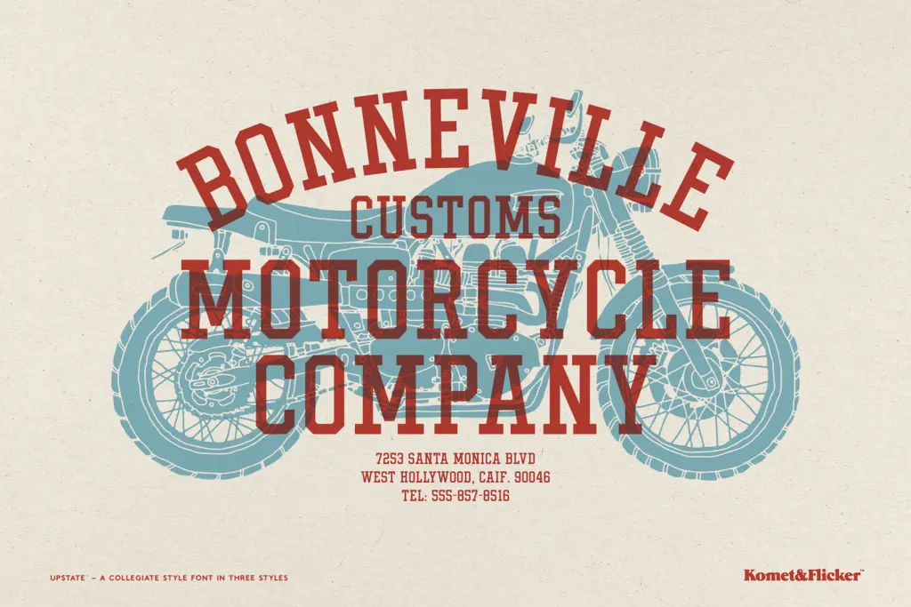
The family covers upper and lowercase A–Z, numerals, punctuation and a set of European characters, so basic multilingual setting is possible without hunting for glyph substitutes. It ships in three constructions: a plain Regular, a Shadow Outline, and a two-layer Shadow Base plus Shadow Fill pair designed to be stacked to build a dimensional shadow effect.
That layered approach is really the headline feature here. Used together, the Base and Fill styles let you build a offset-shadow look — the kind of thing you’d associate with screen-printed team merch — without hand-building the effect in outlines yourself. It’s a smart bit of engineering for a display face, though it does mean the font is really doing one job well (a chunky, shadowed collegiate mark) rather than offering a wide stylistic range within itself. There’s no italic, no light or condensed companion, so what you see in the three styles is the extent of the family.
Lowercase is present but, as with most slab-block collegiate faces, it’s the uppercase that carries the design’s identity — the lowercase reads more as a practical addition than a fully resolved secondary voice.
Use cases
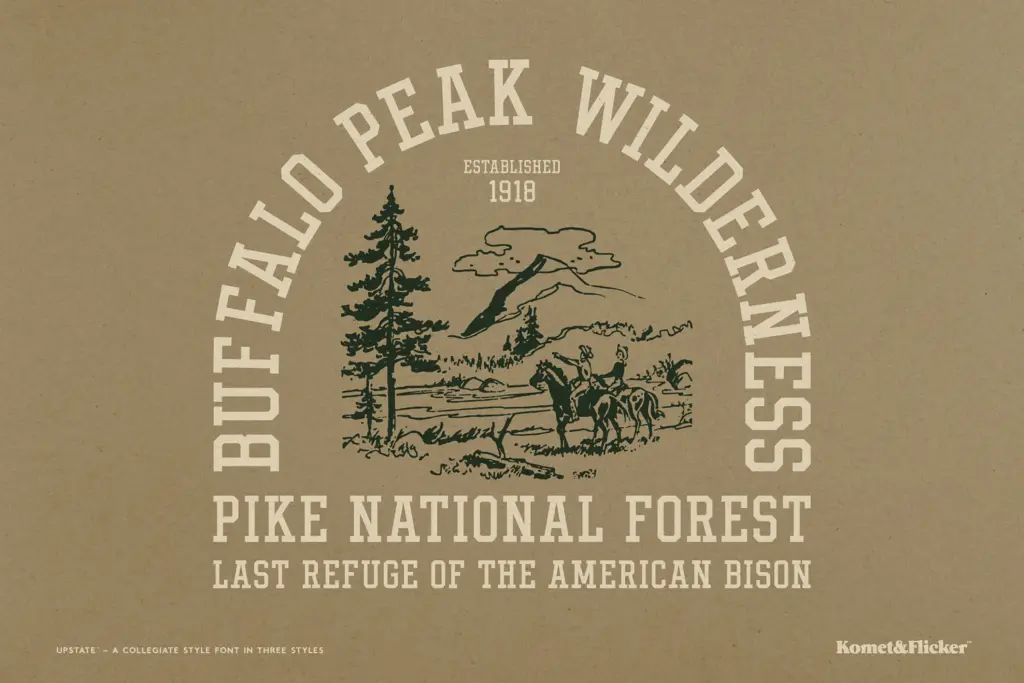
This is a font for short, loud words: team names, school crests, apparel graphics, badge logos, posters for homecoming games and pep rallies. The shadow construction is particularly suited to merchandise and print work where a printed, slightly dimensional mark reads better than a flat one — hoodies, mugs, patches, letterhead for an imagined athletic department.
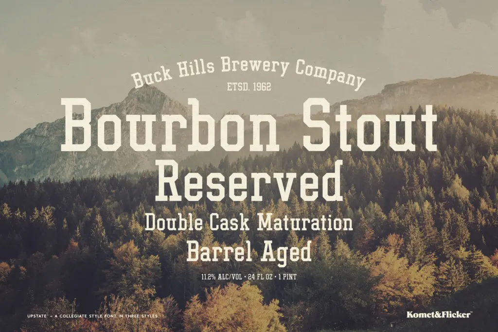
It is not a body-text or long-headline font. At small sizes the slab weight and tight construction will clog, and the letterforms are heavy enough that a full sentence set in it becomes hard to read quickly. Keep it to a handful of words — a team name, a year, a location — and let the surrounding layout carry the rest of the message. For anyone building retro-Americana branding, craft beer labels with a collegiate wink, or varsity-style apparel mockups, Upstate does the job it was built for without asking you to dress it up further.
What we liked, and what we didn’t
Strengths
- The layered Shadow Base and Fill styles build a convincing dimensional effect without manual outline work.
- Angular diagonals give it a distinct stamped, athletic feel rather than generic block lettering.
- European character support extends its usability beyond basic English-only projects.
Trade-offs
- No lowercase voice distinct enough to carry text beyond short display words.
- The family offers only one stylistic register — no condensed, light, or italic variant to extend its range.
Upstate is a competent, purpose-built collegiate slab that does one job — bold, shadowed team-style lettering — cleanly and without fuss. It won't stretch beyond short-word display use, but within that lane it's a reliable, well-constructed choice.
Verdict

Tmfonts reviews typefaces in depth — every font is tested in real branding, editorial and screen layouts before a word gets written. 555+ fonts reviewed and counting.