
Kodam Stylish Serif: a curved, contrast-light serif for branding work
Design style
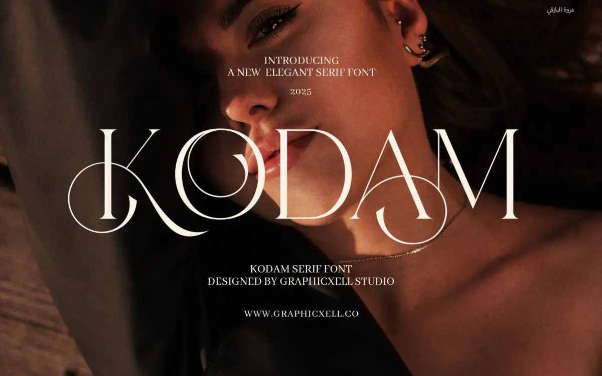
Kodam is a serif built for headlines, not paragraphs. The curves are rounded rather than sharp, the contrast between thick and thin strokes is kept modest, and the serifs themselves are soft, almost bracketed nubs rather than the crisp wedges you’d find in a transitional or Didone. That softness is the whole personality of the font: it reads as approachable and a little decorative, closer to a boutique wordmark than a text face borrowed from print tradition.
The proportions lean slightly condensed in places and generously spaced in others, which gives individual words a distinct silhouette but means the rhythm across a full line can feel uneven if you’re not paying attention to kerning. This isn’t a font drawn to disappear into a paragraph — it’s drawn to be looked at as a single word or short phrase, which is a legitimate design goal, just a narrow one.
Character set and features
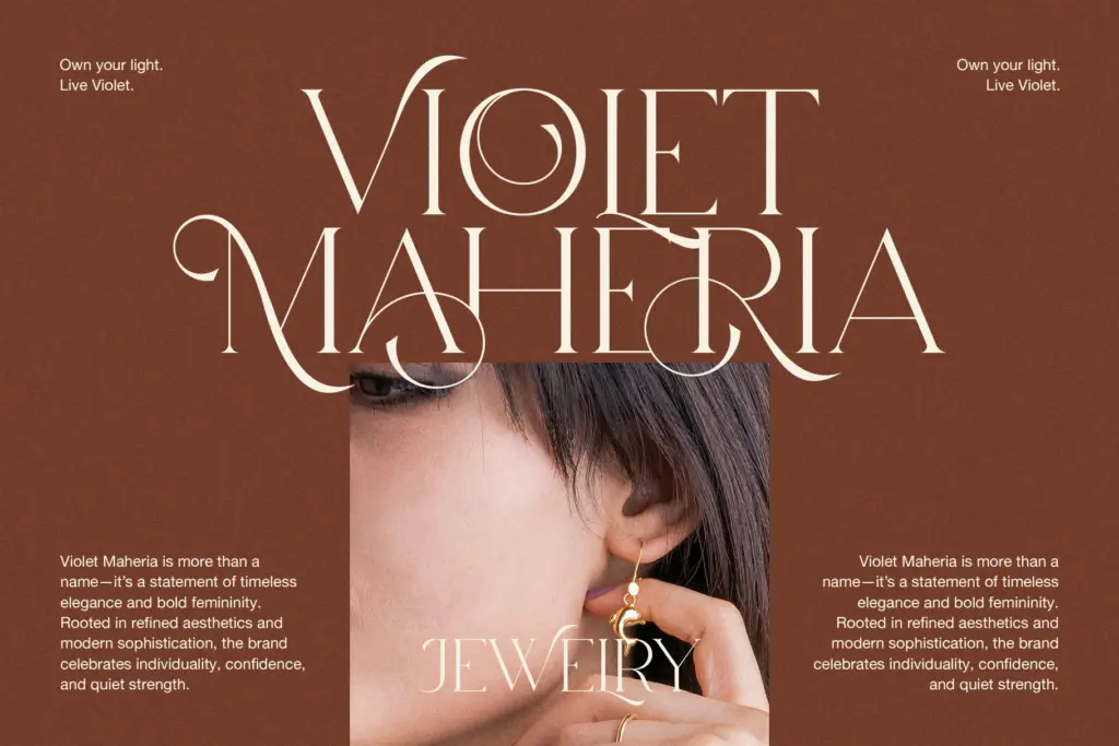
The letterforms hold together best in the lowercase, where the rounded terminals and moderate x-height keep things legible even as the curves get fairly ornate. Capitals are more flourished, with a few letters carrying extra swash energy that makes them better suited to initials or short logotypes than to full-caps headlines. Numerals and punctuation are present but play a supporting role — nothing here suggests this was built with tabular data or long-form typesetting in mind.
There’s no indication of extended language support or a built-in italic or companion weight, so treat this as a single-style display serif rather than a full family. Anyone hoping for small caps, old-style figures, or a range of OpenType alternates should look elsewhere; Kodam’s feature set is modest, and the seller’s claims of
What we liked, and what we didn’t
Strengths
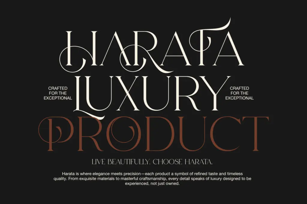
- Rounded, low-contrast serifs give it a friendly, approachable character.
- Lowercase letterforms stay legible even with the added curve detail.
- Works well as a short standalone wordmark or logotype element.
Trade-offs
- Uneven spacing across longer lines means kerning needs manual attention.
- No companion weights, italics, or extended OpenType features to build a full identity system.
Kodam is a pleasant, softly curved display serif that does one job well: short branding lines and wordmarks. It isn't built for body text or heavy multilingual work, and the feature set is thin, but for a single-word logotype or a label headline it has real charm.
Verdict

Tmfonts reviews typefaces in depth — every font is tested in real branding, editorial and screen layouts before a word gets written. 555+ fonts reviewed and counting.