
Vintage Serif & Antique Script Font: an ink-textured duo for heritage branding
Design style
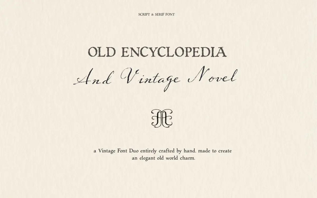
This is a two-font bundle built around a single idea: everything should look like it was written by hand and printed on rough paper. The script half, Vintage Novel, leans into a loose, antique cursive with uneven baselines and joins that don’t quite match letter to letter — the kind of irregularity that reads as handmade rather than templated. The serif half, Encyclopedia, is pitched as a vintage typewriter-style face, but it’s drawn with the same hand-lettered looseness as its partner rather than the mechanical regularity of an actual typewriter font. Both carry a deliberate ink-on-craft-paper texture: slightly broken strokes, soft edges, the odd blot at a stroke end. It’s a consistent aesthetic and the two faces clearly belong together, which is the main job of a duo like this.
The point of view is nostalgic rather than refined — this isn’t a font pairing chasing precision or geometric discipline. It’s chasing the feeling of an old letterpress print or a diary found in an attic. If that’s the mood you’re after, it delivers it without much compromise.
Character set and features
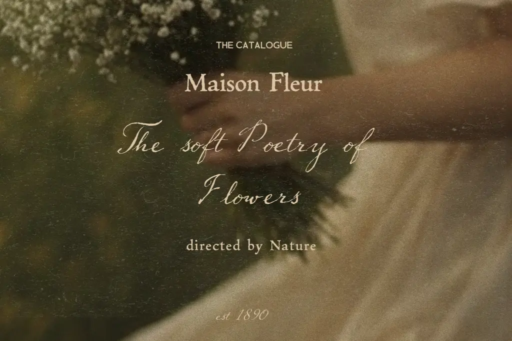
The seller doesn’t specify glyph counts, ligature sets, or language coverage beyond the basics, so treat the letterforms on their own terms rather than expecting an extensive OpenType feature set. What’s clear from the brief is a script and a serif, each as a single weight, each carrying the same worn-ink texture. That texture is baked into the outlines rather than applied as a separate effect, which means it’s consistent across every letter but also fixed — you can’t dial it up or down. Anyone hoping for swash alternates, contextual variants, or a broad multilingual set should confirm before committing, because none of that is claimed here.
The textured stroke treatment is the feature worth noting most: it gives both faces a tactile quality that a clean vector script or slab serif can’t fake, but it also means fine detail can get muddy at small sizes, since the broken edges start to compete with the letter shapes themselves.
Use cases
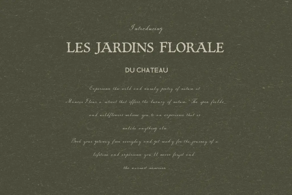
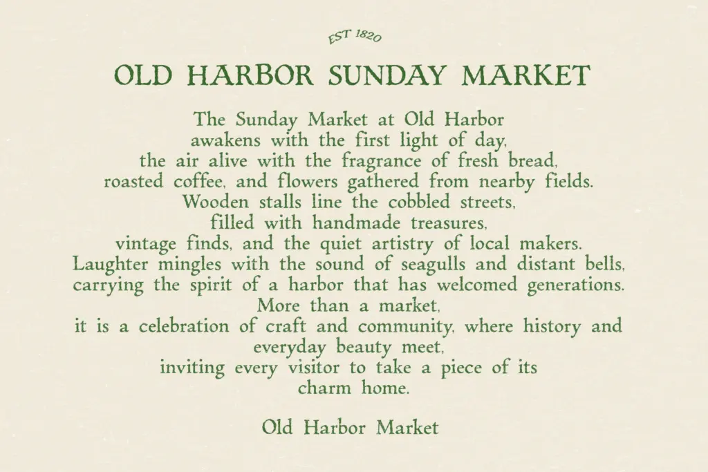
This duo suits short-form, atmosphere-driven work: a logotype for a bakery or bookshop, a wedding invitation with a rustic or countryside theme, packaging for a small-batch product, a book cover that wants to feel found rather than designed. The script works best as a headline or signature element — a name, a title, a few words set large enough that the ink texture reads as character rather than noise. The serif is the natural companion for supporting text: subheads, short taglines, a line of copy under the script’s flourish, though it’s not built for dense paragraphs of body text and starts to feel busy past a sentence or two.
Where it struggles is in any context asking for neutrality or scale flexibility. Corporate branding, UI text, or anything that needs to shrink to caption size will fight the texture and the script’s irregular rhythm. This is a mood font pair, not a workhorse system — best kept to headlines, short editorial moments, and one-off pieces where the heritage feel is the whole point rather than an accent.
What we liked, and what we didn’t
Strengths
- The script and serif share a consistent ink-on-paper texture that makes them feel genuinely paired.
- The loose, irregular script avoids the templated look common in handwriting fonts.
- Well suited to short, mood-driven applications like logos and invitations.
Trade-offs
- The worn texture can turn muddy at small sizes or in dense text.
- No confirmed ligatures, alternates, or extended language support to broaden its use.
A cohesive, well-matched duo for anyone chasing a worn, handwritten heritage look. The ink texture is charming at headline sizes but works against clarity once you push it smaller or longer, and there's no evidence of extended features to widen its range.
Verdict

Tmfonts reviews typefaces in depth — every font is tested in real branding, editorial and screen layouts before a word gets written. 555+ fonts reviewed and counting.