
Dear Camille: a pencil-textured cursive for intimate, handwritten-feeling projects
Design style
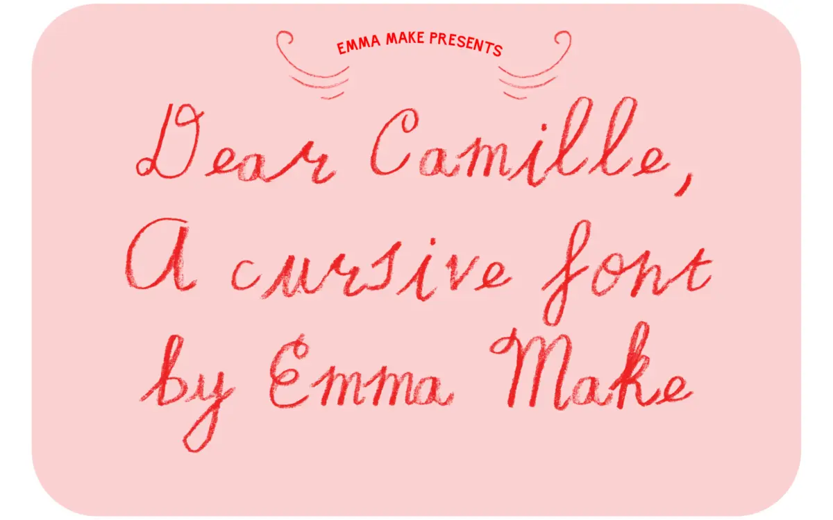
Dear Camille is built around the idea of a pencil-crayon line rather than a pen nib. The strokes carry a soft, slightly broken texture instead of the clean vector edge you get from most script fonts, and that grain is the whole point of the design. Letters lean forward at a relaxed cursive angle, joins are loose rather than mechanically consistent, and there’s a visible looseness in how the pencil texture wobbles along each stroke. It reads as personal rather than polished, closer to a note scribbled in the margin than a formal invitation script.
The weight is light throughout, with no real contrast between thick and thin strokes — the texture does the work that contrast usually does in a script face. That keeps it from feeling like a copy of the countless flowing wedding scripts already on the market. It has a rougher, more domestic character, closer to a diary entry than a monogram.
Character set and features
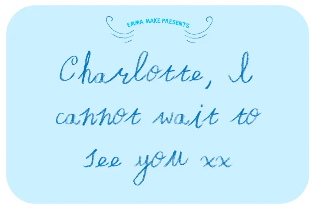
As a cursive script, most lowercase letters are designed to connect, and the font relies on that joining behaviour to feel handwritten rather than typeset. That means short words and full sentences look more convincing than isolated letters or single initials — set a big solo capital and the pencil texture reads as noise rather than charm. The seller notes the font ships as two files: one intended for use in Photoshop, and a second, more broadly compatible version meant for other software. That’s an unusual way to package a script font, and it’s worth knowing going in — the
What we liked, and what we didn’t
Strengths
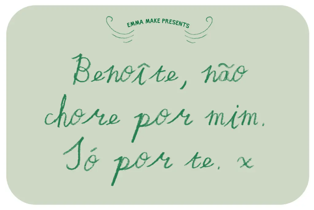
- The pencil-crayon texture gives it a genuinely handmade feel rather than a generic script look.
- Loose, human joins make short phrases and signatures feel personal rather than templated.
- Works well for intimate, low-formality contexts like letters and personal stationery.
Trade-offs
- The split between a Photoshop-only file and a general-use file complicates setup depending on your software.
- Texture and looseness make it hard to read at small sizes or in long passages of text.
Dear Camille has a distinctive, tender pencil-crayon texture that most scripts don't attempt, and it earns its handwritten claim honestly. But the split-file setup and limited legibility at small sizes mean it needs a careful hand to use well.
Verdict

Tmfonts reviews typefaces in depth — every font is tested in real branding, editorial and screen layouts before a word gets written. 555+ fonts reviewed and counting.