
Limoncello Recipe: a casual handwritten script for recipe cards and kitchen branding
Design style
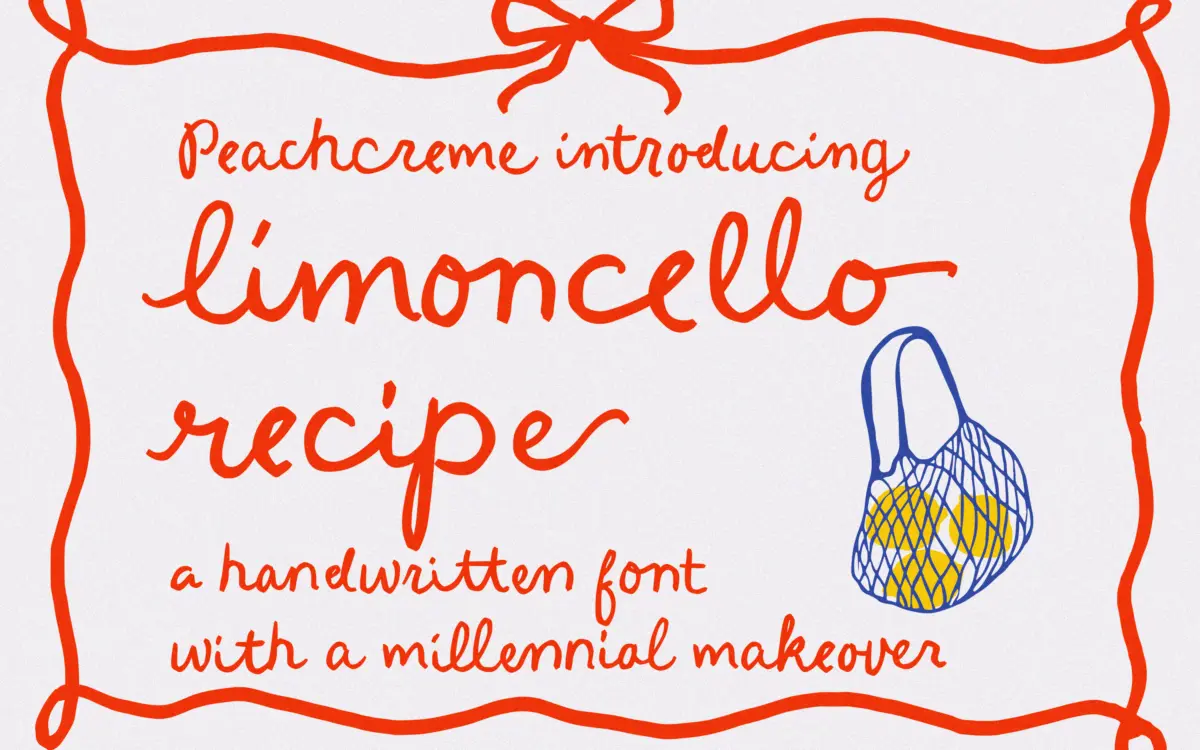
Limoncello Recipe leans into the look of a note scrawled in the margin of a cookbook, not a formal invitation hand. The strokes wobble slightly rather than flow with calligraphic control, and that’s the point: it reads as a real person writing quickly, not a font pretending to be one. Letters sit at slightly uneven baselines and the joins between them have a loose, almost hurried quality. There’s no pretense of contrast or polish here — it’s a casual, single-weight script that trades elegance for warmth.
Where it earns its keep is in consistency of mood. Every letterform commits to the same relaxed, slightly unrefined energy, so the face doesn’t feel like a decorative script bolted onto a body of text. It reads as one voice throughout, which is harder to pull off than it looks when a font is built around irregularity.
Character set and features
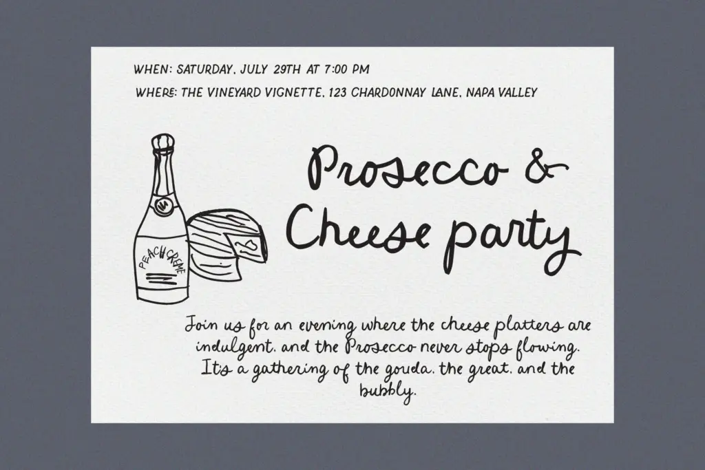
The seller notes 84 standard ligatures, which is the real engine of this typeface. Handwriting fonts live or die on how their letters connect, and a wide ligature set means fewer awkward collisions between letter pairs — the kind of thing that makes handwritten scripts look mechanical the moment you type more than a word or two. Beginning and ending swashes add some flourish to word openers and closers, giving you a way to dress up a heading without changing the whole word.
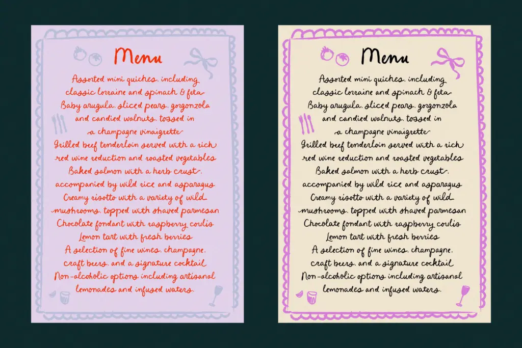
That said, this is a font built for short bursts of text. The deliberate unevenness that makes a single word charming becomes visual noise across a paragraph — the eye has to work harder to parse a wobbling baseline over multiple lines. Treat it as a display and accent typeface, not a body-copy tool, and it behaves well. Push it into long-form use and the charm turns into fatigue.
Use cases
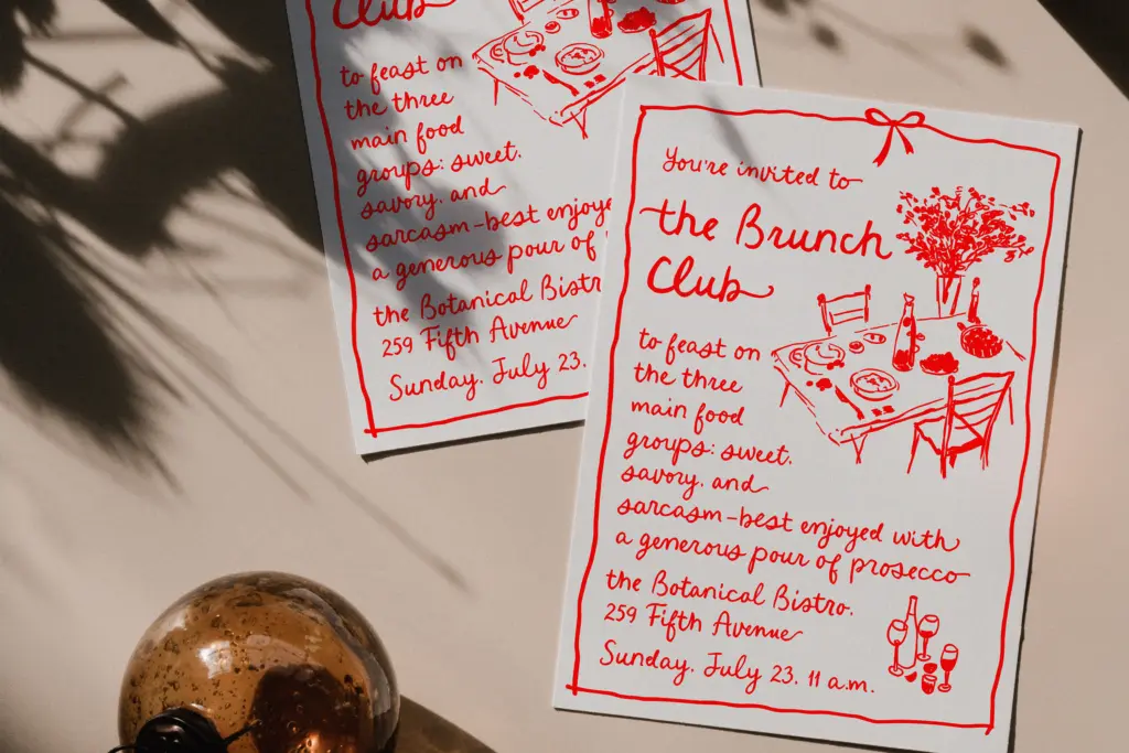
This is a font for projects that want to look hand-touched rather than typeset: recipe cards, kitchen and food branding, packaging for small-batch goods, personal stationery, and the occasional wedding detail where a casual tone fits better than a formal script. The name and the ligature-heavy connections suggest it was built with food and lifestyle branding specifically in mind, and it shows — there’s a homemade, unfussy quality that would feel out of place on a law firm’s letterhead but right at home on a jam jar label or a farmers’-market sign.
Pair it with a plain, quiet sans or serif for supporting text; it needs a neutral partner so its irregularity reads as intentional rather than accidental. Keep it to headlines, titles, and short phrases, and let a more restrained typeface carry the paragraphs. Used that way, it does a specific job well: it makes a design feel personal without needing hand-lettering from scratch.
What we liked, and what we didn’t
Strengths
- Wide ligature set (84) keeps connected letters looking natural rather than mechanically joined
- Consistent, committed handwritten character that doesn't feel like a template script
- Swash alternates give headline-length text some flourish without extra effort
Trade-offs
- Uneven baselines and casual strokes become tiring to read over more than a few words
- Not suited to formal or elegant branding contexts despite being a script font
Limoncello Recipe is a warm, unpolished script that does one job well: short, personal-feeling headlines and labels for food and lifestyle branding. It isn't built for paragraphs or formal work, but within its lane the ligature set and swashes give it real character.
Verdict

Tmfonts reviews typefaces in depth — every font is tested in real branding, editorial and screen layouts before a word gets written. 555+ fonts reviewed and counting.