
The Cutouts: a hand-scissored display face for jazz-poster energy
Design style
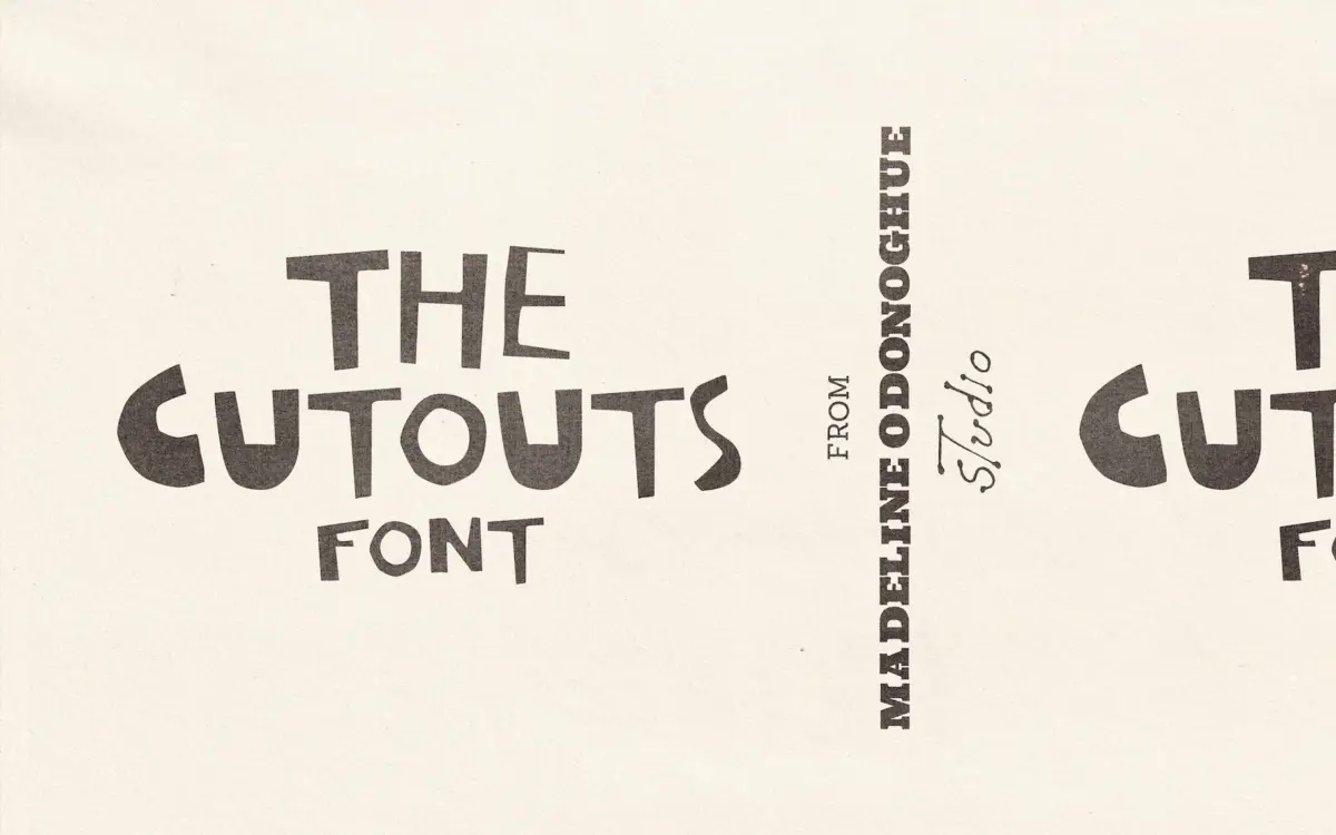
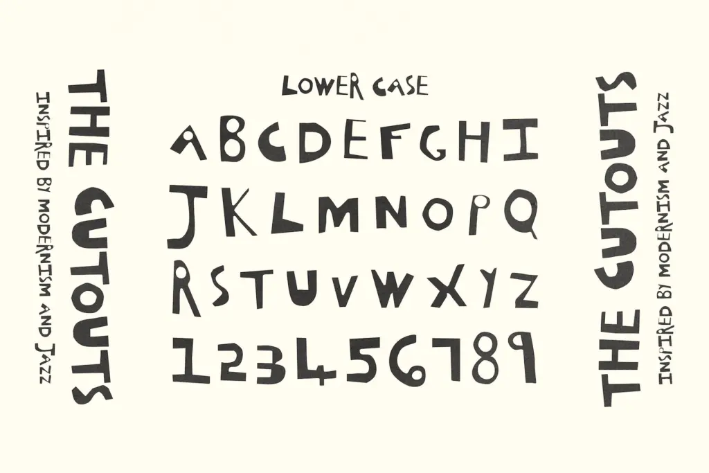
The Cutouts is built from paper, not pen strokes, and it looks it. Every uppercase letter was cut by hand with scissors, so the edges wobble, the curves flatten into short straight segments, and no two strokes of similar weight are quite the same width. It reads as a direct nod to Matisse’s late paper cut-outs and the DIY collage aesthetic of vintage jazz posters, and it commits to that reference rather than just gesturing at it. There’s nothing tidied up in Illustrator here — the raggedness is the whole point.
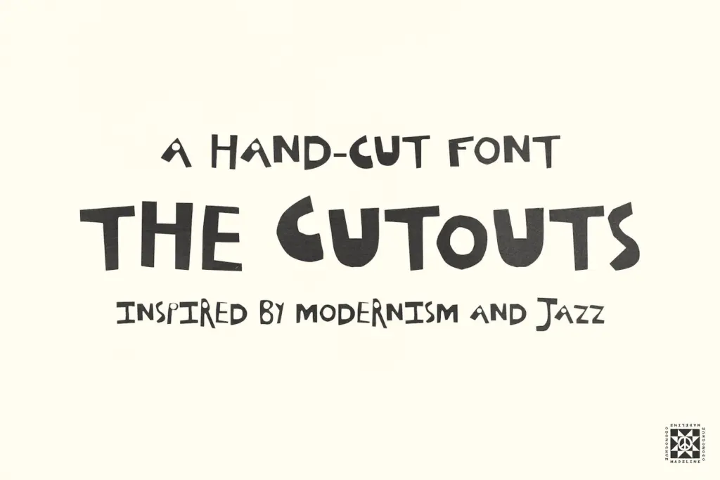
What’s unusual is the second set mapped to lowercase. It isn’t a genuine minuscule alphabet with ascenders and descenders; it’s a finer, lighter cut of the same capital forms. That means you don’t get true lowercase behaviour, but you do get a built-in second weight without switching fonts, which lets you layer a bold cut-out headline over a thinner cut-out subhead using one file. It’s a clever workaround for a font that was never going to have conventional case logic anyway.
Character set and features
The set covers A–Z twice — once as the heavier hand-cut capitals, once as the lighter version sitting on the lowercase keys — plus some alternate letterforms and basic punctuation. The seller is upfront that it isn’t a full symbol set, and that’s worth taking seriously: there’s no expectation here of extended language support, tabular figures, or a run of ligatures. This is a display alphabet, not a text system, and it’s scoped accordingly.
Because the letters were cut individually, spacing is uneven by nature — some pairs sit close, others gap oddly — which is consistent with the analogue premise but means you should expect to kern by eye rather than trust the defaults for anything beyond a word or two. The alternates help here, giving you a way to swap out a letter that’s fighting its neighbours in a specific word.
Use cases
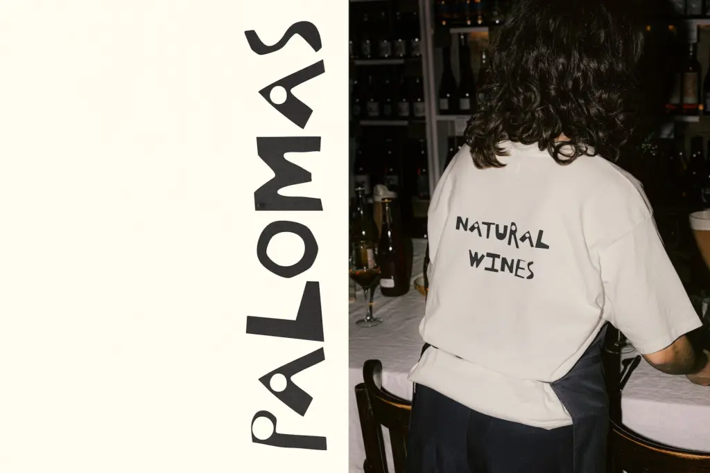
This is a font for headlines, not paragraphs. At poster scale — a gig flyer, an album cover, a zine masthead — the torn edges and irregular strokes give it exactly the handmade texture the brief promises, and the two-weight trick lets you build a title and a secondary line without importing a second typeface. It suits jazz-adjacent branding, art-book covers, and any identity work that wants to signal collage and craft rather than polish.
It will fight you at small sizes: the rough edges that read as charming at three inches tall turn to noise at body-copy size, and the lack of true lowercase rules out running text entirely. It’s also not the choice for a client who needs a font that behaves the same way twice — if consistency and predictability matter more than character, look elsewhere. But for a single striking word on a poster, a record sleeve, or a hand-lettered-feeling logotype, it does a specific job well and doesn’t pretend to do more than that.
What we liked, and what we didn’t
Strengths
- The hand-cut edges give it a genuinely analogue, collage-made texture rather than a filtered approximation of one.
- The lighter 'lowercase' set doubles as a built-in secondary weight for pairing headline and subhead in one font.
- Alternate letterforms give some room to fix awkward pairings without leaving the file.
Trade-offs
- No true lowercase means it can't function as a normal alphabet — every word reads as either heavy caps or light caps.
- The rough, uneven strokes that work at poster scale turn illegible well before body-text sizes.
The Cutouts delivers exactly the raw, hand-scissored texture it promises, with a clever built-in second weight standing in for lowercase. It's a strong, narrow-purpose display face for posters and covers, not a general-purpose typeface, and its charm fades fast below headline size.
Verdict

Tmfonts reviews typefaces in depth — every font is tested in real branding, editorial and screen layouts before a word gets written. 555+ fonts reviewed and counting.