
Brown Sugar: an uppercase-only display sans for punchy branding and posters
Design style
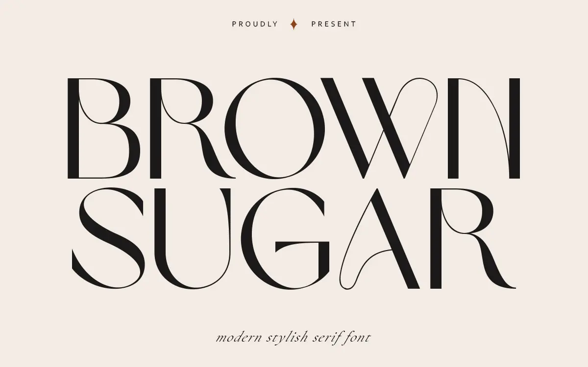
Brown Sugar is a display face built entirely around capitals. There’s no lowercase set here, which immediately tells you what kind of job it’s meant for: short, declarative type rather than continuous reading. The letters carry a slightly condensed, upright posture, with strokes that stay close to a single weight throughout the alphabet. Where the seller describes it as having a “modern stylish” character, that reads accurately in practice — the shapes are clean rather than ornamental, closer to a sans-serif construction than anything with bracketed serifs or calligraphic flourish. There’s a mild geometric squareness to letters like O and G, and a consistent x-height-adjacent cap height that keeps the whole set feeling level when set in a line.
It doesn’t try to be expressive. There’s no swash, no contrast between thick and thin strokes, no historical reference point it’s leaning on. That restraint is the point — it’s a workhorse capital set meant to sit quietly under an image or inside a badge rather than announce itself as a personality font.

Character set and features
The character set covers uppercase letters, a full run of numerals, and a fairly generous range of punctuation. That’s it. No lowercase, no accented characters mentioned, no alternates, no ligatures. This is a narrow toolkit, and it’s worth being clear-eyed about that going in — you’re buying a set of capital letters and numbers, not a full working typeface family.
Because there’s only one case to work with, the font behaves less like body text and more like a stencil kit: you arrange short words, initials, or numerals and let the spacing and scale do the rest. The punctuation set gives you enough to build out short taglines, prices, or badge text without needing to borrow characters from elsewhere. The two format options — OTF and TTF — cover the standard bases for most design software without complication.
Use cases
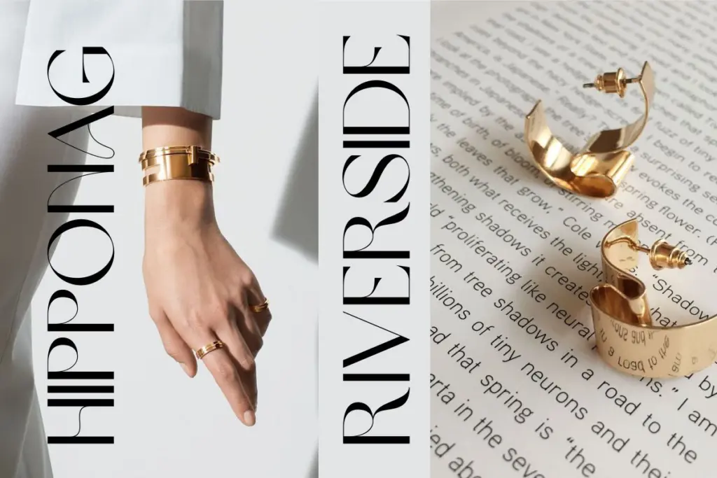
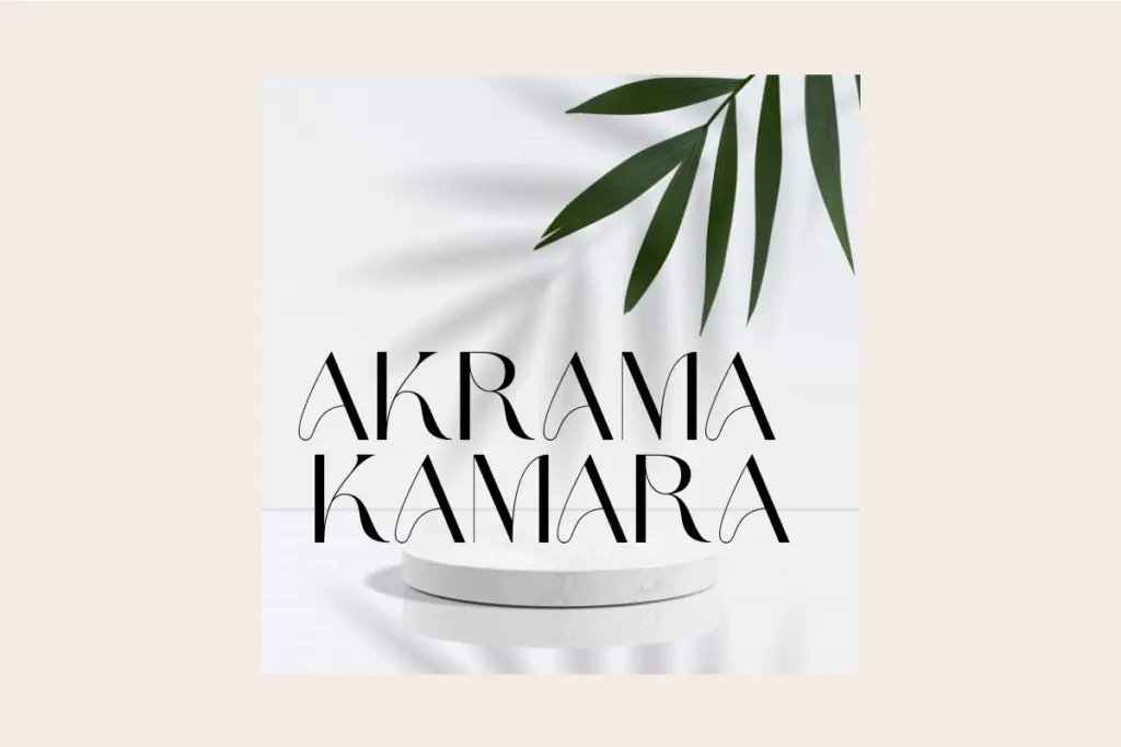
Brown Sugar is suited to work where a short burst of capital letters carries the whole message: poster headlines, badge and stamp lockups, packaging call-outs, small branding marks, or a line of display text on a web banner. Numerals hold up well for pricing tags or date stamps on invitations and event graphics. Because the letterforms are even-weighted and unfussy, the face pairs easily with busier illustration or photography without competing for attention — it’s the kind of type you drop into a badge and expect to disappear into the background of a good layout.
What it won’t do is carry a paragraph, a menu, or any text meant to be read at length — there’s no lowercase to fall back on, and stacking capitals for more than a few words starts to feel heavy and slows reading. Designers should plan around that limitation from the start rather than discover it mid-project. For a logotype, a small badge, or a one-line poster statement, it does the job cleanly; for anything requiring sentence-level text, it needs a different typeface entirely, paired in from elsewhere.
What we liked, and what we didn’t
Strengths
- Even, consistent stroke weight keeps capital-only lines looking tidy at a glance.
- Clean geometric letterforms sit well inside badges, stamps, and short logotypes.
- Generous punctuation and numeral set covers most short-form display needs.
Trade-offs
- No lowercase letters at all, which rules out body copy or longer headlines.
- No alternates or ligatures, so there's limited room to add character to repeated words.
Brown Sugar does one job cleanly: short, capital-only display text for badges, posters, and branding marks. It's competent and unfussy, but the lack of a lowercase set narrows its use considerably. Buy it knowing it's a headline tool, not a working typeface family.
Verdict

Tmfonts reviews typefaces in depth — every font is tested in real branding, editorial and screen layouts before a word gets written. 555+ fonts reviewed and counting.