
Vintage Varsity: a chunky collegiate slab for letterman-style branding
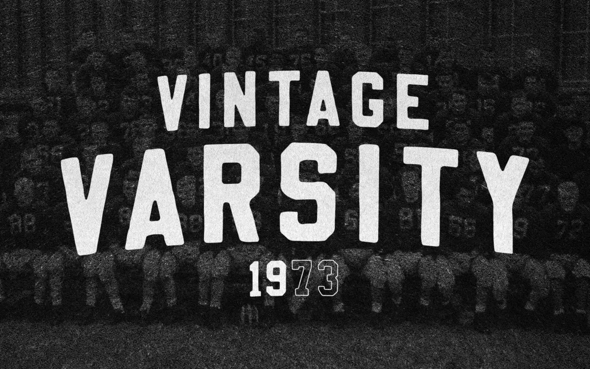
Design style
Vintage Varsity does exactly one thing and does it with conviction: it recreates the felt-appliqué block letters stitched onto letterman jackets. The strokes are thick, upright, and slightly uneven at the edges, as if cut from felt with scissors rather than drawn on a grid. Corners are rounded off just enough to read as handmade without turning soft or bubbly. There’s no attempt at classical proportion here — the letters are squared up, wide-set, and built for maximum presence rather than elegant rhythm.
Contrast is minimal, which fits the source material: felt letters don’t have thin strokes and thick strokes, they have one thickness, and this typeface commits to that. The slab serifs, where they appear, are stubby and blunt rather than bracketed or refined. It’s a typeface with a costume on, and it wears that costume well. What it isn’t is subtle. There’s no register where this face reads as quiet or neutral.
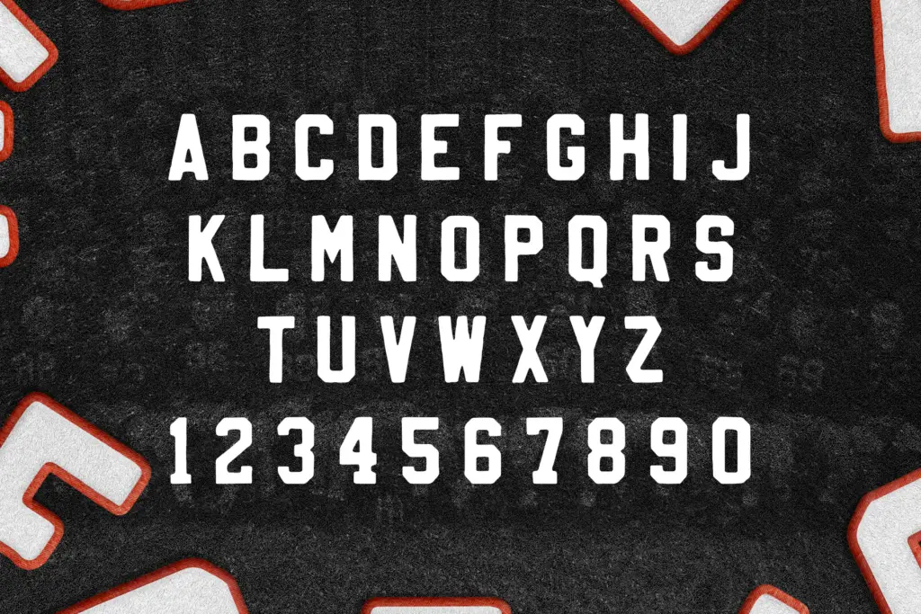
Character set and features
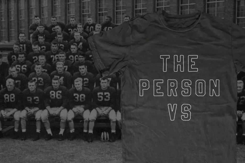
The letterforms carry a consistent hand-cut texture — slightly irregular edges and corner rounding that varies just enough from letter to letter to avoid looking vector-perfect. That irregularity is the whole point: too clean and the varsity illusion collapses. The seller mentions the fill can be stripped and a stroke applied, which is a reasonable way to get an outlined
What we liked, and what we didn’t
Strengths
- Convincingly recreates the look of stitched felt appliqué letters
- Blunt, uniform stroke weight gives logos and short words real punch
- Works well with outline/stroke treatments for badge and crest layouts
Trade-offs
- Loses legibility fast in anything longer than a word or short phrase
- Single mood and weight limit it to a narrow band of nostalgic, sporty projects
Vintage Varsity nails a specific, recognisable reference — felt letterman lettering — and does it with enough textural honesty to feel handmade rather than filtered. It's a one-trick typeface, but the trick is well executed for short, bold, nostalgic headlines.
Verdict

Tmfonts reviews typefaces in depth — every font is tested in real branding, editorial and screen layouts before a word gets written. 555+ fonts reviewed and counting.