
Bringbold Nineties: a bold retro serif for headlines and branding
Design style
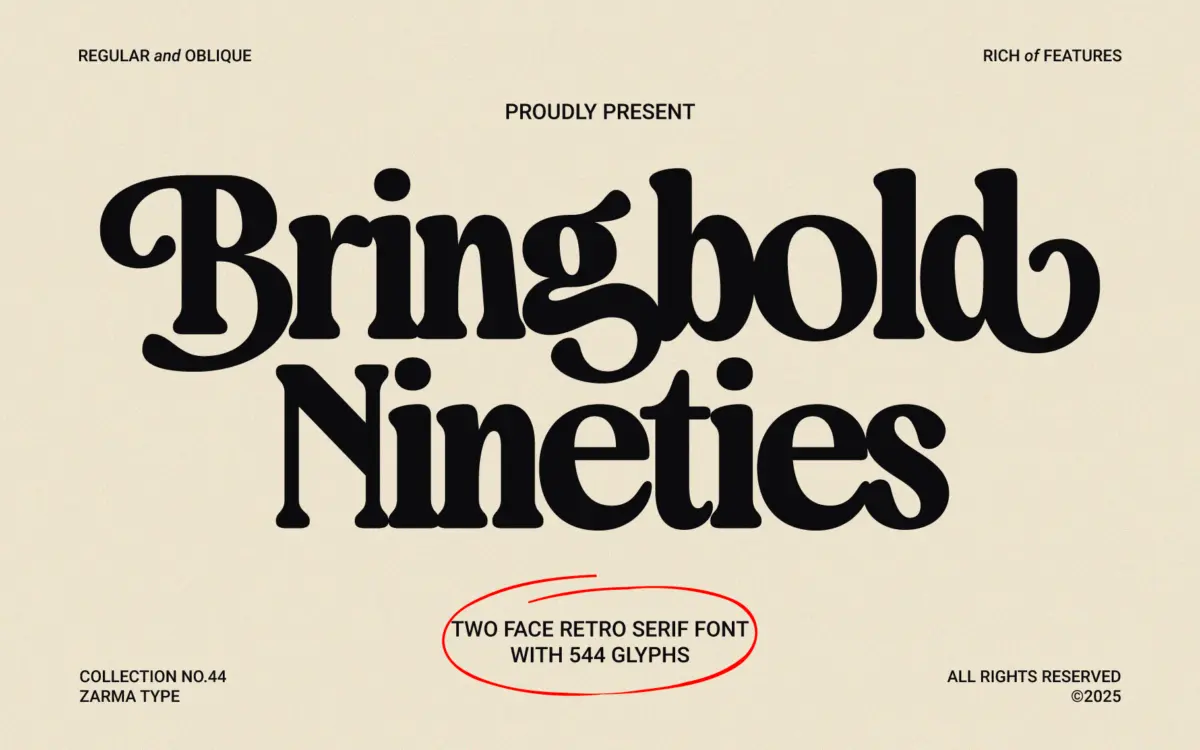
Bringbold Nineties leans into the heavy-serif, high-contrast look that got a lot of use in advertising from the era its name references. The strokes are thick, the serifs are blunt and confident rather than delicate, and the overall texture reads as bold before it reads as refined. It’s not a subtle typeface. It wants to sit large on a page, not disappear into a paragraph.
There’s a slight wedge to the serifs and a compression in the counters that gives the letters some tension — they feel packed, almost straining against their own width, which is exactly the effect that made this kind of serif useful for shouting headlines in the first place. The Slanted companion doesn’t feel like an afterthought italic; it keeps the same weight and bluntness, just tipped over, which makes it more of a variant for emphasis than a true reading italic.
Character set and features
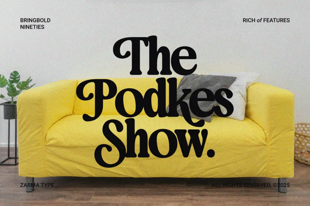
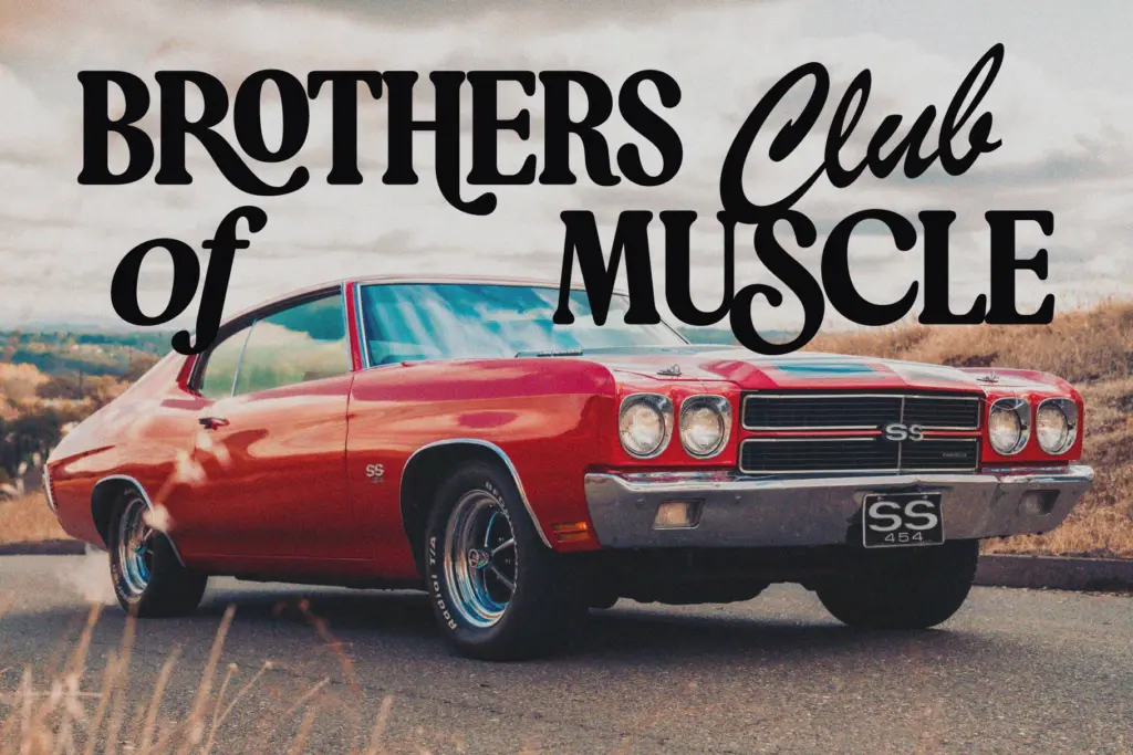
The font ships with a set of OpenType extras — stylistic alternates, contextual alternates, ligatures, and some decorative swashes. In practice these are the difference between a headline that looks like it came out of a template and one that looks hand-set. Swapping a few letterforms via alternates, or letting a ligature soften an awkward pair, is where this typeface earns its keep. The custom ligatures in particular are drawn with enough weight-matching that they don’t look bolted on.
Two styles are included — Regular and Slanted — rather than a full weight range. That’s worth knowing going in: this isn’t a family you’ll use to build a text hierarchy with light, regular, and bold variants. It’s one strong voice with a tilted alternate for variety. The glyph set covers the expected punctuation and figures for the alternates and ligatures to function, but there’s no indication of extended language support beyond the basics, so anyone working outside standard Latin should check the character map before committing.
Use cases
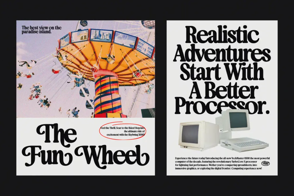
This is a display font first, and it should be treated that way. At headline sizes — posters, packaging fronts, apparel graphics, logotypes — the bold serif strokes and retro character have real presence. It suits projects that are explicitly reaching for a 90s-advertising or retro-poster mood: the kind of branding work that wants a bit of nostalgic swagger rather than quiet elegance.
It’s less suited to body copy or anything that needs to be read at length; the weight and tight spacing that make it punchy at large sizes will fight legibility once you drop it below headline scale. Editorial use should be limited to mastheads, pull quotes, or section titles rather than running text. For branding and logo work, the alternates and ligatures give enough room to customise a mark without redrawing letters, which is probably the strongest practical argument for choosing it over a plainer bold serif.
What we liked, and what we didn’t
Strengths
- Thick, wedge-serif letterforms give it real presence at headline sizes
- Ligatures and stylistic alternates are weight-matched well enough to use without looking bolted on
- Slanted companion keeps the same bold character rather than reading as a generic italic
Trade-offs
- Only two styles (Regular and Slanted), so it can't build a full type hierarchy alone
- Tight spacing and heavy weight make it unsuitable below display sizes
Bringbold Nineties is a confident, heavy-handed display serif that does one job well: loud, retro-flavoured headlines and branding marks. It's not built for reading at length, and the two-style range limits how far it can carry a whole identity system on its own.
Verdict

Tmfonts reviews typefaces in depth — every font is tested in real branding, editorial and screen layouts before a word gets written. 555+ fonts reviewed and counting.