
Flapjack: a hand-drawn signwriting font for vintage brand marks
Design style
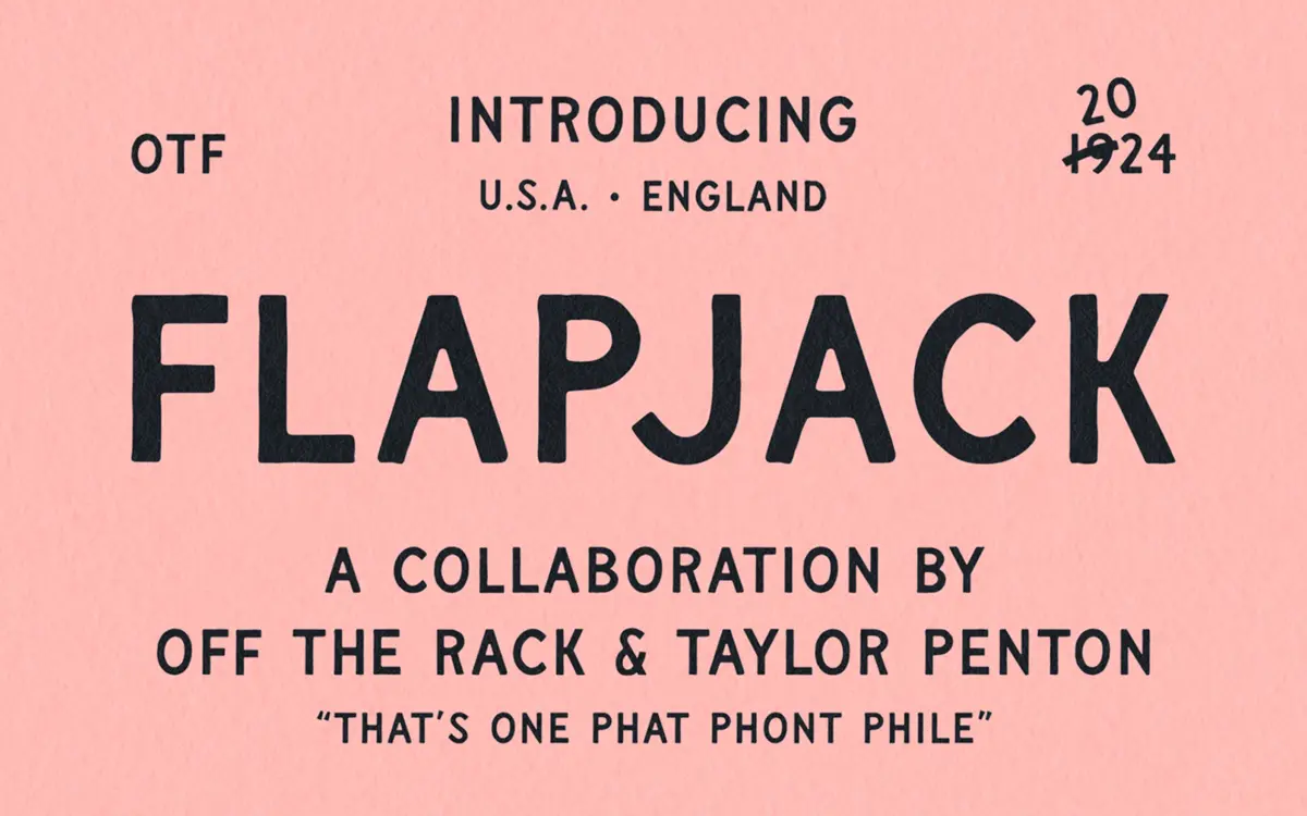
Flapjack draws on the lettering tradition of painted shopfronts and old billboard signage, the kind of work where a brush and a steady hand did all the heavy lifting before vinyl and digital print took over. You can see that origin in the letterforms: strokes swell and taper unevenly, corners round off rather than land square, and the baseline has a slight wobble that reads as confidence rather than sloppiness. It’s an uppercase-only design, which suits the reference material — most of that old sign lettering was capitals anyway, built for maximum read-distance rather than nuance.
The drawing has a point of view. It doesn’t try to smooth over the hand-done quality with digital polish, and it doesn’t overdo the wobble either — this isn’t a font pretending to be scratchy for effect. It sits closer to a competent sign-painter’s alphabet than a novelty typeface, which is the harder trick to pull off.
Character set and features
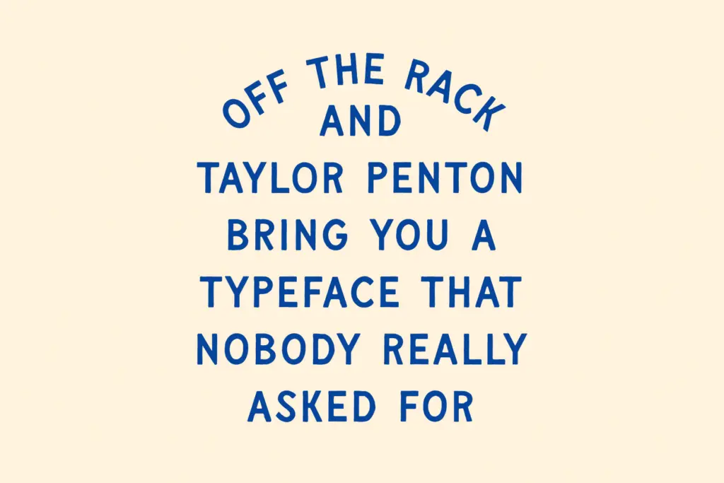
Flapjack includes uppercase letters, alternate glyphs, punctuation and digits, along with support for a wide range of Latin-based languages. The alternates are the useful part here: swapping in a different version of a repeated letter breaks up the mechanical repetition that a single-weight hand-drawn face can fall into when set in longer words. Use them deliberately rather than at random — hand lettering that’s too uniform in its imperfection starts to look designed-to-look-imperfect, which defeats the purpose.
There’s no lowercase, so this isn’t a font you reach for when you need a full sentence set in a friendly, human voice. It’s built for short bursts: a word, a name, a header. That’s a limitation worth knowing going in rather than discovering mid-project.
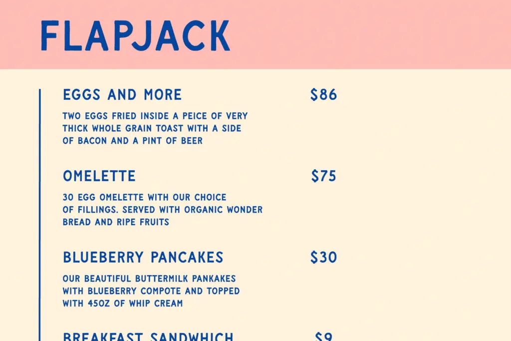
Because the letterforms carry visible texture — thick-to-thin transitions, slightly irregular stroke weight — it holds its character best at larger sizes. The seller’s claim that it works equally well in cafe-menu fine print is optimistic; at small sizes the hand-drawn detail compresses and the face starts to read as slightly rough sans rather than a lettering piece, without the deliberate charm at play.
Use cases
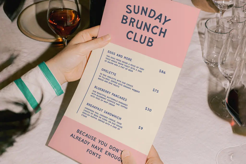
This is a logo and lockup font first — the kind of thing you’d use for a brand mark that wants to signal heritage, craft, or a diner-and-hardware-store kind of Americana without going full distressed-woodcut. It works well for merch, packaging fronts, badge logos, and headline treatments where a handful of capital letters need to carry the whole visual weight.
It’s less suited to body copy or anywhere text needs to disappear into the background — there’s no lowercase to fall back on, and the texture that makes it interesting at large sizes works against legibility at small ones. Pair it with a plain, quiet sans or serif for supporting text, and let Flapjack do the one job it’s built for: the word or two that needs to look hand-painted rather than typed.
What we liked, and what we didn’t
Strengths
- Uneven, hand-painted stroke quality that avoids looking like a generic distressed effect
- Alternate glyphs help break up repetition in short word marks
- Reads clearly as vintage signage without leaning on heavy texture or grunge overlays
Trade-offs
- No lowercase limits it to short headline or logo use rather than running text
- Detail and texture lose impact at small sizes despite claims of fine-print versatility
Flapjack is a well-drawn homage to early sign-painting, strong as a logo and badge font with genuine texture in its strokes. It's not built for body text or small-size use, and the uppercase-only set narrows what it can do beyond headline and lockup work.
Verdict

Tmfonts reviews typefaces in depth — every font is tested in real branding, editorial and screen layouts before a word gets written. 555+ fonts reviewed and counting.