
Nightingale Script: an antique quill hand for old-world branding
Design style
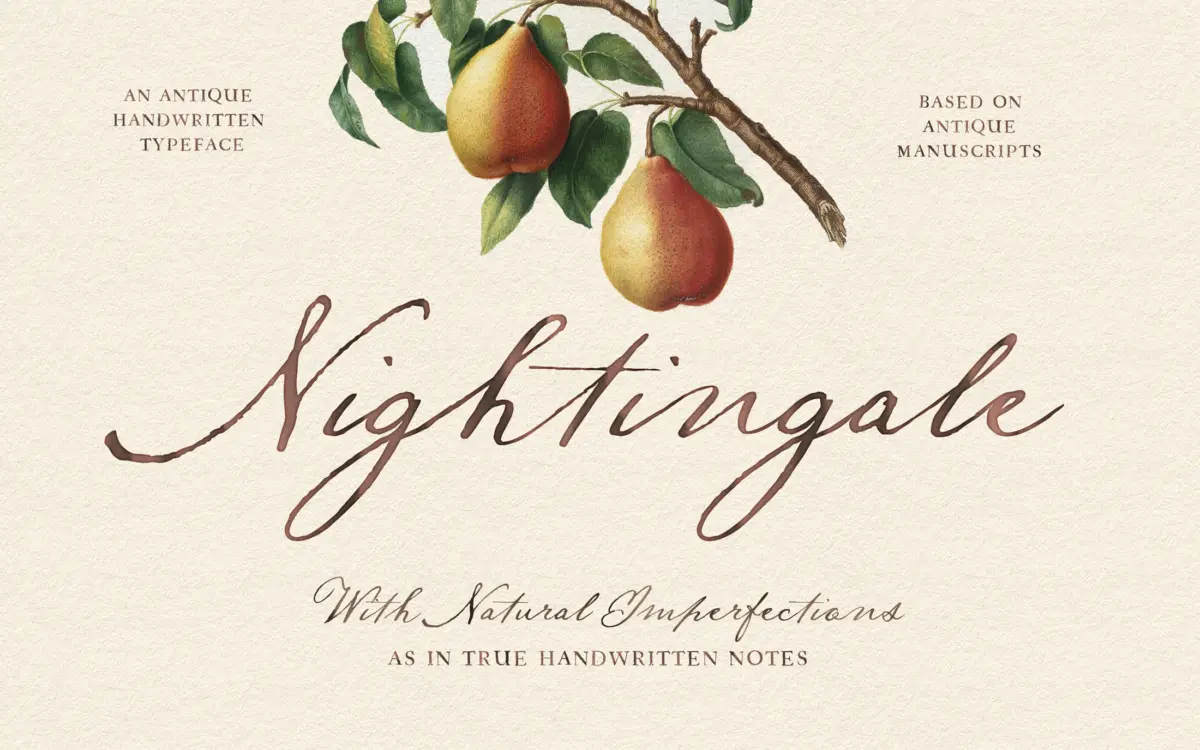
Nightingale Script draws on old manuscript penmanship rather than the smooth calligraphy that dominates the wedding-script category. The letters lean on a quill-pen model: strokes vary in weight as if pressure and ink flow were changing mid-word, and the baseline has a slight wobble built into it. This is deliberate imperfection, and it’s the whole reason the font exists. Where a lot of scripts aim for polished uniformity, Nightingale Script goes the other way, keeping the rough edges and uneven joins that make handwriting look like it was actually written by a hand, not plotted by a machine.
The letterforms sit narrow and slightly compressed, with entry and exit strokes that thin out unevenly rather than tapering on a consistent curve. Some connections between letters are looser than you’d expect from a script font, which reinforces the antique, notebook quality but also means the face needs care in how it’s set. This isn’t a font that wants to be stretched or forced into rigid alignment; it wants room to sit at its natural size with generous spacing around it.
Character set and features
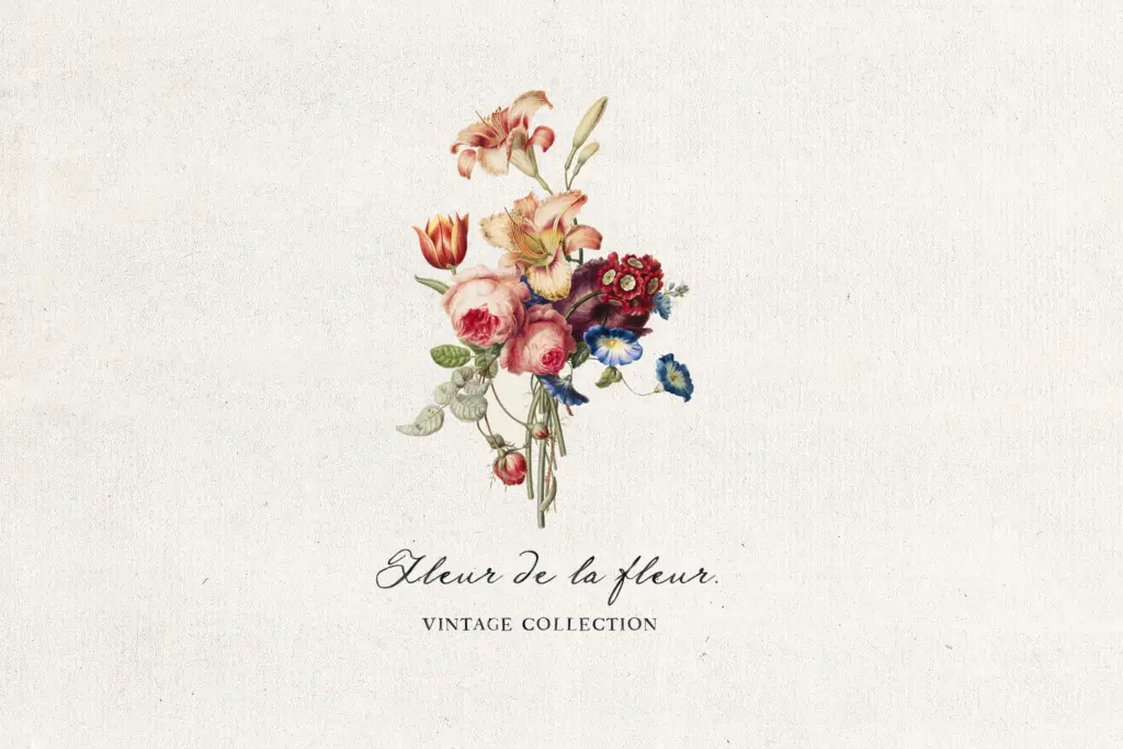
The OpenType feature set includes alternate forms for letters like t and y, along with additional ligatures beyond the standard set. These matter more here than in a lot of script fonts, because the alternates are what break up repetition across a word or paragraph — swap in a different t or y and a line of type reads less like a font and more like continuous handwriting. Designers who skip the OpenType panel and just type the default glyphs will lose a good portion of what makes this typeface work; it rewards someone willing to go in and manually vary the letterforms, or at least turn on contextual alternates in software that supports it.
The imperfection built into the drawing means individual letters can look uneven when isolated — a single word set large will show the same waver and inconsistency that reads as charming at sentence length. That’s a trade-off worth knowing about before committing to it for something like a monogram or a single-word wordmark, where every letter is under scrutiny on its own.
Use cases
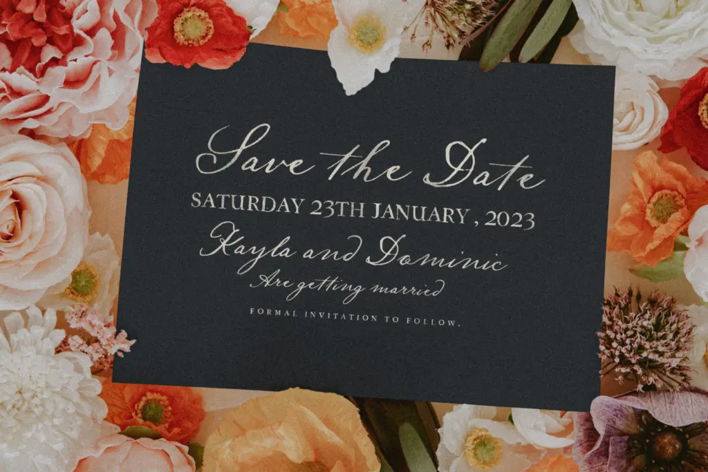
This is a font for evoking an era rather than for reading long-form text. Invitations, package labels, apothecary and herbalist branding, book covers, and anything trying to look like it was pulled from a hundred-year-old letter or ledger are the natural home for it. It also works well for short editorial flourishes — a pull quote, a section header, a logotype for a business built on the idea of heritage or craft.
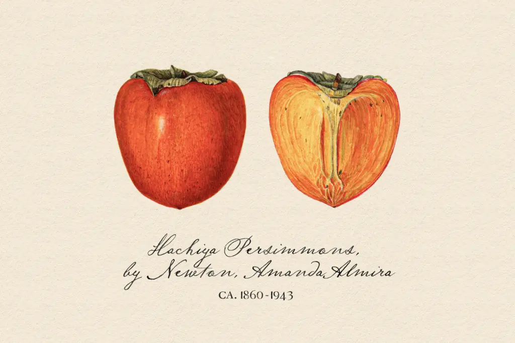
It is not a body text font, and treating it as one at small sizes will cause the antique roughness to collapse into illegibility. Keep it to display sizes, short phrases, and settings where the handwritten quality is the point rather than something to work around.
What we liked, and what we didn’t
Strengths
- Alternate t and y forms plus extra ligatures let you break up repetition across a line so it reads more like real handwriting.
- The uneven, quill-based strokes give it a genuinely antique character that polished scripts don't achieve.
- Well suited to short-phrase branding work like apothecary labels, book covers, and invitations.
Trade-offs
- The built-in imperfection makes single words or monograms look uneven when every letter is scrutinised on its own.
- Not legible at small sizes or in long text, so its use is limited to display settings.
Nightingale Script commits fully to its antique-manuscript premise, and the alternate letterforms and ligatures are what actually make that premise work in practice. It's a strong pick for short, display-scale work with a heritage feel, but it's not built for body text or single-word marks where its deliberate unevenness gets exposed.
Verdict

Tmfonts reviews typefaces in depth — every font is tested in real branding, editorial and screen layouts before a word gets written. 555+ fonts reviewed and counting.