
The Poet: a raw, ballpoint-style handwriting font for artisanal branding
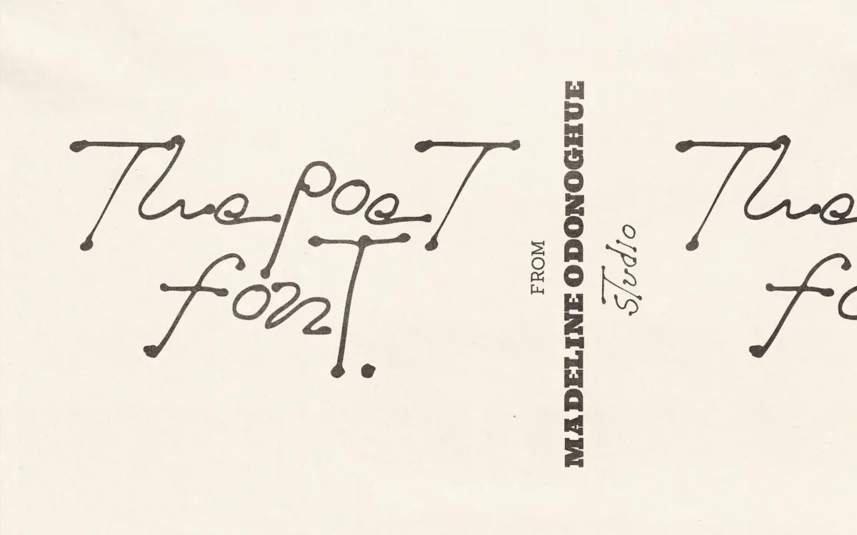
Design style
The Poet reads like a note scrawled in the margin of a sketchbook, not a font engineered to look that way. The strokes carry the pressure variation of a ballpoint pen dragged quickly across paper: thin entries, occasional blots where the pen paused, baselines that dip and rise letter to letter. There’s no attempt to smooth any of this out. Where a lot of hand-drawn fonts fake looseness with a light wobble, The Poet commits to genuine irregularity — some letters lean, some sit heavier than their neighbours, and that inconsistency is the whole point.
It sits closer to lettering than to a disciplined script typeface. The seller’s nod to modernist sketchbook influence tracks in the loose, gestural quality of the forms, though this isn’t a face with a tight structural logic underneath — it’s built on feel. That’s a strength in short bursts and a liability if you ask it to behave like a workhorse.
Character set and features
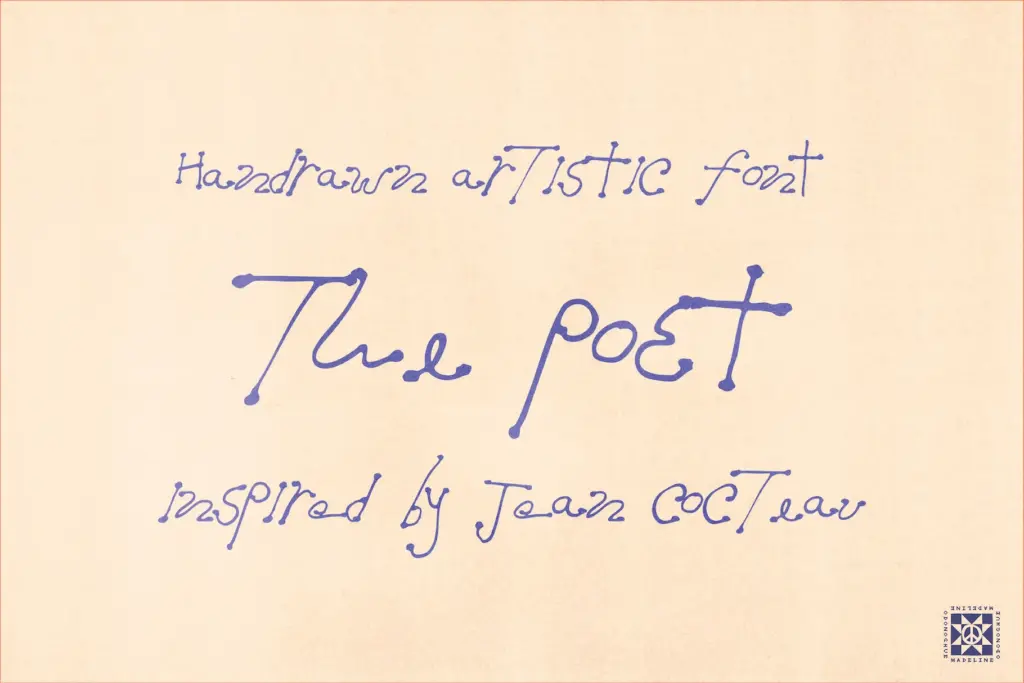
The set is lowercase-led, with select alternates and capitals rather than a full parallel uppercase — worth knowing before you build a layout that leans on capitals for hierarchy. Numerals 0–9 are included, and given the pen-blot styling, they’ll likely read more as illustrative marks than tabular figures, so anything requiring numeral alignment or repeated data isn’t its job.
Because the letterforms are drawn rather than systematically modulated, you should expect visible repetition in longer passages of text — a handwriting font at this scale of irregularity works best when you’re not asking it to fill paragraphs. Test any word you actually intend to use before committing; hand-drawn sets like this one tend to have a handful of hero letters and a few less flattering ones, and you find out only by typing your specific word.
There’s no mention of extended language support or built-in ligatures, so treat this as a Latin-alphabet, English-first tool rather than a multilingual family.
Use cases
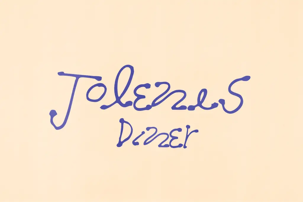
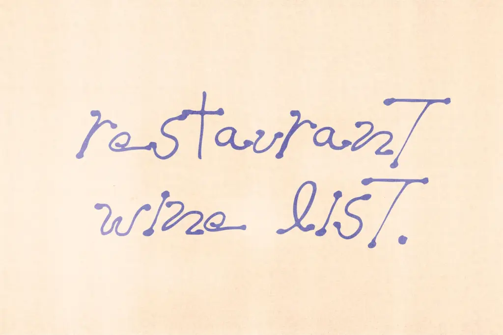
This is a font for a signature moment, not a body of text. A restaurant name on a chalkboard-style menu, a bar sign, a one-line pull quote in an editorial spread, a logotype for a brand that wants to feel handmade and slightly imperfect on purpose — these are the jobs it’s built for. The pen-blot texture also makes it a natural fit for packaging where a human touch is the selling point: small-batch goods, artisanal food and drink, anything trading on the idea that someone actually made this by hand.
It’s less suited to interfaces, long-form reading, or any context where consistency and legibility at small sizes matter more than personality — the uneven baseline and blotted strokes that make it charming at display size will just look messy shrunk down to a caption. Pair it sparingly with a plain, quiet secondary typeface so the handwriting has room to be the loud one in the room, and keep the words it’s used for short. Test the specific letters you need before locking in a layout, since a hand-drawn font like this lives or dies on individual character quality rather than an even system.
What we liked, and what we didn’t
Strengths
- Genuinely irregular strokes and baselines that avoid the templated look of many hand-drawn fonts
- Ballpoint texture with ink blots gives it real personality for rustic or artisanal branding
- Works well as a single accent word alongside a plain secondary typeface
Trade-offs
- Lowercase-focused set with limited capitals restricts layouts that need strong hierarchy
- Irregularity that reads as charming in one word can become messy and repetitive across longer text
The Poet is a convincingly rough, pen-drawn display font that earns its charm through genuine inconsistency rather than a faked wobble. It's built for single words and short phrases in branding and signage, not for sustained reading, and its lowercase-led, limited character set means you should test your actual words before committing.
Verdict

Tmfonts reviews typefaces in depth — every font is tested in real branding, editorial and screen layouts before a word gets written. 555+ fonts reviewed and counting.