
Black Magic Slab Serif: a hand-drawn 70s slab for retro branding work
Design style
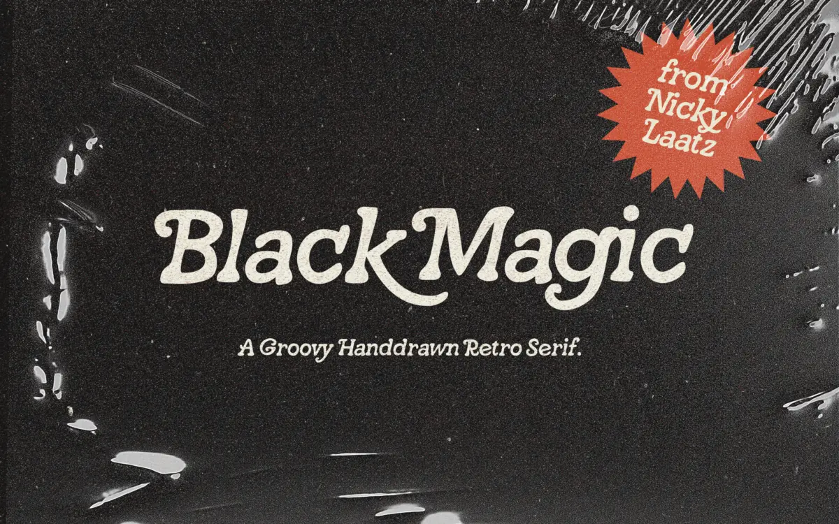
Black Magic is a slab serif built on a hand-drawn chassis rather than a geometric one. The slabs are soft and slightly uneven, the curves bow out a touch past where a ruler would put them, and the overall feel sits closer to a marker-drawn logotype than to anything cut for a text face. That’s the point: this is a typeface styled after 1970s signage and album art, not a workhorse slab in the Rockwell or Roboto Slab family.
You can see the hand in the details. Serifs flare unevenly from letter to letter, stroke joins have a slight bulge where a pen would have doubled back, and the rhythm across a word is loose rather than mechanical. That looseness is the character of the font — it reads as drawn, not drafted — but it also means it won’t sit quietly next to a crisp grid. It wants to be the loudest thing on the page, which for a display face styled this way is exactly right.
Character set and features
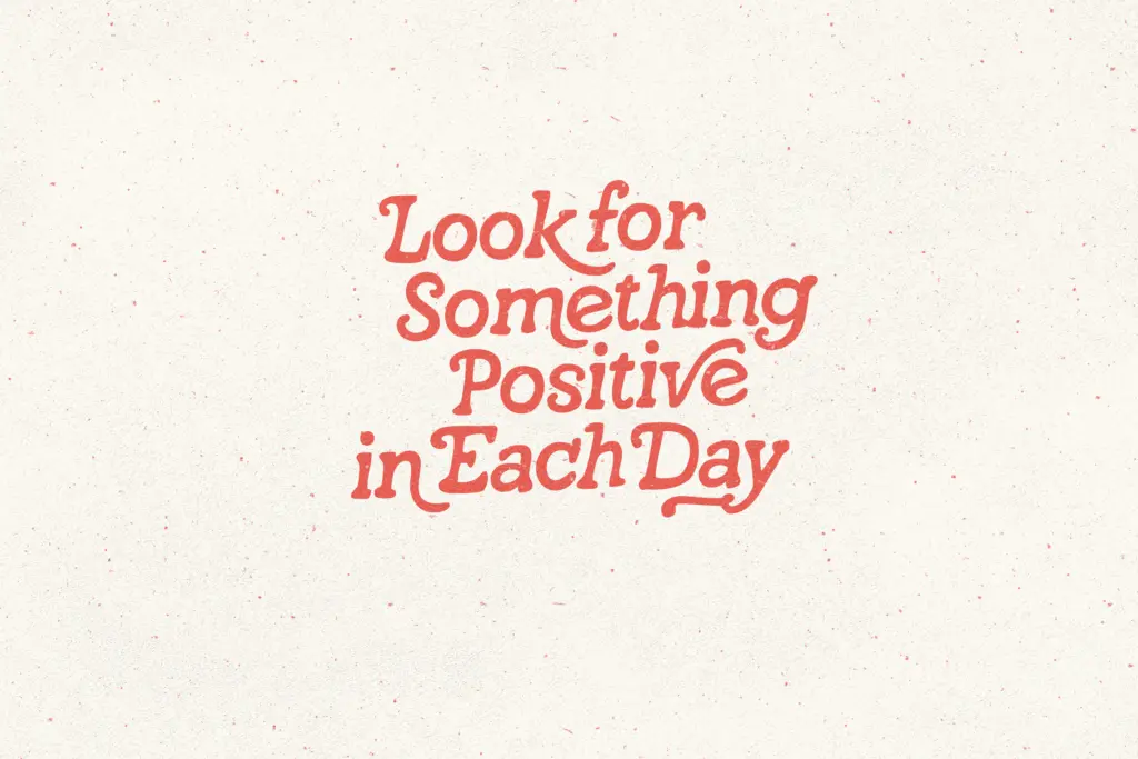
The face ships with OpenType stylistic alternates, which is where most of the personality lives. Swap in the alternate characters and letters like the lowercase a, g, or terminal strokes pick up extra curl or an extended tail, pushing the

Verdict

Tmfonts reviews typefaces in depth — every font is tested in real branding, editorial and screen layouts before a word gets written. 555+ fonts reviewed and counting.