
Antique Font Family Rustic Serif Duo: a letterpress serif with a handwritten sidekick
Design style
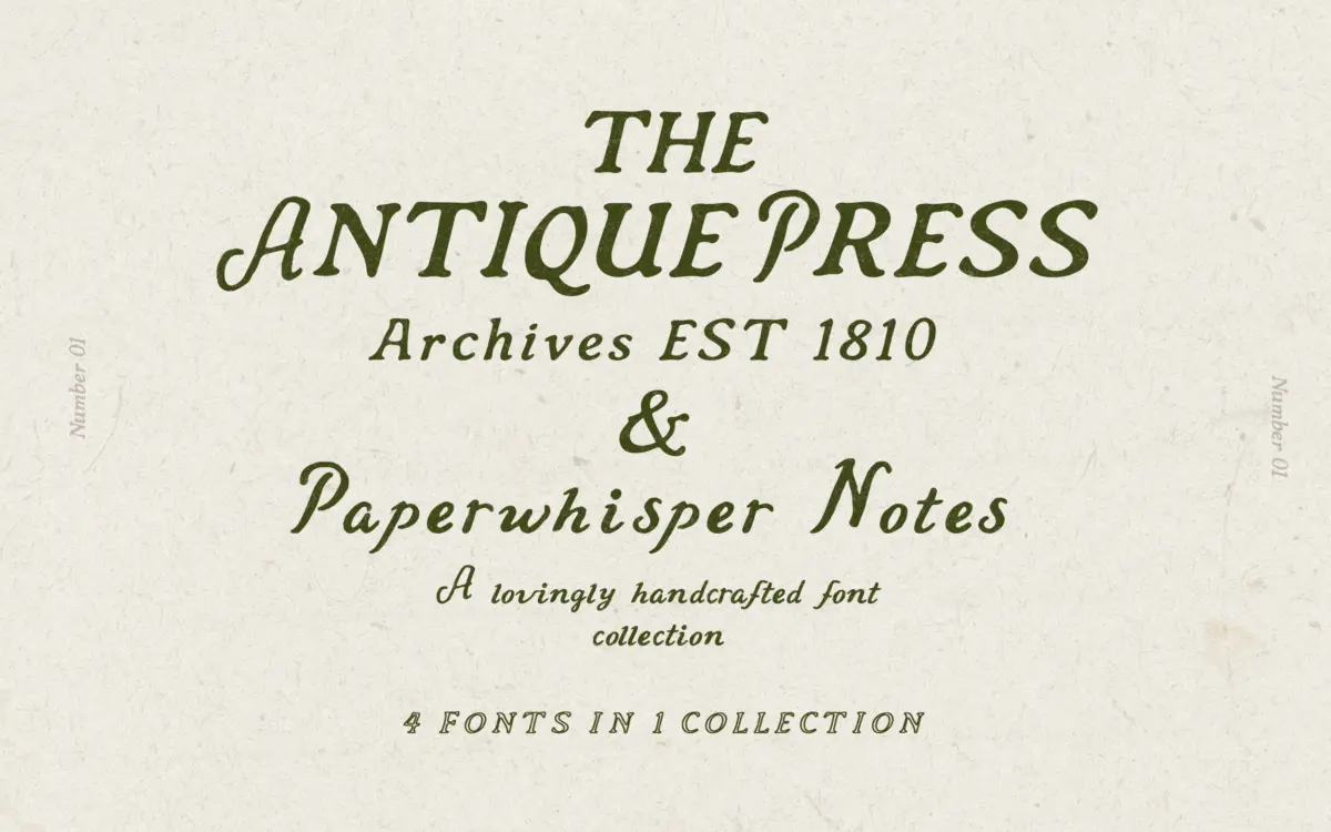
This is a two-part release built around a familiar but effective idea: a sturdy letterpress-style serif paired with a looser handwritten companion. Antique Press, the serif half, leans on the worn, slightly irregular character of old printing house type. Strokes are heavy in the bold cut, with terminals that look cut rather than drawn, and the overall texture nods to woodblock and hot-metal printing rather than clean digital revival. The outline variant strips the same skeleton down to a single-weight line, useful for layering over the solid version or for a lighter touch on packaging.
Paperwhisper, the second face, is a soft, informal script-like hand meant to sit alongside the serif rather than replace it. It has none of the letterpress heaviness — it’s loose, a little uneven, and reads like a handwritten annotation rather than a formal script. The pairing is deliberate: one face does the structural, branded work, the other adds a human aside.
Character set and features
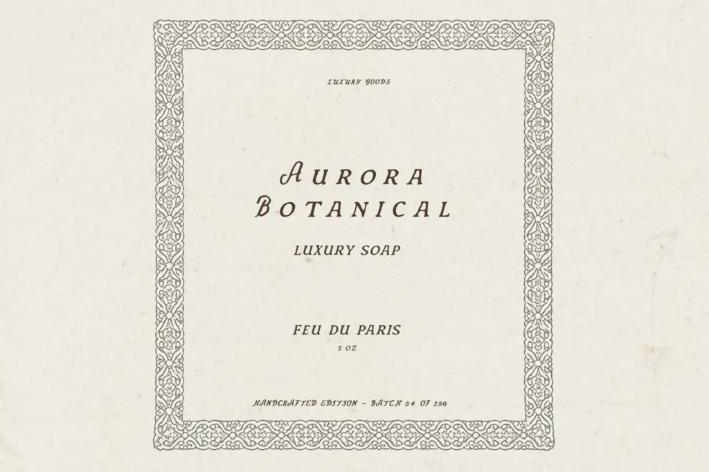
The family ships as three OTF files: Antique Press Regular, Bold, and Outline, plus the single-style Paperwhisper. That’s a modest but coherent set — enough to build a hierarchy (bold headline, regular subhead, outline accent) without needing to reach for another typeface. There’s no indication of extended language support, alternate character sets, or OpenType contextual features beyond the basic glyph set, so designers working in multiple scripts or needing swash alternates should treat this as a straightforward Latin-only duo rather than a feature-rich system font.
Because Paperwhisper is a single weight with no listed alternates, its usefulness is tied closely to short bursts of text — a word or two, a signature-style flourish — rather than paragraphs. Antique Press’s three cuts give it more flexibility, but three styles is still a tight range if a project needs, say, a light weight or an italic.
Use cases
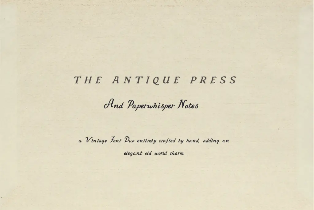
Antique Press is well suited to logotypes, book covers, packaging labels, and any heritage-branding job where a slightly battered, printed-in-1920 texture is the point. The bold weight carries headline duty; the outline works as a secondary mark or a textured background element. It holds up at large display sizes and on printed goods where a little roughness reads as craft rather than error — think market stalls, small-batch food labels, or independent bookshop branding.
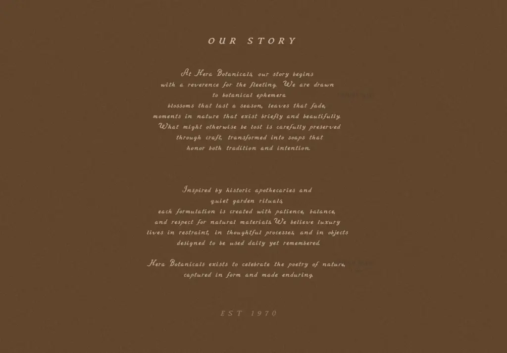
Paperwhisper is best kept to accent duty: a scrawled note under a heading, a quote pulled to the side, a signature-like flourish on an invitation. It’s not built for body copy or long-form editorial text, and pushing it there will expose its unevenness rather than its charm. Used sparingly against Antique Press’s more structured letterforms, it does the job it was designed for — adding warmth without competing for attention.
Overall, this is a duo for a specific, narrow brief: vintage-adjacent branding and packaging that wants a printed, handmade feel without venturing into full script territory. It won’t stretch to a modern minimalist project or serve as a workhorse text face, but within its lane it’s a functional, well-matched pair.
What we liked, and what we didn’t
Strengths
- The three cuts of Antique Press give a workable hierarchy without needing another typeface
- The letterpress texture reads as genuinely worn rather than filtered
- Paperwhisper adds a human accent without fighting the serif for attention
Trade-offs
- No extended language support or OpenType alternates limits it to straightforward Latin-only branding jobs
- Paperwhisper's single weight and uneven texture make it unsuitable for anything beyond short accent text
A competent vintage-inspired duo that does one job well: heritage branding with a handmade edge. It's narrow in scope, with limited weights and no extended features, but the pairing itself makes sense and the letterpress texture is convincing at display sizes.
Verdict

Tmfonts reviews typefaces in depth — every font is tested in real branding, editorial and screen layouts before a word gets written. 555+ fonts reviewed and counting.