
Barlett No.1: a vintage serif and script duo for whisky labels and heritage branding
Design style
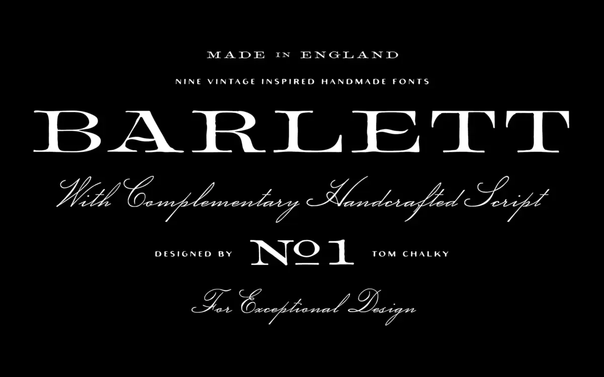
Barlett No.1 works from a familiar reference point: 1800s English serif types, the kind you find on old dry-goods packaging and letterpress ephemera. Rather than a clean revival, the family leans into imperfection — edges that don’t quite sit true, strokes with slight variance in weight, terminals that look cut rather than drawn. This is a deliberate strategy, and it works better in some styles than others. The bold and expanded cuts carry the vintage texture with confidence at larger sizes, where the irregularities read as craft rather than noise. The rounded variant softens the effect further, trading some of the historical flavour for a friendlier, more approachable feel.
The script companion is where the family earns its “duo” billing. It’s a connected, flowing hand with enough looseness to avoid feeling mechanical, pitched as contrast rather than a matching partner in weight or formality. Paired with the serif’s blockier presence, the two styles do the classic label-design job: structure and title-casing from the serif, a personal flourish from the script for a name or a tagline.
Character set and features
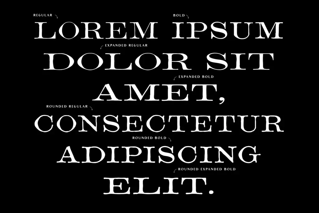
Nine styles in total, spanning regular, bold, expanded, and rounded serif variants alongside the script. That’s a reasonable spread for a display family and gives some room to build hierarchy within a single project — headline in expanded, supporting text in regular, accent in script — without needing to source a second family for contrast.
Stylistic alternates and custom ligatures are included, which matters more for a script-and-serif pairing than it would for a straightforward text face, since swash variation is often what keeps a handcrafted script from repeating itself awkwardly across a label or headline. Worth checking the alternate set before committing to long-copy use — vintage-inspired scripts like this one tend to be built and tested for short bursts: a wordmark, a product name, a line of copy, not a paragraph.
Use cases
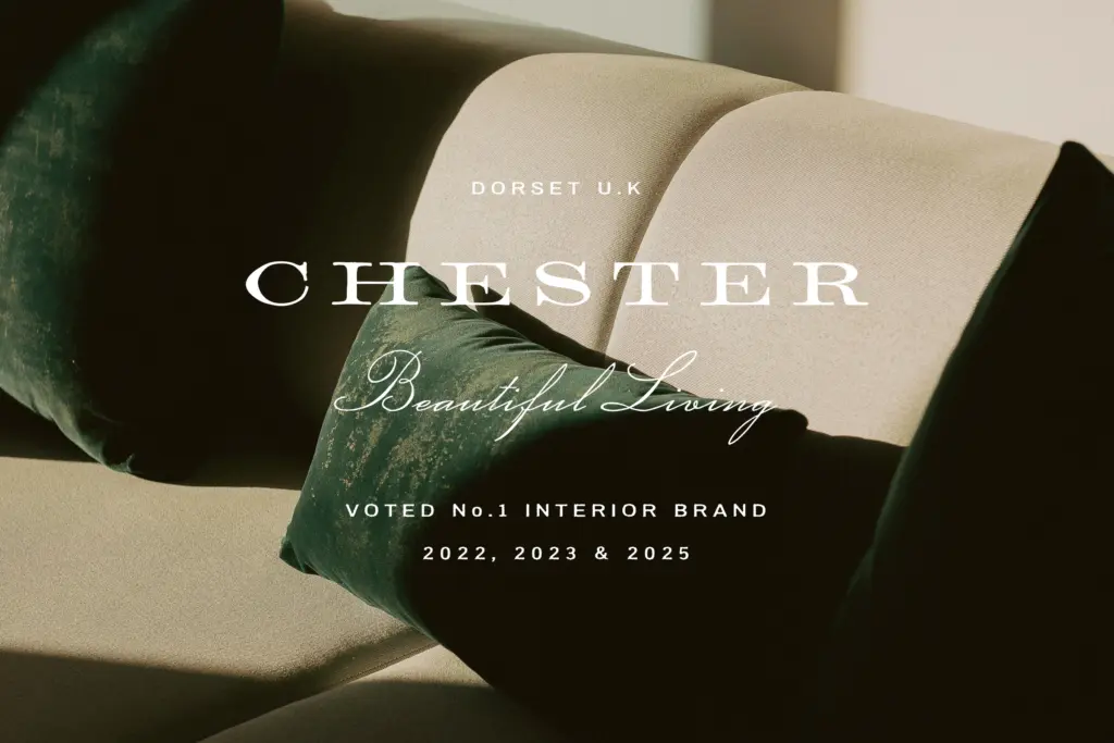
This is a label and branding font first. Whisky and spirits packaging, artisan food labels, boutique fashion tags — anywhere a project wants to borrow the credibility of an old-world print job without going full pastiche. The rounded serif variant extends that reach slightly toward stationery and invitation work, where the vintage cues can be softened without losing them entirely.
It’s less suited to editorial body text or long-form reading — the irregularities that make it charming at display sizes will just read as noise below a certain point size, and the family doesn’t appear built for that job anyway. Treat it as a headline and label system: serif for structure, script for the signature touch, and keep the point sizes generous. Used that way, it does what it sets out to do — texture and period feel without demanding a full brand overhaul to support it.
What we liked, and what we didn’t
Strengths
- Nine styles give real hierarchy options within one family, from expanded bold to rounded soft.
- The imperfections feel deliberate rather than templated, especially at label and headline sizes.
- Stylistic alternates and ligatures help the script avoid repetitive letterforms in short copy.
Trade-offs
- The textured, irregular character set will strain legibility if pushed into body copy or small sizes.
- The script and serif styles are designed as contrast pieces, not a seamlessly matched pair, so pairing choices need care.
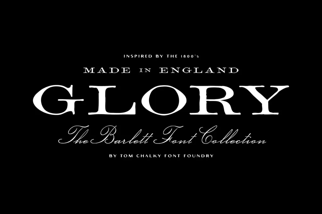
Barlett No.1 is a solid, well-crafted vintage label duo that knows its lane — display sizes, packaging, and heritage branding — and doesn't try to be more than that. The nine styles give it decent internal range, but it's not a text face and shouldn't be asked to be one.
Verdict

Tmfonts reviews typefaces in depth — every font is tested in real branding, editorial and screen layouts before a word gets written. 555+ fonts reviewed and counting.