
Ethic Light Font Free Download
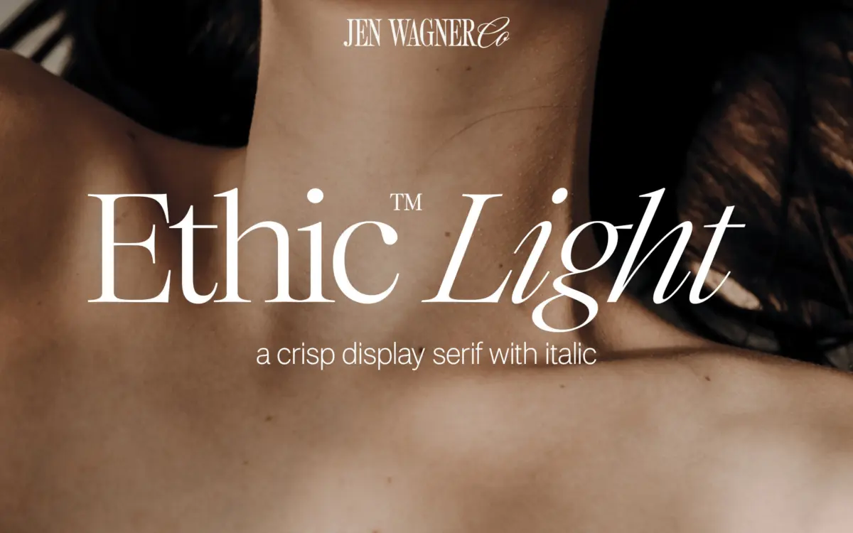
Is Ethic Light free to download?
Ethic Light is a commercial font sold on Creative Market, so the full version needs a paid license. Get it from the official listing: Ethic Light font download.
Need something free? These serif fonts from Google Fonts are free for personal and commercial use:
Design style
Ethic Light sits in the lighter end of the display serif family, built around fine hairlines and modest bracketing rather than heavy contrast or ornament. The stroke weight stays close to a single register across the letterforms, so nothing swells or thickens unexpectedly. It reads as a contemporary take on classic serif proportions: upright, a little cool, with none of the swash or flourish that display serifs often reach for. The x-height is generous enough to keep the light strokes from thinning out visually, which is the usual risk with a serif this pared back.
What gives it character is restraint rather than novelty. The terminals are clipped and quiet, the serifs are short and mostly unbracketed, and the overall rhythm across a line of text is even. It does not try to look handmade or vintage. It reads as a design tool first — something you’d reach for when a project needs a serif with polish but not personality that competes with the content around it.
Character set and features
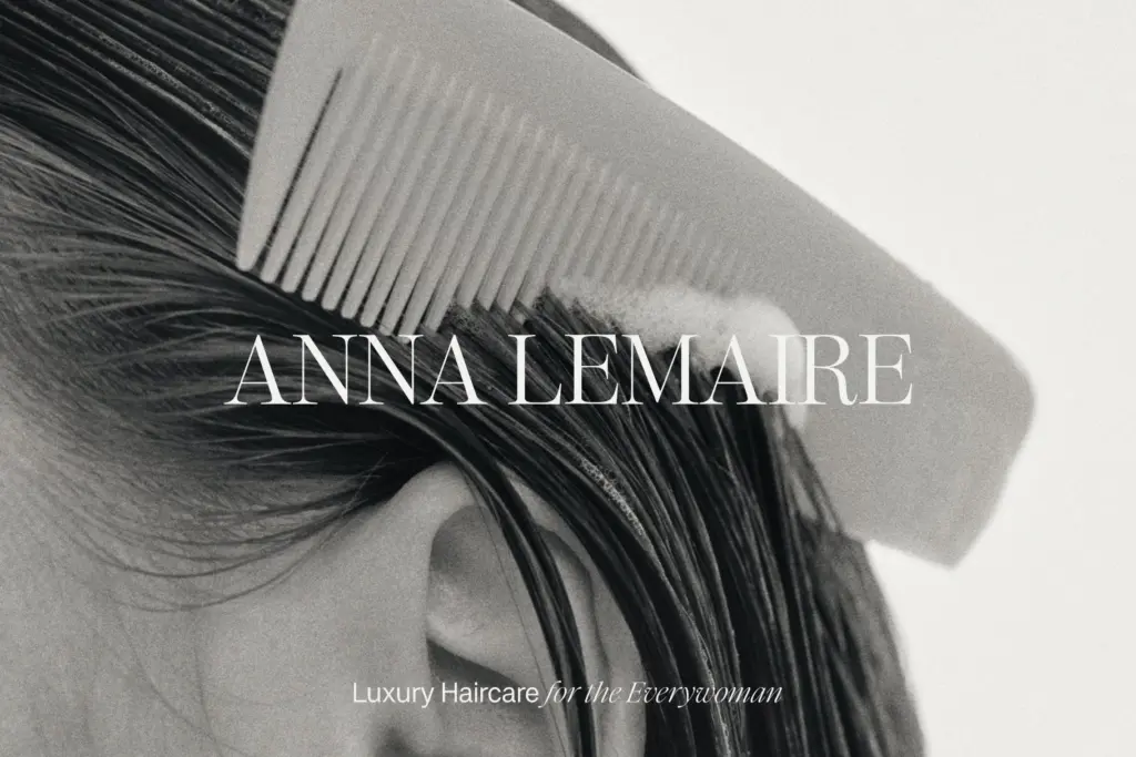
The italic is the more expressive half of the family. Where the roman stays formal, the italic loosens slightly, with a gentler slant and softer joins that give it a more conversational tone — useful for pull quotes, captions, or anywhere you want a shift in register without switching families. Numerals and standard punctuation are cut with the same crispness as the letters, so mixed alphanumeric settings — addresses, dates, prices — hold together cleanly.
At larger display sizes the thin strokes are the main thing to watch. On screen, especially at smaller weights, hairlines can start to break up under poor anti-aliasing or on lower-resolution displays, so this is a typeface that wants a reasonably sized rendering to look its best. Set it too small in body copy and the light contrast disappears into grey mush; it is happier as a headline or subhead face than as long-form running text.

Use cases
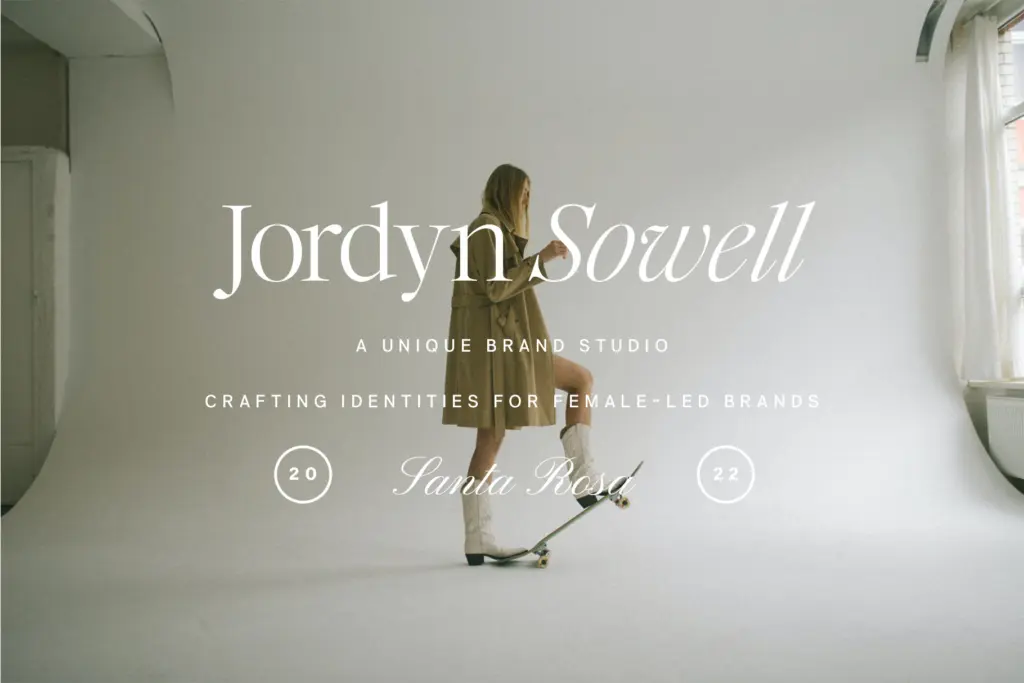
Ethic Light is well suited to branding work that wants a serif signal without heaviness — logotypes, packaging headers, masthead treatments where a light touch reads as considered rather than decorative. It also works well in editorial contexts: pull quotes, section heads, magazine-style layouts where a crisp serif needs to sit above a sans-serif body without shouting. On social graphics it holds up nicely as a quote face, provided the point size stays generous; the fine strokes lose definition fast once you shrink them down for a square Instagram tile.
It is less suited to dense paragraph setting or anywhere the type has to survive rough print conditions, cheap paper stock, or heavy compression. Pair it with a sturdier serif or sans for body text and let Ethic Light do the header work it’s built for. Used that way — as a quiet, confident display voice rather than a workhorse — it earns its place in a kit.
What we liked, and what we didn’t
Strengths
- The italic has a genuine shift in tone, useful for quotes and captions
- Even stroke weight keeps the letterforms calm rather than fussy
- Clean numerals and punctuation make mixed alphanumeric lines legible
Trade-offs
- Fine hairlines lose crispness at small sizes or on lower-resolution screens
- Not suited to long-form body text; it's a display face through and through
Ethic Light is a restrained, well-drawn display serif that does headline and branding work quietly and well. It's not built for body copy or small sizes, where its fine strokes lose definition, but as a header face paired with something sturdier it holds up nicely.

Tmfonts writes independent reviews of typefaces: what each font does well, where it falls short, what it suits, and where it is sold.