
Tallica Font Free Download
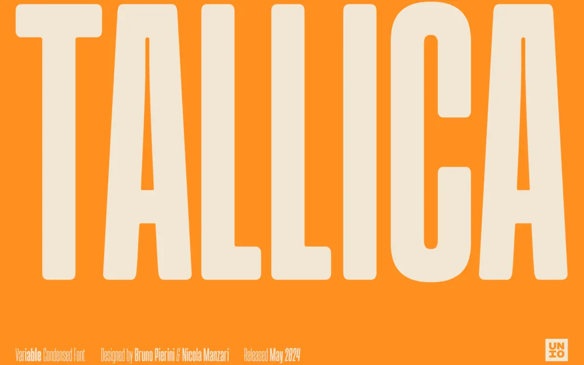
Is Tallica free to download?
Tallica is a commercial font sold on Creative Market, so the full version needs a paid license. Get it from the official listing: Tallica font download.
Need something free? These sans serif fonts from Google Fonts are free for personal and commercial use:
Design style
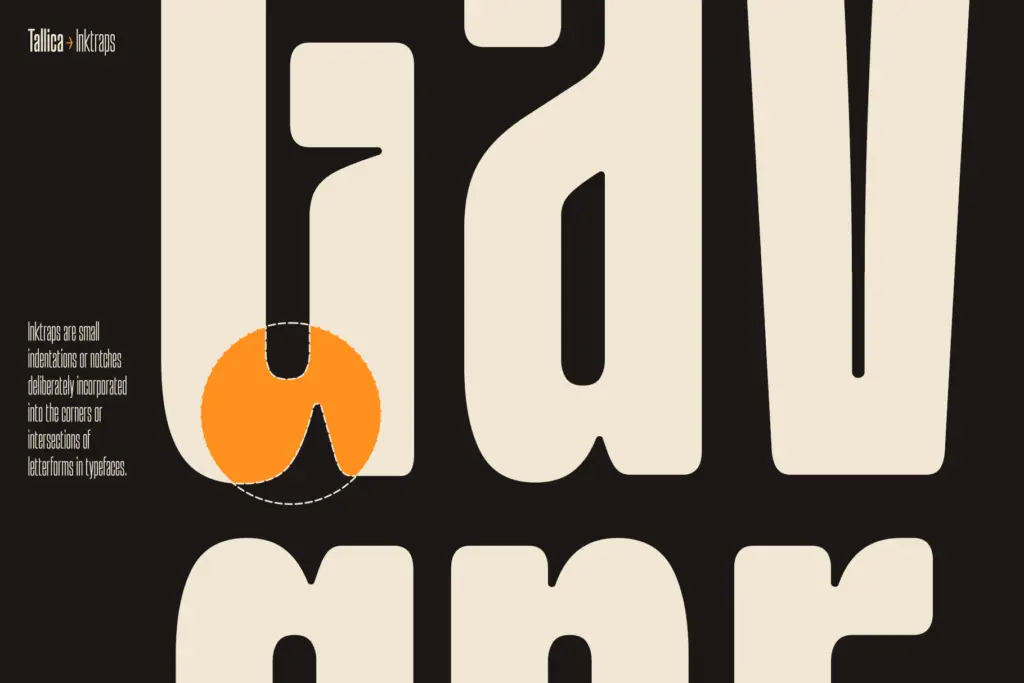
Tallica sits at the extreme end of the condensed grotesque spectrum. The letterforms are squeezed hard, but the drawing doesn’t feel starved — strokes stay confident and the rhythm between letters holds steady rather than collapsing into a grey wall, which is the usual failure point of ultra-compressed sans faces. The x-height is generous, which is doing a lot of the work here: it gives the counters room to stay open even as the overall width shrinks. There’s a slightly quirky treatment at the ink traps, rounded rather than sharp, and it reads as a deliberate personality choice rather than a purely technical fix. It softens what could otherwise be a fairly severe, mechanical typeface and gives it a bit of warmth without pushing into novelty territory.
Character set and features
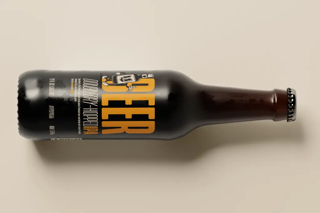
As a variable font, Tallica runs from Thin through Bold, with an oblique tied to each weight. That’s the real value of the build — you get a full axis to work with rather than a handful of static cuts, so you can dial in exactly how much visual weight a headline needs instead of jumping between two options that don’t quite fit. The obliques follow through consistently rather than feeling like a mechanical slant applied after the fact. Tight, controlled line spacing is baked into the design intent, which matters for a condensed face like this — loose leading would undercut the compactness that’s the whole point. At lighter weights the strokes get delicate enough that they’re clearly built for larger sizes rather than body copy; at the bold end the ink traps do more visible work and the letterforms hold their shape well under pressure. Diacritic and multilingual coverage isn’t something I can confirm from the source material, so treat that as a question to check before committing to a project with extended language needs.
Use cases
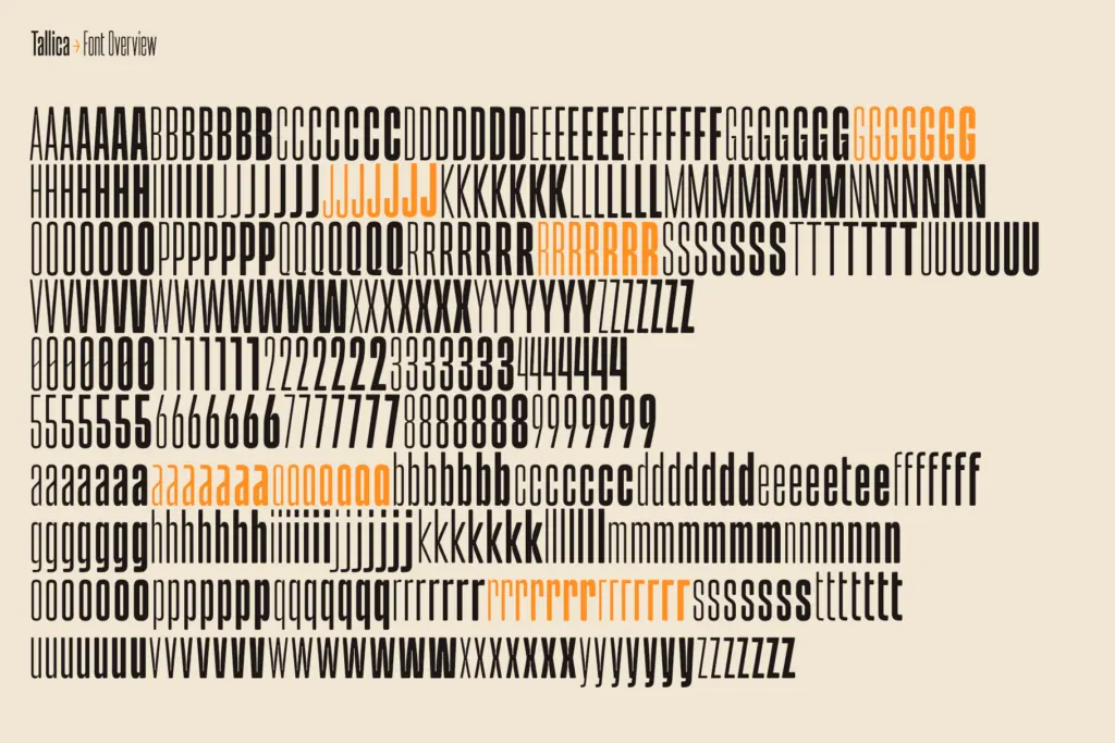
This is a headline font first, and it’s honest about that. The extreme condensation makes it useful in exactly the spots where horizontal space is the enemy — packaging panels, editorial kickers, posters and flyers where you need a lot of characters to fit a narrow column without shrinking to illegibility. Logo and branding work is a reasonable stretch too, particularly for names that are long or need to sit in a tight lockup; the rounded ink traps give it enough character to avoid looking like a generic stretched grotesque. Where it gets more demanding is body text. The generous x-height buys it some legibility credit at small sizes, but the compression itself puts a ceiling on how far you can push it before word shapes start blurring together, especially in the lighter weights or in busy layouts. Treat it as a display and short-copy tool — headlines, subheads, callouts, packaging copy — rather than a paragraph-setting workhorse, and it earns its keep. Pair the variable range with a more neutral, wider-set sans for actual reading text, and let Tallica do the shouting.
What we liked, and what we didn’t
Strengths
- Rounded ink traps give the compression a bit of personality instead of feeling purely mechanical
- Generous x-height keeps counters open even at the tightest widths
- Full variable axis from Thin to Bold with matching obliques gives real control over weight
Trade-offs
- Lighter weights strain at small sizes and are clearly not meant for body copy
- Multilingual and diacritic support isn't confirmed, worth checking before international projects
Tallica does one job — extreme condensation — with more care than most faces in this niche, thanks to a generous x-height and softened ink traps that keep it from turning to mush. It's a display and headline tool, not a body text solution, and the lighter weights ask a lot of the reader at small sizes. For packaging, editorial kickers and space-starved logotypes, it's a solid, characterful pick.

Tmfonts writes independent reviews of typefaces: what each font does well, where it falls short, what it suits, and where it is sold.