
Chunky Retro Font Free Download
Is Chunky Retro Font free to download?
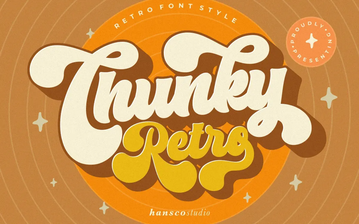
Chunky Retro Font is a commercial font sold on Creative Market, so the full version needs a paid license. Get it from the official listing: Chunky Retro font download.
Need something free? These display fonts from Google Fonts are free for personal and commercial use:
Design style
Chunky Retro Font is a bold slab-like display face built around thick, evenly weighted strokes and softened corners. Instead of sharp geometric edges, every terminal and joint has been rounded off, which gives the letterforms a slightly bubbled, friendly feel rather than the harder-edged retro look you get from typefaces built on strict geometric grids. The weight is heavy throughout, closer to the poster lettering of mid-century signage than to any contemporary sans construction, and there’s no attempt at optical modulation between strokes — the thickness stays consistent, which is part of what gives it that stamped, blocky presence.
The retro reference here is more attitude than historical accuracy. It borrows the confidence of vintage badge and package lettering without copying a specific era’s proportions. That’s a reasonable trade-off for a display font meant to be recognisable at a glance rather than studied closely.
Character set and features
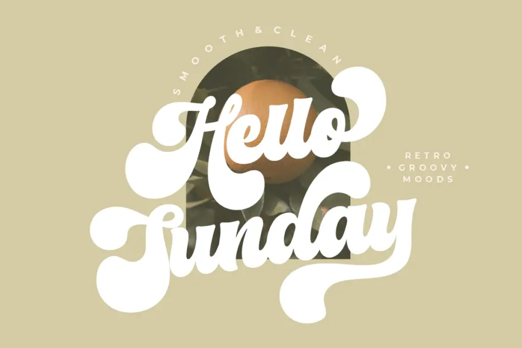
The set covers uppercase and lowercase, numerals, punctuation, and multilingual support, so it’s built for more than just English headlines. Alternates and swashes are included for letters that benefit from a flourish, giving some flexibility when a straight setting feels too flat. Ligatures are also part of the package, useful for tightening up common letter pairs in short-word settings like logotypes.
The standout feature is the separate shadow/outline layer, designed to sit behind or alongside the main font to fake dimensional depth — a classic retro trick that’s much easier to fake digitally than to hand-letter. Used well, this adds real punch to short headline settings; used carelessly, or at the wrong offset, it can start to look like a template rather than a considered design choice. Getting the alternates, swashes and shadow layer to show up correctly does require an OpenType-aware application, so anyone working outside Adobe or CorelDraw will lose some of what’s on offer.
Use cases
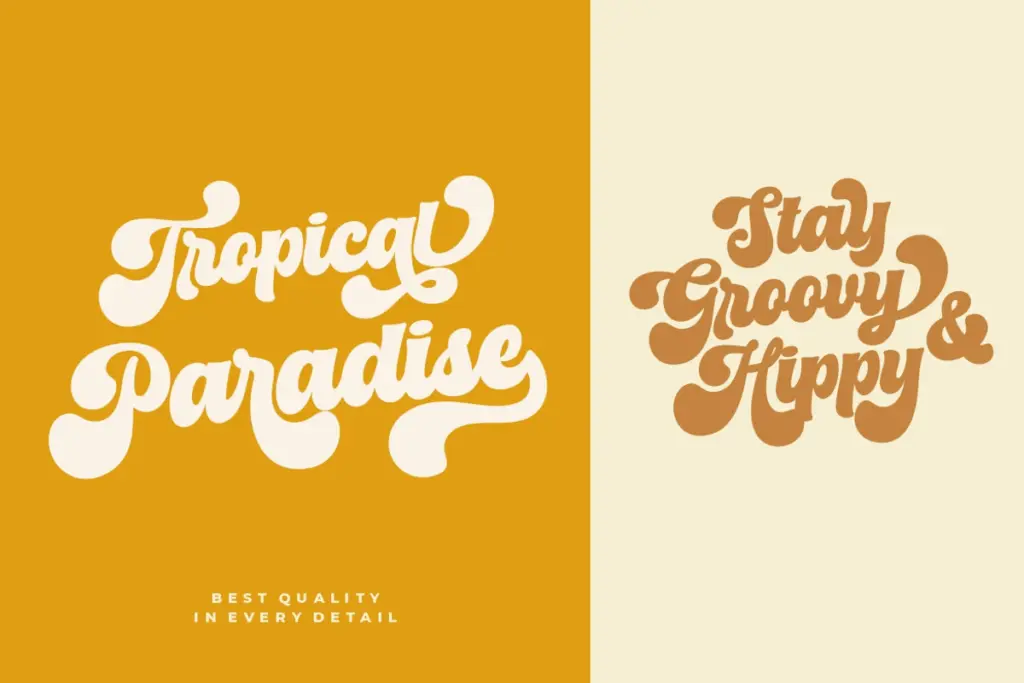
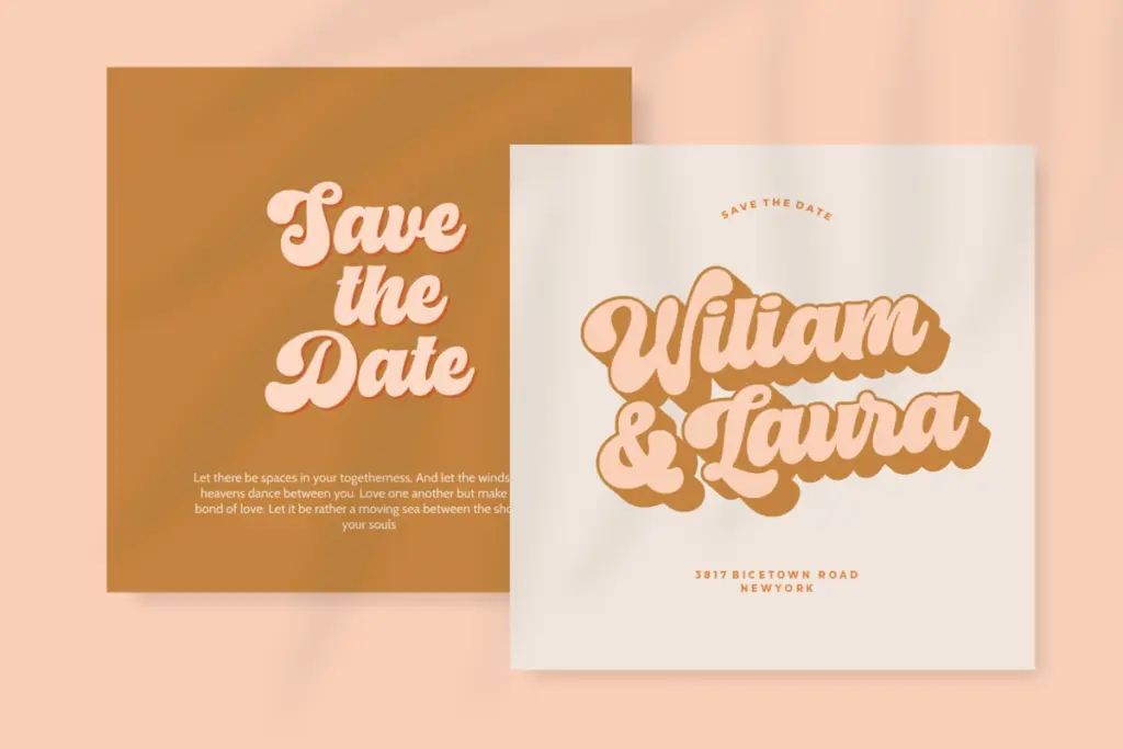
This is a headline font, not a text font, and it should be treated that way. It’s suited to logotypes, badges, stickers, packaging, and short apparel graphics where a bold, rounded, slightly playful retro voice is the goal. Cricut and other cutting-machine projects are a natural fit given the chunky, simplified shapes — they’ll cut cleanly at most sizes. Posters, YouTube thumbnails, and Instagram graphics are other reasonable homes, anywhere a few words need to carry visual weight rather than convey a paragraph of information.
It’s less suited to body copy, dense signage, or anything requiring sustained reading — the heavy, rounded strokes get visually loud fast, and the personality that makes it work in a three-word headline becomes fatiguing over a full sentence. Pair it sparingly with a plainer companion font for supporting text, and let this one carry only the words that need to shout.
What we liked, and what we didn’t
Strengths
- The built-in shadow/outline layer gives an easy way to fake dimensional depth without extra software work
- Rounded corners give the heavy strokes a friendly, approachable tone distinct from sharper geometric retro faces
- Alternates, swashes and ligatures add some flexibility for short logotype-style settings
Trade-offs
- The heavy, uniform weight makes it unsuitable for anything beyond short headlines or single words
- Full access to alternates, swashes and the shadow layer depends on using OpenType-aware software
Chunky Retro Font is a solid, single-purpose display face: bold, rounded, and built for short bursts of text rather than paragraphs. The shadow layer is its most useful feature, but it needs a careful hand to avoid looking like a template. Buy it for logos, badges and packaging, not for anything that needs to be read at length.

Tmfonts writes independent reviews of typefaces: what each font does well, where it falls short, what it suits, and where it is sold.